by Julie Schauer | Jul 23, 2011 | Exhibition Reviews, Expressionism, Franz Marc, Kandinsky, Modern Art, Paul Klee, The Phillips Collection
The Phillips’ Kandinsky exhibition centers around this painting from
the Guggenheim, Painting with White Border, 1913. It appears primarily
abstract, but has two specifically Russian iconographic references: a troika
(three horses) and St. George and the Dragon.
 The Phillips Collection’s current exhibition on Kandinsky not only provides insight into the thought process of this giant of early 20th century abstraction, but it also gives us a chance to compare the artists with whom he worked and influenced.
The Kandinsky exhibition is juxtaposed next to an exhibition of contemporary artist Frank Stella, whose sculptures are influenced by music of Domenico Scarlatti, called Stella Sounds. The metal and plastic sculptures point, poke off the walls and into space curving vigorously with color. They become 3-dimensional expressions of abstraction comparable to Kandinsky.
Frank Stella’s K43 comes out of the wall and into space. His sculptures
on view at the Phillips are based on the Sonatas of Italian composer Domenico Scarlatti
Both artists were inspired by music and Stella admits his appreciation for Kandinsky. Kandinsky named most of his early abstract paintings with titles suggestive of music: Improvisation, Composition, Impression, followed by a number. Ironically, the Phillips calls its exhibition Kandinsky and the Harmony of Silence: Painting with a Large White Border. The white border may be silent and restful, but the rest of this large painting has a rich depth, as each strong color pushes into space and clamors for attention.
The Phillips exhibition is educational, showing his drawings and his working process. Included is Sketch 1 for Painting with White Border (Moscow), a major holding of The Phillips Collection, as well as ten other preparatory studies in watercolor, ink, and pencil. But even more instructive is putting Kandinsky in perspective with his colleagues in two German art groups, the Blaue Reiter and the Bauhaus. If the great Russian painter and philosopher was the spiritual leader amongst the abstract artists centered around Munich, their spokesman, it is fitting because his art is the brashest and most assertive of the group.

The Phillips Collection has a superb painting by Franz Marc, Deer in the Forest, II. Looking forward to environmentalism, this painting hints at the destruction of nature in the 20th century. Unfortunately the artist himself died in World War I.
The Phillips owns many paintings done by Kandinsky’s colleagues : Franz Marc, the other leader of Der Blaue Reiter (The Blue Rider) who died in World War I; the nervous Austrian, Oskar Kokoschka; the whimsical, childlike but sophisticated Paul Klee, and the playful American-German Lyonel Feininger. It’s a special treat to see the other early masters of Expressionism.
 Lionel Feininger’s Village is a geometric construction of shifting planes of color.
Beginning in 1922, Kandinsky taught at the Die Bauhaus, a comprehensive art and design school. Paul Klee was one of his colleagues there, as well as in Der Blaue Reiter. Klee’s art is as abstract, automatic and free as Kandinsky. But his vision is more subtle, more simple and more symbolic. Having at least 5 paintings by Klee to compare, we clearly see the difference.
 Paul Klee,Tree Nursery, 1929, is one of several Klee paintings on view to compare with Kandinsky. In Klee’s paintings–not Kandinsky’s – we see the harmony of silence.
One of the great strengths of this Washington museum is its commitment to comparative exhibitions which give the viewer a fuller understanding of individual artists. Fortunately, the Phillips already has a large collection of early Modernism to supplement its exhibitions. The Kandinsky and Stella displays will be on view until September 4.
Copyright Julie Schauer 2010-2016
by Julie Schauer | Apr 5, 2011 | 19th Century Art, Exhibition Reviews, Gauguin, Impressionism and Post-Impressionism, National Gallery of Art Washington, The Art Institute of Chicago
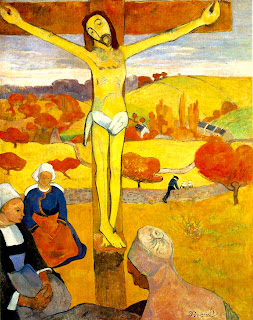 Paul Gauguin was impressed with the sincere, unspoiled piety of women from Brittany, where he painted in 1887. He placed the Yellow Christ, 1889, in a Breton landscape.
Paul Gauguin, an early modern rebel against western culture, is influenced by religious culture like his French forebears who painted for kings and churches 400 years earlier. After seeing the Art Institute of Chicago’s exhibition of
Early Renaissance Art in France, I saw the Gauguin exhibition at the National Gallery. Many of Gauguin’s subjects also had religious themes. He put the Crucifixion in a setting of yellow and ocher pigments, and blended it into the landscape of Brittany, a region he respected for its piety and cultural backwardness at that time.
 The standing woman in Delectable Waters, above, has the shame of Eve being expelled from the garden of Paradise. We don’t know her relationship to the other women, although they also seem to live in a lush tropical place, much like a Garden of Eden
Many of the paintings in Gauguin: Maker of Myth come from his Tahitian stay after 1891. He treats several scenes of Tahitian women and gods through the lens of Christianity and other religious traditions. It’s curious that the moon goddess Hina who appears in Delectable Waters, above, is actually in a pose from Hinduism that Gauguin morphs into this Tahitian image. In some canvases the Tahitian women, rather than Eve, deal with evil and temptation. He portrays human dramas of guilt, fear, agony and pain.
Why Are You Angry, from the Art Institute of Chicago, has always fascinated me. It also seems to have a mysterious theme of guilt or shame. This encounter between a standing lady and two seated girls who humble themselves creates a provocative drama separated by an old woman and a tree. Each woman is strongly modeled with lovely, brownish skin tones. The colors of this paradise blend warm hues of yellow and red with the cool, peaceful colors of mauve and blue.

Why Are You Angry, from the Art Institute of Chicago, exemplifies Gauguin’s ability to balance the warm and cool colors of nature, while the composition is balancing the various sides of the human drama .
Even before going to Tahiti, he painted of Christ’s
Agony in the Garden, showing Jesus is a human who feels the same pain of rejection that we, as humans, do. He uses his own face as Jesus Christ. Bright red-orange hair is symbolic of the fire and pain of human suffering, which we see not only as Jesus but part of humankind. There are many self-portraits on view
. Symbolist Self-Portrait from the National Gallery’s collection, shows the paradox of his own good and evil natures, making his choices appear like Adam and Eve’s. More powerful than ego promotion, these self-portraits are powerful expressions of the human dilemma. After all, he started out as a stockbroker, which clearly did not work for him. The exhibition has an impressive display of Gauguin’s sculpture and ceramics, even in self-portraiture.
 The Agony in the Garden, is a Christian theme. Here Gauguin has given Jesus his own face, suggesting that he empathized and identified with the suffering of Jesus.
One can wonder if Gauguin ever overcame his pain, shame and reached a type of salvation in his final destination, Tahiti. Whether it was Eden, Tahiti or Gethsemane, he seems to paint so many gardens, the paradises for which he hoped. (He had spent a childhood in Peru, traveled to the island of Martinique, to the opposite corners of France, Brittany and Arles, in search of simplicity before arriving in the South Seas.) Curiously, there are no paintings representing his short stay in Arles with Vincent Van Gogh.
In the end, Gauguin leaves his meanings ambiguous, but color is Gauguin’s salvation as an artist.

Two Women, above, from the Metropolitan Museum of Art, shows Gauguin’s gift of color–not only yellow sky and brilliant red cherries. The woman to the right is painted with green hues beneath her brown skin, a wonderful match for her blue dress, while the other women has red under brown skin.
Copyright Julie Schauer 2010-2016
by Julie Schauer | Dec 5, 2010 | 19th Century Art, American Art, Exhibition Reviews, Landscape Painting

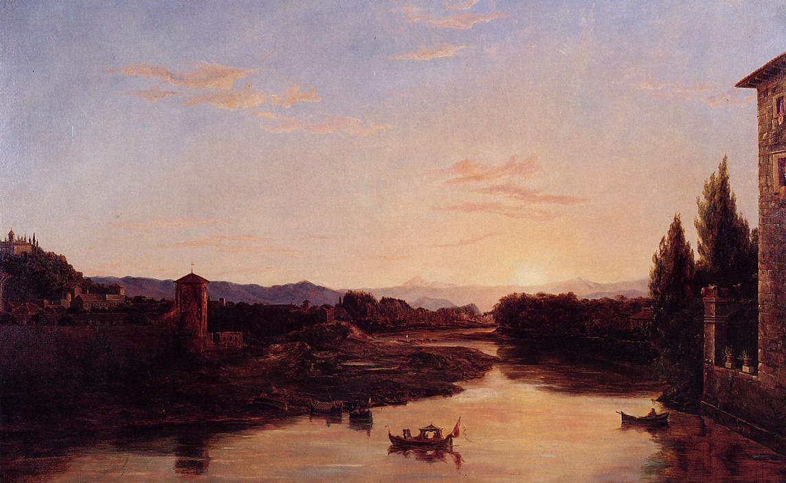
Thomas Cole, Sunset on the Arno, 1837, is at the Museum of the Shenandoah Valley until January 23. The exhibition, organized by the Westmoreland Museum of American Art, is from a private collection. Whispy clouds hover above, almost like angels.
Forty paintings from the Hudson River School of painting glow in the Shenandoah Valley, in the Museum of the Shenandoah Valley, Winchester, VA. Certainly this location has some resemblance to the Hudson River Valley and these paintings would naturally resonate in the community. Just as the 19th century artists centered mainly in New York and New England hoped to capture and hold onto the natural beauty of their unspoiled nature, the Shenandoah Valley still offers a resting place from too much human development. Entitled “Different Views of Hudson River Painting,” the paintings will be in Winchester until January 23.
 Jasper Francis Cropsey, The Narrows of Lake George, in the Hudson River Museum. A smaller, view of Lake
 George with similar colors is on view is in the in the Museum of the Shenandoah Valley
In this two-room exhibition, many pristine paintings are arranged amongst poetry and quotations by Walt Whitman, William Cullen Bryant and others. The four seasons and many sunsets are on view. These paintings capture views we occasionally see in the mountains or countryside in those moments of nature’s most beautiful light and color. I was particularly drawn to Jasper Francis Cropsey’s radiant, reflecting color in Lake George, reminding me of the beautiful autumn that has just passed. Much if its appeal is that this painting and several others allow us to remember something and then hold onto it.
 John William Casilear, Quiet River (Genesee), 1874. Often there are usually more cattle than people in the Hudson River paintings.
The majority of paintings are small and intimate; brushstrokes are minute and very detailed. People and animals, if depicted, are extremely small to show the grandeur of the natural world. The air is clean, often hazy, and the water is totally placid. We are invited into contemplation.
There are majestic views of Niagara Falls and Mount Washington, but also simple scenes of unknown places such as John William Casilear’s Quiet River (Genesee),1874. There is nothing intellectual about the exhibition, only the opportunity for reverie in peaceful, pastoral places. Thomas Cole, founder of the Hudson School and painter of the Journey of Life series in Washington’s National Gallery, often painted his landscapes as allegories, but there doesn’t seem to be an underlying message in this Italian scene, Sunset on the Arno–unless the clouds are seen as angels.
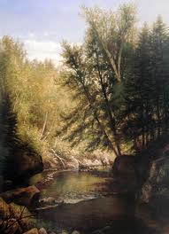
Laura Woodward, Adirondeck Woodland with Deer, has an infinite variety of greens, from very light to dark. The two deer are barely shown against the daylight around the bend of a stream and under the tall trees on the right.
The entire exhibition helps us understand why the Hudson River School is still admired. Alexis Rockman, a contemporary New York painter featured in this blog’s next entry was influenced by the Hudson River School.This distinctive American style of painting was importan t from the 1830s to 1880s. Impressionism in France had a much bigger influence on modernism and is usually more popular, but these artists–and there are so many of them– deserve a long look and a lot of our respect.
At home I have a small painting on a plate, done in the Hudson River style by my great-grandmother. A gift to my great-grandfather, it is signed on the reverse, “From Helen to James, painted between Xmas and New Year’s 1889.

George Inness, Moonlight, Tarpons Springs, 1892, is in the Phillips Collection and part of the current exhibition, Side by Side, which offers comparison to paintings in Oberlin College’s Allen Art Museum. Along with Ralph Blakelock’s Moonlight and three other moonlight paintings, it can be seen until January 16Washington museums also have several paintings of the Tonalists who came after the Hudson River School and were generally more painterly. These artists used more layers and show greater influence from the techniques of French painters, particularly from the Barbizon School. The Tonalist painters of moonlight scenes, offer a nice comparison with the sunsets of Hudson River painters—less color but perhaps even more evocative of moods. These paintings include several by Ralph Albert Blakelock at the National Gallery, Phillips, Corcoran and Smithsonian American Art Museum, as well as paintings by George Inness.
Here is a blog devoted to the Hudson River School: http://circa1855.blogspot.com/
Copyright Julie Schauer 2010-2016
by Julie Schauer | Aug 13, 2010 | 19th Century Art, Art Appreciation: Visual Analysis, Exhibition Reviews, Expressionism, Modern Art, Munch, National Gallery of Art Washington, Printmaking
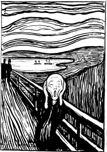
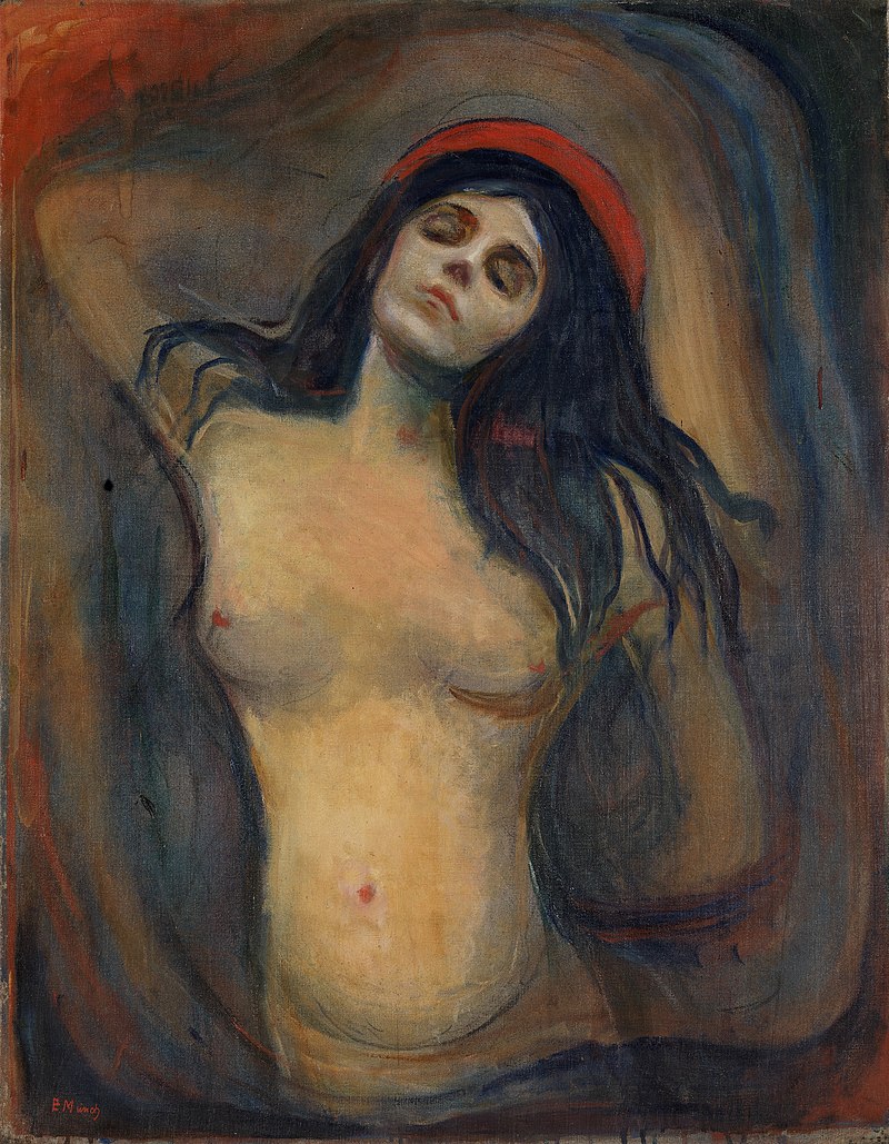
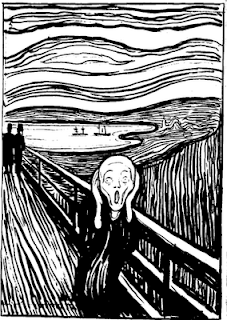 Edvard Munch’s The Scream is so powerful that the other works of this great Norwegian artist are overlooked. Other art by Munch articulated his feelings about the sad passages of life–sickness, death and breakups. Currently at The National Gallery of Art in Washington is an exhibition of Munch’s graphic art which represents many of the other themes he dealt with intensely, including illness, love, loss, and loneliness. The museum has pulled together prints from its own collection with images from two private collections to present a fuller view of the real artist. In fact, the sounds of silence in Munch’s work are as frequent and powerful as the voices of pain.
Munch also can be subtle. He explores the possibilities of images morphing into something else. In Waves of Love, we see a floating woman but don’t notice the man right away. Yet, when we discover him, the work becomes even more powerful.
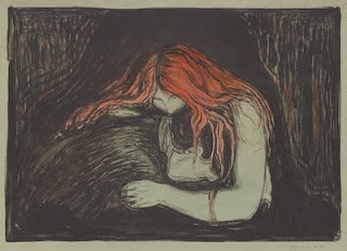 Munch, Vampire II, 1895, lithograph with watercolor, from the National Gallery of Art
Whether there is silence or pain depends on who you are and when you see these works. Vampire II, above, can be seen as a comforting relationship, but the playwright August Strindberg renamed it with a more provocative title and Munch let it stand. Munch’s original title was Love and Pain, suggesting that falling in love ultimately causes pain, or, more optimistically, that love will console you from the other pains of life.The Vampire series of prints, three prints entitled Sin, and a group of images from the Ashes and Madonna series may suggest unkind, fearful views of women or anxiety in regards to relationships. However, Munch was deeply hurt by the loss of his mother at age five and his older sister when he was 14, both of whom he adored. They died of tuberculosis and he feared the same for himself. Interpreting his images as misogyny is too simplistic.
The Ashes series of prints, above, explores the turmoil after a breakup.
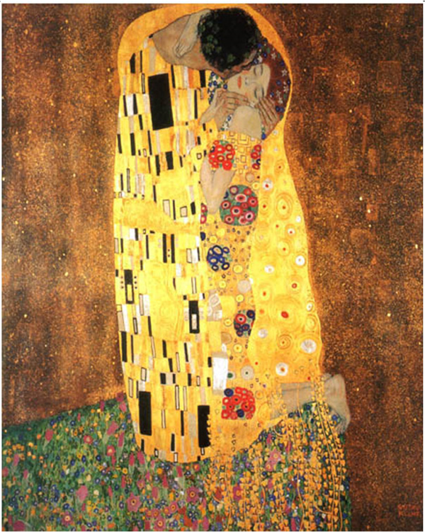
A group of prints entitled The Kiss can be seen as more harmonious symbols of love. One of these prints, an early intaglio example of The Kiss, is sensual in a idealized, classical form. You can see how it became a precursor to Munch’s symbiotic, unified idea of love in the woodcut versions, such as the one on the left, The Kiss IV of 1902. Here, Munch used different colors of ink and exploited the grain of wood to replicate the curves of the couple. Notice that the side view of “his” face is the front of “her” face. This print was certainly an inspiration for Gustav Klimt’s The Kiss–with its colors and mosaic patterns– much more popular and famous than Munch’s versions. Klimt borrowed Munch’s vertical emphasis and upward sweep of motion ending in the curving form of “oneness,” the back of a man’s head and the front of a woman’s face. In Munch’s version the man and woman’s face become one, a prelude to the unity of form that Constantin Brancu
 si used for his abstract rectangular block sculpture of The Kiss in 1910, where the eye of two becomes the eye of one.
Klimt’s The Kiss shows the influence of Munch, above left
The beauty of seeing these graphic images is to see how he reworked themes over many years, changing the content as he made minor changes to the works. His prints are done in multiple colors and states, and vary in graphic techniques, from woodcut to etching, lithograph, aquatint and more. The Impressionists influenced his color and Van Gogh inspired his line, but he tried to reduce expressions even further than Van Gogh, making each of his images powerful symbols of human experiences.
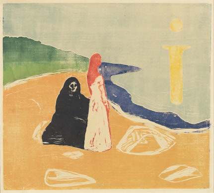
Two Women on the Shore focuses on one central standing woman, with the seated person behind her — perhaps alluding to an elderly figure in her life, a ghost from her past, an alter ego, or a projection of whom she will become. Munch probably wished to evoke different viewpoints and we are likely to experience her differently depending on our individual conception. The colors changed a great deal from print to print, and this series of prints evokes variety of meanings. I am particularly fond of the way Munch repeatedly used a large bright symbol resembling the letter i — the sunlight or moonlight reflecting on water.
 Two Women on the Shore, 1920s, color woodcut National Gallery of Art
Often the power in Munch’s imagery comes from the push-pull effect of space: figures in front, space rushing behind, or figures in both places so we can’t help but be aware of the drama of their distance. Ashes explores the debris left over at the end of a relationship. Repeatedly, Munch used the figure in a landscape as a vehicle to summarize feeling. His women can be brash, his men often hurting.
It’s likely that two of the great images of the early 20th century, Matisse’s Blue Nude and Picasso’s Les desmoiselles d’Avignon fell under the influence of Munch’s slightly earlier, unforgettable figures, the women in Ashes and Madonna. Some find Munch’s art too pessimistic; others say his art was less inspired after a breakdown at age 45 after which he gave up drinking.
Madonna
Copyright Julie Schauer 2010-2022
by Julie Schauer | Apr 8, 2010 | 19th Century Art, Corcoran Gallery of Art, Exhibition Reviews, Japanese Art, Jean-Francois Millet, Landscape Painting, Painting Techniques, Van Gogh
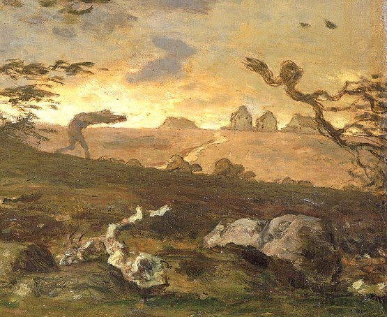
 Jean-Francois Millet, The Gust of Wind, 1871-73, National Museum of Wales
It’s disappointing that the Corcoran exhibition, From Turner to Cezanne, had to be taken down early as a precaution over environmental concerns……I was counting on going Friday, April 9, three days after it abruptly closed. What am I missing? A spectacular collection from the National Gallery of Wales, little-known paintings of well-known artists that are seldom seen in the US………………… Torrents of Rain and Gusts of Wind…..
Vincent Van Gogh, Rain, Auvers, 1890, from the National Museum of Wales
Vincent Van Gogh’s suns, stars and flowers from sunny Provence express the intensity he experienced while living there. But in May, 1890, he moved north of Paris to Auvers-sur-Oise and painted Rain, Auvers in July. Van Gogh used such a heavy impasto of paint that this painting conveys a heavy impact of rain. Van Gogh had an uncommon ability to combine actual texture of the paint itself with the tangible, tactile sense of objects painted. I really wanted to see Rain, Auvers to experience the downpour. Exaggerated or not, Van Gogh has the power to create a reality that makes us feel its presence more keenly. But the rain in this painting, deliberate gashes to the canvas surface, warns of a downpour more powerful than rain, the artist’s impending doom–he shot himself July 29th.
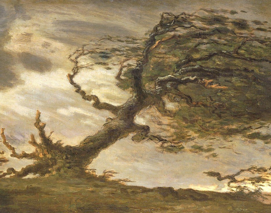
Even more than the Van Gogh, I was also looking forward to seeing paintings by Daumier and Millet, two mid-19th century French painters who are often overlooked, particularly in their gifts of great draftsmanship. Van Gogh seems to have admired them. One of Millet’s paintings from this Davies Collection at the National Museum of Wales is The Gus t of Wind, 1871-73. Millet conveys the full fury of a storm in the countryside. He captures the birds, leaves and branches with jagged, undulating brushstrokes. Along with the wind, his tree is uprooted and the birds, man (a shepherd whose sheep can barely be seen) and flock scatter in a fury, as the luminous colors of daylight poke through the background.
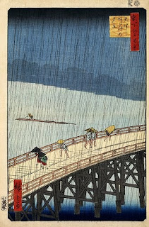
It is commonly understood that Van Gogh’s paintings of The Sower were inspired by Millet’s The Sower. No doubt Van Gogh knew many paintings by Millet and shared his appreciation for man’s connection to the land. He adopted Millet’s expressive lines, but thickened the contours and turned up the volume on color. Brandon, one of my students, was amazed to discover the wind that Van Gogh captured in The Olive Orchard, now on view in the Chester Dale Collection at the National Gallery of Art. Certainly Millet was one of Van Gogh’s most inspiring teachers, along with the Japanese artist Hiroshige, whose woodcuts gave Van Gogh the motif of diagonal cuts for rain.
In May and during
most of the summer, this exhibition travels to Albuquerque Museum of Art in New Mexico. However, while the O’Keeffe exhibition remains at the Phillips until May 9th, its worth seeing the weather photographs of Alfred Stieglitz and comparing them to paintings about weather.
Ando Hiroshige, Rain Shower on Ohashi Bridge, 1857woodcut, at the Library of Congress. The rain, treated like gashes in the wood, influenced the gashes in “Rain,Auvers”
Van Gogh, The Olive Orchard, 1889, Chester Dale Collection,N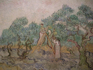 ational Gallery of Art, Washington, DC
detail, The Gust
of Wind, shows
how Millet’s lines influenced Van Gogh
Copyright Julie Schauer 2010-2016
by Julie Schauer | Mar 21, 2010 | American Art, Exhibition Reviews, Georgia O'Keeffe, Modern Art, The Phillips Collection, Women Artists
 Series 1, No. 3, 1918, is from the Milwaukee Art Museum
Once again the Phillips Collection in Washington, DC, has put on a splendid exhibition of an early modern master, Georgia O’Keeffe: Abstraction. Although I’ve seen O’Keeffe exhibitions in the past, there is always something new to be seen in her work. Several compelling images that I had not seen before, especially from the Whitney Museum, a co-organizer of the exhibition, and the Milwaukee Art Museum, are in this show.
O’Keeffe’s abstract imagery is inspired by diverse subjects, more often natural than manmade–flowers, bones, mountains, aerial views, and the diverse places she lived, Wisconsin, Lake George, NY and New Mexico. Less well known is the fact that she lived in Charlottesville, Va., and some of her colors could easily be reflections of sunsets over the Blue Ridge Mountains. Even though a group of abstractions is inspired by music, one of the curators pointed out that Music, Pink and Blue, No. 2, resembles Natural Bridge, Va. The meaning of each single work is unique to the viewer; everyone who goes to visit the show is inclined to see something different and take their own inspiration from it.
The exhibition is enhanced by O’Keeffe’s charcoal drawings and the weather photographs of Alfred Stieglitz. One thing I recognized anew is the quality of O’Keeffe’s brushstrokes and how they reflect the particular form of each abstraction takes. Although photographs may provide a glimpse at her subtle blending of colors, it is only through seeing the exhibition that one can truly enjoy the wonder of O’Keeffe’s vision. It will be at the Phillips until May 9th, and then moves to the Georgia O’Keeffe Museum in Santa Fe.

Music, Pink and Blue, No. 2, from the Whitney Museum of American Art, New York
Copyright Julie Schauer 2010-2016


Recent Comments