by Julie Schauer | Dec 13, 2015 | Gauguin, Picasso, Rouault
 |
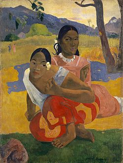
Paul Gauguin, NAFAE faaipoipo (When Will You Marry?) 1892
Rudolph Staechelin Collection |
The Phillips Collection’s latest loan exhibition, “Gauguin to Picasso: Masterworks from Switzerland,” draws upon a pair of collections assembled by two prominent but very different Swiss art collectors. To me, the theme of dualism, pairs and split identities stands out strongly. The exhibition highlights one of Gauguin’s most famous paintings, When are You to be Married? — a painting that recently was sold. (The Staechelin and Im Oberstag collections of modern art are normally on display at the Basel Kunstmuseum. Here’s an article for background on the collectors why the paintings are traveling.)
Like so many other paintings by Gauguin, the two women in this infamous painting express two realities, which could represent the split identities within Tahitian society. He painted it during his first stay in Tahiti in 1892. The woman in front is natural, organic, relaxed and colorful in her red skirt. The orchid in her hair was said to suggest that she is looking for a mate. A woman behind is taller, more severe and covered in a pink dress buttoned to the top–an influence of Western missionaries. The woman in back has a bigger head than the woman in front. Does he mean to imply that she dominates? Or, is Gauguin imagining a single Tahitian woman who is torn between her native identity and the invasion of western civilization.
 |
| Eugene Delacroix, Women of Algiers, 1834, The Louvre |
The woman in front may be inspired by one of the very beautiful, sensual women painted in Delacroix’s Women of Algiers, one of my all-time favorite paintings. (Delacroix was allowed into the mayor’s harem to sketch the women–pictured at right. Like Gauguin, Delacroix was European observing women in an exotic, foreign land.)
 |
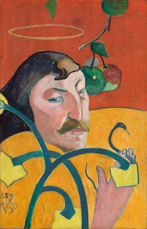
| Gauguin, Self-Portrait, 1889, NGA |
|
|
|
|
In his self-portraits and so much of his art, Gauguin expresses the split nature in mankind, the areas where there is inner conflict. Symbolist Self-Portrait at the National Gallery of Art (NGA), Washington, is a divided person, both a saint and a sinner. He has a choice in the matter, and we wonder what he’ll choose.
The two Tahitian women are different, yet blended. Warm brown skin tones unite them and the hot red skirt of the “natural” native woman flawlessly flows into the warm pink of the stiffer, “civilized” woman. The colors blend and contrast simultaneously into a beautiful harmony. (Is it surprising that this picture was the most expensive painting ever sold? Rumor has it that it was purchased by a Qatari for Qatar Museums.)
 |
| Georges Rouault, Landscape with Red Sail, 1939, Im Obersteg Foundation, permanent loan to the Kunstmuseum Basel. Photo © Mark Gisler, Müllheim. Image © 2015 Artists Rights Society (ARS), New York / ADAGP, Paris |
Other artists in this exhibition continue the theme of duality and split personality. Early 20th century Expressionist Georges Rouault was honest about his identity as a person belonging in another century, the age of the cathedrals. His heavily-outlined Landscape with Red Sail uses colors reminiscent of the colors in stained glass and the way stained glass is divided by lines of lead. Yet, his paint is applied in a very rough, heavy manner, hardly like the smoothness of glass. His beautiful seascape does, however, evoke the light of a sunset peaking behind the sailboat–like the light filtering in medieval churches.
 |
| Alexej Jawlensky, Self-Portrait, 1911 Im Obersteg Collection |
|
|
The Expressionist painter Alexej von Jawlensky was a Russian living in Switzerland, in exile there during World War I. There’s a haunting quality to his Self-Portrait, left. Jawlensky and Im Obersteg had a strong friendship throughout his career.
One side of a Picasso painting features a woman in a Post-Impressionist style, “Woman At the Theatre,” and the other side has a sad woman, The Absinthe Drinker, from the beginning of the “Blue period.” Both were painted in 1901. They could not be more different from each other. Picasso was very experimental at that
 |
| Picasso, The Absinthe Drinker, 1901 Im Obersteg Collection |
|
|
time of his life and in his career.
Expressionism is a large part of the exhibition, especially with Wassily Kandinsky, Chaim Soutine, Marc Chagall and Alexej von Jawlinsky. Swiss Symbolist Ferdinand Hodler shares with us his experience of love and death in a group of paintings of his dying lover Valentine Gode-Darel. It is difficult to watch and for him painting may have been an attempt to make peace with the awful situation.
The series of paintings by Hodler are some of the most powerful in the exhibition because we experience the unfolding of a tragedy. Gode-Darel died of cancer in
 |
| Ferdinand Hodler, The Patient, painted 1914, dated 1915. The Rudolf Staechelin Collection © Kunstmuseum Basel, Martin P. Bühler |
1915, a year after diagnosis. The three paintings of rabbis by Marc Chagall continue in the theme of portraiture.
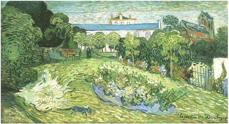
There are very fine small paintings by Cezanne, Monet, Manet, Renoir and Pissaro, two beautiful landscapes by Maurice de Vlaminck. Van Gogh’s, The Garden of Daubigny, 1890 is one of three he did of the same subject weeks before his death. The black cat in the painting is small but curiously out of place. The 60 paintings on view, on view until January 10 — are worth the trip to the Phillips. Here are some of the best photographs of the paintings in the show. These Swiss collections complement the Phillips own marvelous collection of early Modernism. It is curious that the Swiss collections don’t show the greatest of all 20th century Swiss artists, Paul Klee.
 |
| Vincent Van Gogh. The Garden of Daubigny, 1890 Rudolf Staechelin Collection |
Copyright Julie Schauer 2010-2016
by Julie Schauer | Nov 16, 2012 | Collage, Conceptual Art, Contemporary Art, Modern Art, Picasso, Pop Art
Semen Fridliand, Die kaüfliche Presse (The Venal Press) 1929 halftone reproduction,
6 1/4 x 8 1/4 in. (16 x 21 cm) National Gallery of Art Library, David K.E. Bruce Fund
At least four exhibitions on the Mall, at the National Gallery of Art and Hirshhorn Museum, take a look at printed word in painting and other art forms of the past century. Chronologically, these exhibits begin with the avant-garde artists of circa 1910 at the National Gallery of Art’s “Shock of the News” exhibition. They end with today’s leading provocateur-artist, Ai Weiwei of China, at the Smithsonian’s contemporary art museum, the Hirshhorn. So we search for the meaning of the word in art.
 |
| Jean-Léon Gérôme, O Pti Cien, 1902, is an academic style |
|
|
|
|
|
|
In 1902, Jean-Léon Gérôme, a leading academic artist of the day, painted O PTI CIEN, a puppy wearing a monacle. The letters suggest a reading of “au petit chien” (“at the little dog”), which would sound approximately like Oh P T shee-en to the French. But the letters also form the French word for an optician. This work actually was a competition for an advertisement, but Gérôme’s humorous pun set the stage for the Cubists, Surrealists and other artists who brought the painted word into prominence: Picasso and Georges Braque, Dada artists and even Surrealists like Magritte.

The intersection of the news media and visual art is the subject of the National Gallery’s Shock of the News. This cultural force burst onto the scene around the 2nd decade of the 20th century, when an Italian group, the Futurists, published their manifesto in 1909. Pablo Picasso and Georges Braque were soon incorporating collage into Cubism and using words from the newsprint to articulate their artwork. Guitar, Sheet Music and Glass, 1912 has the masthead from “Le Journal,” a Paris daily. The letters Jou appear as reminders of le jour, meaning day, journal, the daily newspaper and jouer, which means to play.
Pablo Picasso, Guitar, Sheet Music, and Glass, 1912 sheet music, newspaper, colored and white paper, charcoal, and hand-painted faux-bois paper on wallpaper 47.9 x 36.5 cm (18 7/8 x 14 3/8 in.)Collection of the McNay Art Museum, Bequest of Marion Koogler McNay ©2012
Estate of Pablo Picasso/Artists Rights Society (ARS), NewYork
That last word is the key, because modern art, if anything, is playful and ironic. If you can’t make the world better, why not laugh about it? The Dadaists, who followed Picasso, were despondent over the established civilization and the horrors of World War I. Particularly in urban centers of Germany and in Paris and New York, they couldn’t fight the world, so ridiculed it. Their art is full of newsprint, ready-made objects and things not expected to part of aesthetics. Hannah Hoch’s collages are particularly playful and interesting
Hannah Höch Von Oben (From Above), 1926-1927 photomontage and collage on paper 30.5 x 22.2 cm
(12 x 8 3/4 in.)Des Moines Art Center’s Louise Noun Collection of Art by Women through Bequest, 2003
Semen Fridliand’s photo halftone image, The Venal Press, above center, is a commentary on the public’s capability to let the press influence their to beliefs in everything. How much greater that power is with the blogs, the facebook and Twitter of today!
Of course, Picasso continued to respect the power of print media in Guernica, of 1937 (not in the exhibition), which is his commentary the first time a bomb was dropped from air, hitting the Basque city of Guernica in Spain. He wanted the monumental, 25-foot painting to have journalistic quality and therefore imitated the lettering of newspapers, while painting only blacks, whites and grays.
 |
On Kawara,Oct. 26, 1971 (Today series no. 97), 1971
cardboard box, newspaper, and liquitex on canvas
painting: 10 1/8 x 13 in., box bottom: 10 1/2 x 13 3/8 x 1 3/4 in. box lid: 10 5/8 x 13 1/4 x 1 3/16 in. Hirshhorn Museum and Sculpture Garden, Smithsonian Institution, Joseph H. Hirshhorn Purchase Fund, 2007. The Panza Collection |
On Kawara painted the date, October 27, 1971, in white on a black canvas. It is one of over 5,000 such images his has done over many years. Each painting goes along with a cardboard box and cover and the packing functions as a time capsule, because the news of that day is place in the box with the painting. After leaving the Shock of the News exhibition, National Gallery visitors move onto the next exhibition, Roy Lichtenstein: A Retrospective.
 |
|
Roy Lichtenstein, Look Mickey, 1961, oil on canvas, 121.9 x 175.3 cm (48 x 69 in.)
National Gallery of Art, Washington, Gift of Roy and Dorothy Lichtenstein in Honor of the 50th Anniversary of the National Gallery of Art © Board of Trustees, National Gallery of Art, Washington
|
First and foremost, we think of Roy Lichtenstein (1923-1997) as the artist who transformed the art of the comic book into a higher form of art. As a Pop artist, he is often eclipsed in reputation by Warhol. This large exhibition brings together works from his entire career, encompassing several themes. Throughout his long career, he used bold colors and ben-day dots. The dots imitative of a printer’s dots for the comics and newsprint remain a consistent signature of his style, but Lichtenstein’s late work parodies earlier art history using few words. His images of the 1960s borrow from cartoons, but he added captions and details to complete the compositions. His captions capture the spirit and humor of certain cultural icons like Mickey Mouse and Donald Duck. Other large cartoon-like images fill rooms on the specific themes of war and romance. He uses boldness, humor and a surprising amount of emotion in a simplified style.
 |
| Barbara Kruger, an installation at the Hirshhorn Museum, Washington, through 2014 |
The bold, sans serif letters of Barbara Kruger overwhelm the ground floor of the Hirshhorn right now. The exhibition, called Belief + Doubt = Sanity, uses words in every way to make us think. Kruger was a graphic artist before she became a fine artist and the heritage of graphic art remains part of her style and her appeal, much like it did for the Pop Artists before her. The stairs and adjoining rooms are dressed in bold letters using only black, yellow, red and white, an overwhelming effect. Her messages are arresting, questioning thought about politics, consumerism and all sorts of aspects of contemporary life. We realize the dichotomy of much in the world in which political banter stems from belief in one truth. The only sane way to evaluate it is with a blend of belief and doubt. Her art functions to ask questions, to question the cultural norms and to make us stop to think. As we ponder one of her bold messages, we recognize ourselves in the lines: “YOU WANT IT, YOU BUY IT, YOU FORGET IT.”
 |
|
Ai Weiwei, Coca-Cola Vase, 2007, paint on Qing Dynasty
ceramic at Hirshhorn Museum until February 24, 2013 |
The Ai Weiwei exhibition, According to What (named after a painting by Jasper Johns currently in a Philadelphia Museum of Art exhibition, Dancing around the Bride), is on the 3rd and 4th floors of the Hirshhorn. Like many contemporary artists, Ai Weiwei doesn’t limit himself to one medium; he does photographs, sculptures installations. He critiques American and Chinese governments, most notably the shoddy building construction which led to the death of 4,000 plus children in an earthquake. Ancient culture and modern life clash, but come together in Coco-Cola vase. He disrespects tradition but forces us to think how consumerism, corporate marketing and globalism meet ancient culture.
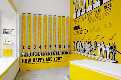
The works of Ai Weiwei and Barbara Kruger entertain, but those artists also challenge us and make us think more than Pop Art does. This summer I saw another contemporary, conceptual artist’s work at the Institute of Contemporary Art in of University of Pennsylvania, Philadelphia. Stefan Sagmeister’s The Happy Show, is also the work of a graphic artist, like Kruger. The words printed are in black on a yellow ground, the typeface combination that can be read most easily in the mode of the yellow pages. Yellow is the happiest of colors. Sagmeister made me think of a modern “pursuit of happiness” written into the Declaration of Independence. The exhibition questioned, provoked, entertained, tried to make us laugh and added one more valuable asset, encouraging happiness. If we recognize the paradoxes that Barbara Kruger and Ai Weiwei demonstrate, it’s possible to use the art of the word to promote not just “JOU” (play), but also joy in the world, or joy in the word.
 |
| Stefan Sagmeister, The Happy Show, at Institute of Contemporary Art, Philadelphia, April 4 – August 12, 2012 |
Copyright Julie Schauer 2010-2016


 1929 halftone reproduction Des Moines Art Center Louise Noun Collection of Art by Women through Bequest, 2003")


Recent Comments