Marseille: New Glass Designs for an Old Port
France’s oldest city and one the great ports of the Mediterranean has been revitalized to become a European Cultural Capital of Europe this year. Some of the most innovative practicing architects of today are making their mark on the city, cleaning up old areas and transforming it into an exciting new seaport environment. Abandoned parts of the old port and places where immigrants first entered the city are in the process of being turned into new commercial areas, with restaurants, art galleries, museums, music venues and shops.
 |
| Marseille became a Greek city about 2700 years ago. The island is where the Count of Monte Cristo was imprisoned. |
Sheaths of glass, concrete and metal, the materials of new architecture, butt up against the old stone towers, hills and masts of this port which geographically reminds me of San Francisco to a certain extent. (Reminiscent of the Alcatraz, there’s an island in the harbor containing Chateau d’If, where the Count of Monte Cristo was imprisoned.) Yet, the feeling inside is more rugged and grittier than San Francisco, with a multinational flavor.
 |
| Ricciotti designed MuCEM with a ramp linked to Fort Saint-Jean |
My photos taken last month showed the MuCEM (Museum of Civilizations of Europe and the Mediterranean) nearly finished, adjacent to the Villa Méditerranée. The 236 square foot box building, right, will be the country’s largest museum outside of Paris. In essence, the building has two facades, the glass covering and the concrete covering. The outer covering is a dark blue concrete which I actually thought was made of steel/ it shields the glass and museum visitors from the intense Mediterranean sun. The “lacey” outer face and “glassy” inner building and the two parts connect with a ramp. A walkway also links the new building to the very old 12th century building and tower, the Fort Saint-Jean.
Architect Rudy Ricciotti’s style has also raised eyebrows. He designed a floating gold roof on the Louvre in Paris to house the Islamic collection and a Jacques Cocteau museum in Menton. Each building is quite different, though, unlike Frank Gehry’s architecture. MuCEM’s concrete shell resembles a fisherman’s net. Its concrete is blue-gray, but that color will change with reflections of light, water and the sun. Ricciotti calls the eight different lattice patterns “sun-breakers.” They are meant to shield the southern and western facade from intense sunlight. MuCEM opened June 7, 2013.
 |
| A fishnet pattern of concrete shields MuCEM from intense sun on the south and west. |
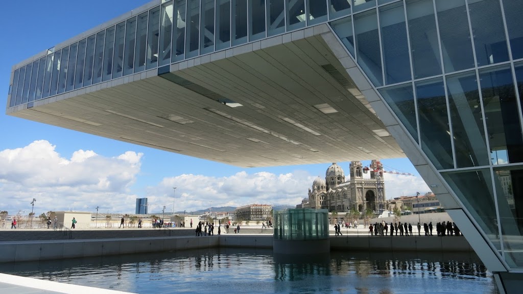
Next door is the Villa Méditerrannée, a product of Italian architect Stefano Boeri’s design studio, and a building devoted to exhibiting Marseille’s Mediterranean culture. It has a huge, cantilevered roof, but below it is an area with a view into the sea basin. The building’s auditorium goes under the water, too. The museum officially opened last weekend. Its exhibitions and films visualize the present and the future of the sea. Supported by the region of Provence-Alpes-Cote’Azur, Villa Méditerannée hopes to encourage communication among the many countries which have ports on the Mediterranean It can be understood as an exciting new cultural center for the entire Mediterranean region.
 |
| Another view of Boeri’s Villa Méditerannée, with Ricciotti’s MuCEM and Fort Saint-Jean to right. Glass is used extensively in the new buildings to take advantage of reflections of sun and water. |
There are other new museums, including the Musée des regards de Provence, where the old health station had been and where immigrants first went as they entered Marseille. The museum has a Michelin three-star restaurant.
There’s a new museum of decorative arts and a fine arts museum at Palais Longchamp has reopened after being closed many years. (That museum and the Musée Granet in Aix-en-Provence are hosting large exhibitions of the shares a major exhibitions of the many important artists who painted in the region, Cézanne, Van Gogh, Matisse, etc. In fact, Arles and other venues in Provence are sharing in the European Cultural Capital events. The Palais du Pharo, on the shoreline of Marseille has a large sculptural exhibition of steel arcs by Berner Venet, in celebration of the events.)
 |
| In the Parc du Pharo, the sculptor Bernar Vernet designed 12 steel arcs, called Desordre, created a pattern of light and shadow against the shoreline. |
 |
| Reflective glass creates is s museum without walls, at FRAC, a regional museum of contemporary art. |
It seems that all the contemporary architects working here–the local and the international ones–respect the city’s very irregular seaport. They design with the knowledge that water reflects light and that glass reflects water and light. Multitudes of glass heighten the reflections many times over.
FRAC (Fonds regional d’art contemporain or the Regional Collection of Contemporary Art) opened in March, 2013. The building has about 55,000 square feet. Its the work work of Japanese architect Kenzo Kuma. The exterior is covered with 1,500 panes of glass, all of which have been recycled and enameled in the workshop of Emmanuel Barrois.
 |
| Kenzo Kuma designed FRAC, a regional museum of contemporary art |
Kuma, like Ricciotti, is concerned with shielding the sun. (It’s interesting that exhibition while I was there concerned environmental art.) The glass is hung and diverse angles, offset from the building at various places. Kuma tries to evoke a museum without walls, and a feeling of openness prevails. There is a beautiful, peaceful aura to his building, a feeling modern Japanese architects convey so well. Kuma also said that he imitated the flow of space learned from the study of Le Corbusier, a labyrinthine, interlocking flow of space.
 |
| Le Corbusier, Cité Radieuse, 1947-52. It has 347 apartments on 12 stories |
Going to Marseille warrants a trip to the Cité Radieuse, Le Corbusier’s masterpiece of modern architecture, formerly called l’Unité d’Habitation.
 |
| Entrance to Le Corbusier’s Cité Radieuse The ground floor rests on muscular “pilotis” made of concrete, which hold up the building |
His blueprint for modern living, completed in the 1950s, unifies all aspects of living, eating, school, doctors and recreation in one building. Unfortunately, there was a fire last year which harmed some units but most of the building is intact. Many portions of the building have recently been painted and the colors make a brilliant splash reminiscent of Mondrian. It’s hard to go to the restaurant without disturbing clients or to visit one of the individual apartments without an invitation.
 |
| The ground floor lobby radiates warmth and color |
As much as I don’t necessarily think architects should try to be sociologists who tell people how to live, but this building succeeded and the residents like it. The concept and design were repeated again in Nantes, Berlin, Briey and Firminy. Le Corbusier proved that the modern concrete could be beautiful, colorful and expressive. Concrete, usually when reinforced with cast iron, need not be sterile.
 |
| An art school is on the rooftop. The force of brutal concrete pushes against the sky |
The day we were there, a film crew was making a television commercial on the roof and all kinds of goods were set blocked off and set aside for film use. It was May 22nd, and the sky was making some interesting cloud designs. Like Antoni Gaudí, Le Corbusier made his ventilation shafts into expressive, sculptural forms. The brutal, rough-hewn concrete has force and muscle which come alive against the muscle a alive against the sky.
The rooftop is a communal terrace and residents have a straight view to Marseille and the Mediterranean Sea. We’re left with the feeling that yes, Marseille is a city with muscle and it will be a force for 2700 more years.
 |
| Notre-Dame de la Garde, perched high above the old port, has protected the boats for years |
Construction was going on everywhere the other time I went to Marseille, in 2011. The photo below on the left, taken at that time, may represent a vista that’s gone now. It was on the other side of the port and opposite the church of Notre-Dame de la Garde.
 |
| Fishing and seafaring have always been the business of Marseille. |
Boats, fishing and seafaring will continue for a long time, as long as we respect and protect our resources.


Recent Comments