by Julie Schauer | Jan 26, 2014 | Asian Art, Buddhism, Collage, Folk Art Traditions, Mandalas, Medieval Art, Mosaics, The Sackler Gallery of Art
 |
Temporary floor mandala, flashed by light onto the floor
of the Smithsonian’s Sackler Gallery of Asian Art |
Mandalas, an important tradition in India, Nepal and Tibet have spread well into the West, or as some think, have always been in the West. The exhibition, Yoga: The Art of Transformation at the Smithsonian’s Sackler Gallery of Art, takes us into art and history surrounding the physical, spiritual and spiritual exercise of yoga. It’s the first exhibition of its kind. This is the last weekend of the show, featuring works of art in Hindu, Jain and Buddhist practice. Yoga hold some keys to mental and physical healing.
We’re led into yoga’s 3,000-year history by a series of light patterns flashed on the floor–patterns that are mandalas and have lotus patterns. (Lotus is also the name of a yoga pose.) After this weekend, they’ll be gone with the show, but that’s the spirit of mandalas, at least in the Tibetan tradition.
 |
| Light Pattern on the floor of the Sackler Gallery of Asian Art forms a Mandala |
Mandalas have radial balance, because their designs flow radially from the center, somewhat like the spokes of a wheel. Traditional Buddhist monks in Tibet spend time together making mandalas of colored sand, working from the center outward using funnels of sand that form thin lines. Deities are invoked during this process of creation, following the same ancient pattern of 2,500 years. The creation is thought to have healing influence. Shortly after its completion, a sand mandala is poured into a river to spread its healing influence to the world.
 |
| Chenrezig Sand Mandala was made for Great Britain’s House of Commons in honor of the Dalai Lama’s visit in May, 2008. Material: sand, Size: 7′ x 7′ Source of photo: Wikipedia |
|
|
|
Like the Buddhist Stupas which began in India, the Mandalas are microcosms of the macrocosm, or small replicas of the universe. Yantras are mandalas that are an Indian tradition which may have a more personal meaning. Their beautiful geometric designs can be highly efficient tools for contemplation, concentration and meditations. Concentrating on a focal point, outward chatter ceases and the mind empties to gain a window into truth. Making mandalas can be a powerful aid in Art Therapy.
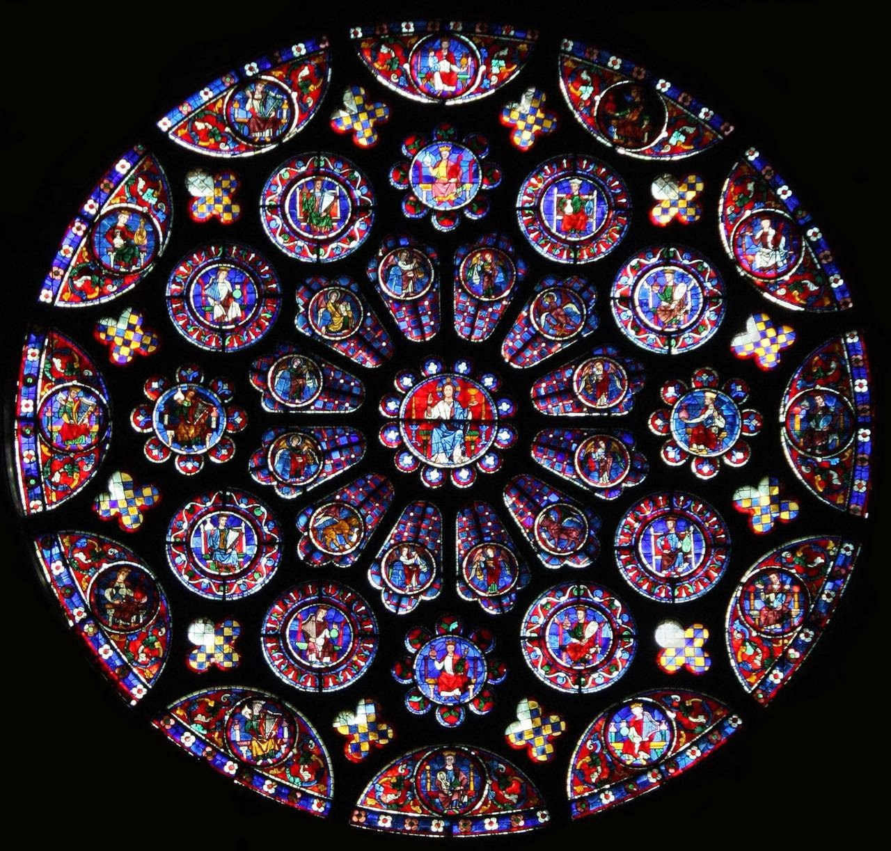 |
| North Rose Window of Chartres Cathedral, France, c. 1235 |
Circles, without a beginning or end, have an association with God and perfection. They’re an integral part of the design of Gothic Cathedrals, such as Chartres Cathedral and Notre-Dame of Paris which are among the most famous. Their patterns radiate out from the center, into rose patterns. I didn’t believe it when, years ago, a student mentioned they were inspired by Indian mandalas. The greater possibility is that spiritual wisdom comes from the same or similar sources.
 |
Sri Chakra Mandala, ceramic tile, made by Ruth Frances Greenberg
17-1/4″ x 17-1/4″ x 1-1/4′ photo Lubosh Cech |
Artist Ruth Frances Greenberg makes ceramic tile mosaic mandalas in her Portland, Oregon studio, and sells them for personal and decorative use. Some are inspired by the Om symbol and by the home blessing doorway mandalas of Tibet. Others are inspired by the Chakras, the energy centers in ancient Indian tradition. The Sri Chakra Mandala has nine interlocking triangles and beautiful geometric complexity. It combines the basic geometric shapes of circle, square and triangle, and expresses powerful energies.
The circle within a square is common in many traditions, but in Indian art the openings of the square represent gateways. Leonardo da Vinci’s Vitruvian Man, a study of perfection in human proportions, has a circle within a square. Medieval mystic, St. Hildegard of Bingen, a Doctor of Church, wrote music and created art in response to her visions. Wheel of Life is one of her many visions that were put into illumination in the mandala form, in the 12th century.
Chicago artist Allison Svoboda makes mandalas from a surprising combination of media: ink and collage. She explains, “The same way a plant grows following the path of least resistance, the quick gestures and simplicity of working with ink allows the law of least resistance to prevail….With this process, I work intuitively through thousands of brushstrokes creating hundreds of small paintings. I then collate the work…When I find compositions that intrigue me, I delve into the longer process of collage. Each viewer has his own experience as a new image emerges from the completed arrangement. The ephemeral quality of the paper and meditative aspect of the brushwork evoke a Buddhist mandala.”
 |
| Allison Svoboda, Mandala, GRAM, 211–detail |
The 14′ by 14′ Mandala GRAM from the Grand Rapids Art Museum is a radial construction with many inner designs. Some of these designs resemble a Rorschach test, but infinitely more complicated.
The intricacies of the GRAM Mandala alternate and change as our eyes move around it. It’s like a kaleidoscope or spinning wheel. But a configuration in center pull us back in, reminding us to stay centered and whole, as the world changes around us.
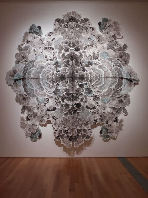 |
| Allison Svoboda, Mandala, GRAM, 2011, Grand Rapids Museum of Art, in on paper, collaged 14′ x 14′ |
Copyright Julie Schauer 2010-2016
by Julie Schauer | Nov 16, 2012 | Collage, Conceptual Art, Contemporary Art, Modern Art, Picasso, Pop Art
Semen Fridliand, Die kaüfliche Presse (The Venal Press) 1929 halftone reproduction,
6 1/4 x 8 1/4 in. (16 x 21 cm) National Gallery of Art Library, David K.E. Bruce Fund
At least four exhibitions on the Mall, at the National Gallery of Art and Hirshhorn Museum, take a look at printed word in painting and other art forms of the past century. Chronologically, these exhibits begin with the avant-garde artists of circa 1910 at the National Gallery of Art’s “Shock of the News” exhibition. They end with today’s leading provocateur-artist, Ai Weiwei of China, at the Smithsonian’s contemporary art museum, the Hirshhorn. So we search for the meaning of the word in art.
 |
| Jean-Léon Gérôme, O Pti Cien, 1902, is an academic style |
|
|
|
|
|
|
In 1902, Jean-Léon Gérôme, a leading academic artist of the day, painted O PTI CIEN, a puppy wearing a monacle. The letters suggest a reading of “au petit chien” (“at the little dog”), which would sound approximately like Oh P T shee-en to the French. But the letters also form the French word for an optician. This work actually was a competition for an advertisement, but Gérôme’s humorous pun set the stage for the Cubists, Surrealists and other artists who brought the painted word into prominence: Picasso and Georges Braque, Dada artists and even Surrealists like Magritte.

The intersection of the news media and visual art is the subject of the National Gallery’s Shock of the News. This cultural force burst onto the scene around the 2nd decade of the 20th century, when an Italian group, the Futurists, published their manifesto in 1909. Pablo Picasso and Georges Braque were soon incorporating collage into Cubism and using words from the newsprint to articulate their artwork. Guitar, Sheet Music and Glass, 1912 has the masthead from “Le Journal,” a Paris daily. The letters Jou appear as reminders of le jour, meaning day, journal, the daily newspaper and jouer, which means to play.
Pablo Picasso, Guitar, Sheet Music, and Glass, 1912 sheet music, newspaper, colored and white paper, charcoal, and hand-painted faux-bois paper on wallpaper 47.9 x 36.5 cm (18 7/8 x 14 3/8 in.)Collection of the McNay Art Museum, Bequest of Marion Koogler McNay ©2012
Estate of Pablo Picasso/Artists Rights Society (ARS), NewYork
That last word is the key, because modern art, if anything, is playful and ironic. If you can’t make the world better, why not laugh about it? The Dadaists, who followed Picasso, were despondent over the established civilization and the horrors of World War I. Particularly in urban centers of Germany and in Paris and New York, they couldn’t fight the world, so ridiculed it. Their art is full of newsprint, ready-made objects and things not expected to part of aesthetics. Hannah Hoch’s collages are particularly playful and interesting
Hannah Höch Von Oben (From Above), 1926-1927 photomontage and collage on paper 30.5 x 22.2 cm
(12 x 8 3/4 in.)Des Moines Art Center’s Louise Noun Collection of Art by Women through Bequest, 2003
Semen Fridliand’s photo halftone image, The Venal Press, above center, is a commentary on the public’s capability to let the press influence their to beliefs in everything. How much greater that power is with the blogs, the facebook and Twitter of today!
Of course, Picasso continued to respect the power of print media in Guernica, of 1937 (not in the exhibition), which is his commentary the first time a bomb was dropped from air, hitting the Basque city of Guernica in Spain. He wanted the monumental, 25-foot painting to have journalistic quality and therefore imitated the lettering of newspapers, while painting only blacks, whites and grays.
 |
On Kawara,Oct. 26, 1971 (Today series no. 97), 1971
cardboard box, newspaper, and liquitex on canvas
painting: 10 1/8 x 13 in., box bottom: 10 1/2 x 13 3/8 x 1 3/4 in. box lid: 10 5/8 x 13 1/4 x 1 3/16 in. Hirshhorn Museum and Sculpture Garden, Smithsonian Institution, Joseph H. Hirshhorn Purchase Fund, 2007. The Panza Collection |
On Kawara painted the date, October 27, 1971, in white on a black canvas. It is one of over 5,000 such images his has done over many years. Each painting goes along with a cardboard box and cover and the packing functions as a time capsule, because the news of that day is place in the box with the painting. After leaving the Shock of the News exhibition, National Gallery visitors move onto the next exhibition, Roy Lichtenstein: A Retrospective.
 |
|
Roy Lichtenstein, Look Mickey, 1961, oil on canvas, 121.9 x 175.3 cm (48 x 69 in.)
National Gallery of Art, Washington, Gift of Roy and Dorothy Lichtenstein in Honor of the 50th Anniversary of the National Gallery of Art © Board of Trustees, National Gallery of Art, Washington
|
First and foremost, we think of Roy Lichtenstein (1923-1997) as the artist who transformed the art of the comic book into a higher form of art. As a Pop artist, he is often eclipsed in reputation by Warhol. This large exhibition brings together works from his entire career, encompassing several themes. Throughout his long career, he used bold colors and ben-day dots. The dots imitative of a printer’s dots for the comics and newsprint remain a consistent signature of his style, but Lichtenstein’s late work parodies earlier art history using few words. His images of the 1960s borrow from cartoons, but he added captions and details to complete the compositions. His captions capture the spirit and humor of certain cultural icons like Mickey Mouse and Donald Duck. Other large cartoon-like images fill rooms on the specific themes of war and romance. He uses boldness, humor and a surprising amount of emotion in a simplified style.
 |
| Barbara Kruger, an installation at the Hirshhorn Museum, Washington, through 2014 |
The bold, sans serif letters of Barbara Kruger overwhelm the ground floor of the Hirshhorn right now. The exhibition, called Belief + Doubt = Sanity, uses words in every way to make us think. Kruger was a graphic artist before she became a fine artist and the heritage of graphic art remains part of her style and her appeal, much like it did for the Pop Artists before her. The stairs and adjoining rooms are dressed in bold letters using only black, yellow, red and white, an overwhelming effect. Her messages are arresting, questioning thought about politics, consumerism and all sorts of aspects of contemporary life. We realize the dichotomy of much in the world in which political banter stems from belief in one truth. The only sane way to evaluate it is with a blend of belief and doubt. Her art functions to ask questions, to question the cultural norms and to make us stop to think. As we ponder one of her bold messages, we recognize ourselves in the lines: “YOU WANT IT, YOU BUY IT, YOU FORGET IT.”
 |
|
Ai Weiwei, Coca-Cola Vase, 2007, paint on Qing Dynasty
ceramic at Hirshhorn Museum until February 24, 2013 |
The Ai Weiwei exhibition, According to What (named after a painting by Jasper Johns currently in a Philadelphia Museum of Art exhibition, Dancing around the Bride), is on the 3rd and 4th floors of the Hirshhorn. Like many contemporary artists, Ai Weiwei doesn’t limit himself to one medium; he does photographs, sculptures installations. He critiques American and Chinese governments, most notably the shoddy building construction which led to the death of 4,000 plus children in an earthquake. Ancient culture and modern life clash, but come together in Coco-Cola vase. He disrespects tradition but forces us to think how consumerism, corporate marketing and globalism meet ancient culture.
The works of Ai Weiwei and Barbara Kruger entertain, but those artists also challenge us and make us think more than Pop Art does. This summer I saw another contemporary, conceptual artist’s work at the Institute of Contemporary Art in of University of Pennsylvania, Philadelphia. Stefan Sagmeister’s The Happy Show, is also the work of a graphic artist, like Kruger. The words printed are in black on a yellow ground, the typeface combination that can be read most easily in the mode of the yellow pages. Yellow is the happiest of colors. Sagmeister made me think of a modern “pursuit of happiness” written into the Declaration of Independence. The exhibition questioned, provoked, entertained, tried to make us laugh and added one more valuable asset, encouraging happiness. If we recognize the paradoxes that Barbara Kruger and Ai Weiwei demonstrate, it’s possible to use the art of the word to promote not just “JOU” (play), but also joy in the world, or joy in the word.
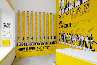 |
| Stefan Sagmeister, The Happy Show, at Institute of Contemporary Art, Philadelphia, April 4 – August 12, 2012 |
Copyright Julie Schauer 2010-2016
 1929 halftone reproduction Des Moines Art Center Louise Noun Collection of Art by Women through Bequest, 2003")


Recent Comments