by Julie Schauer | Feb 13, 2016 | Ceramics, Contemporary Art, Eva Zeisel, Hiroshi Sugimoto, Hirshhorn Museum and Sculpture Garden, Industrial Design, Isamu Noguchi, Karen Karnes, National Museum for Women in the Arts, Ruth Asawa, Surrealism
 |
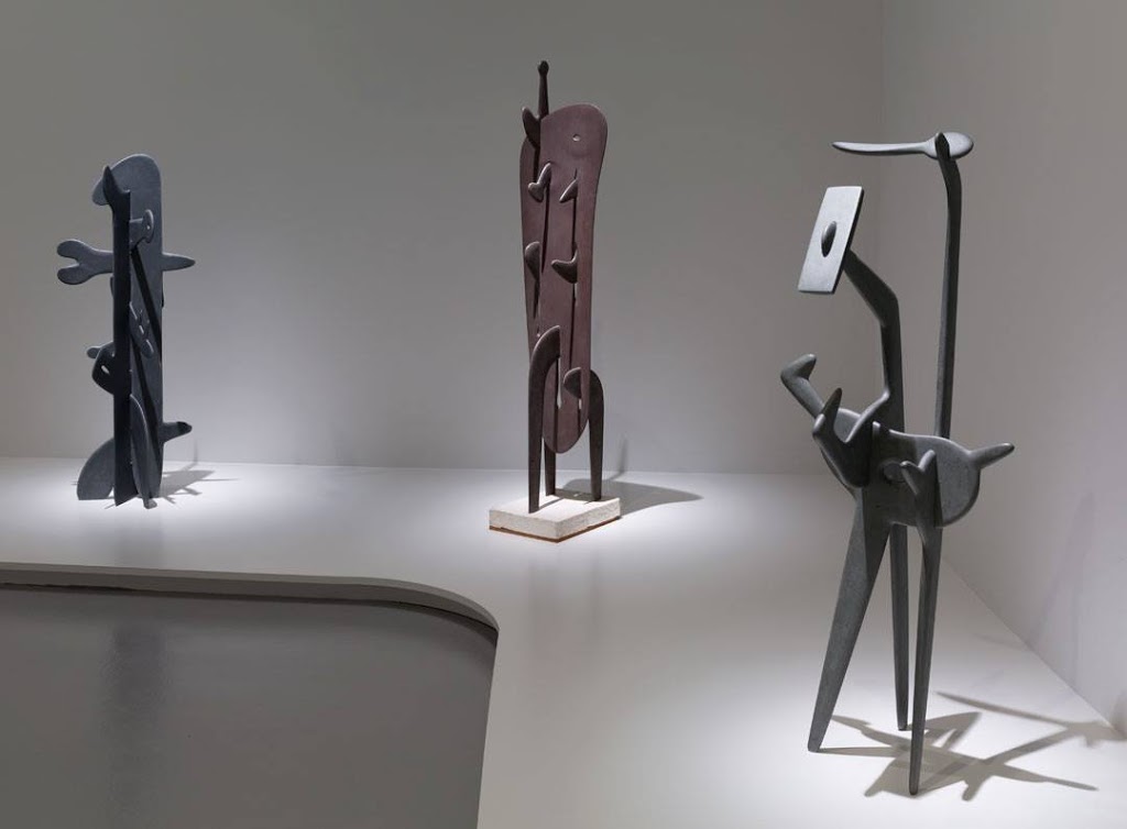
Isamu Noguchi, Trinity, 1945, Gregory, 1948, Strange Bird (To the Sunflower)
Photo taken from the Hirshhorn’s Facebook page |
Biomorphic and anthropomorphic themes run through quite a few exhibitions of modern artists in Washington at the moment. The Hirshhorn’s Marvelous Objects: Surrealist Sculpture from Paris to New York has several of the abstract, biomorphic Surrealists such as Miro and Calder. The wonderful exhibition will come to a close after this weekend.
Isamu Noguchi’s many sculptures that are part of Marvelous Objects deal with an unexpected part of the artist’s life and work. Noguchi was interned in a prison camp in Arizona for Japanese-Americans during World War II. Whatever the horrors of his experience, he dealt with it as an artist does — making art and using creativity to express the experience by transforming it.
 |
| Isamu Noguchi, Lunar Landscape, 1944 |
Lunar landscape comes from immediately after this difficult time period. The artist explained, “The memory of Arizona was like that of the moon… a moonscape of the mind…Not given the actual space of freedom, one makes its equivalent — an illusion within the confines of a room or a box — where imagination may roam, to the further limits of possibility and to the moon and beyond.” It’s like taking tragedy and turning it into magic.
 |
| Strange Bird (To the Sunflower), 1945 Noguchi Museum, NY |
|
|
The most interesting piece from this period is Strange Bird (To the Sunflower), 1945. It is pictured here 2x — on top photo, right side, and from a different angle on the left, from a photo in the Noguchi Museum. Between 1945 and 1948, Noguchi made a series of fantastic hybrid creatures that he called memories of humanity “transfigurative archetypes and magical distillations.” Yet the simplicity and the Zen quality I expect to see in his work is gone from this time of his life.
From the beginning of time, “humans have wanted a unifying vision by which to see the chaos of our world. Artists fulfill this role,” said Japanese artist Hiroshi Sugimoto.
I’m reminded of the ancient Greeks who created satyrs and centaurs to deal with their animal nature. At the Metropolitan Museum of Art, there’s a small Greek sculpture of a man and centaur from about 750 BCE, the Geometric period. The man confronting the centaur seems to be taming him or subduing his own animal nature. Like Noguchi’s sculpture, it has hybrid forms and angularity, but it’s made of bronze. Noguchi’s sculpture is of smooth green slate, which gives it much of its beauty and polish.
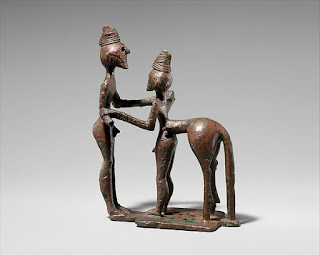 |
| Man and Centaur, bronze, 4-3/4″ mid-8th century BCE Metropolitan Museum |
Noguchi was a landscape architect as well as a sculptor. When designing gardens, he rarely used sculpture other than his own. Yet he bought garden seats by ceramicist Karen Karnes. A pair of these benches by Karnes are now on display at the National Museum for Women in the Arts’ exhibition of design visionaries. Looking closely, one sees how she used flattened, hand-rolled coils of clay to build her chairs. The craftsmanship is superb. It’s easy to see how her aesthetic fit into Noguchi’s refined vision of nature.
 |
| Karen Karnes, Garden seats, ceramic, from the Museum of Arts in Design, now at NMWA |
|
Copyright Julie Schauer 2010-2016
by Julie Schauer | Jul 26, 2013 | Contemporary Art, Eco-Art, Environmental Art, Greater Reston Arts Center, Local Artists and Community Shows, Painting Techniques, Sculpture
 |
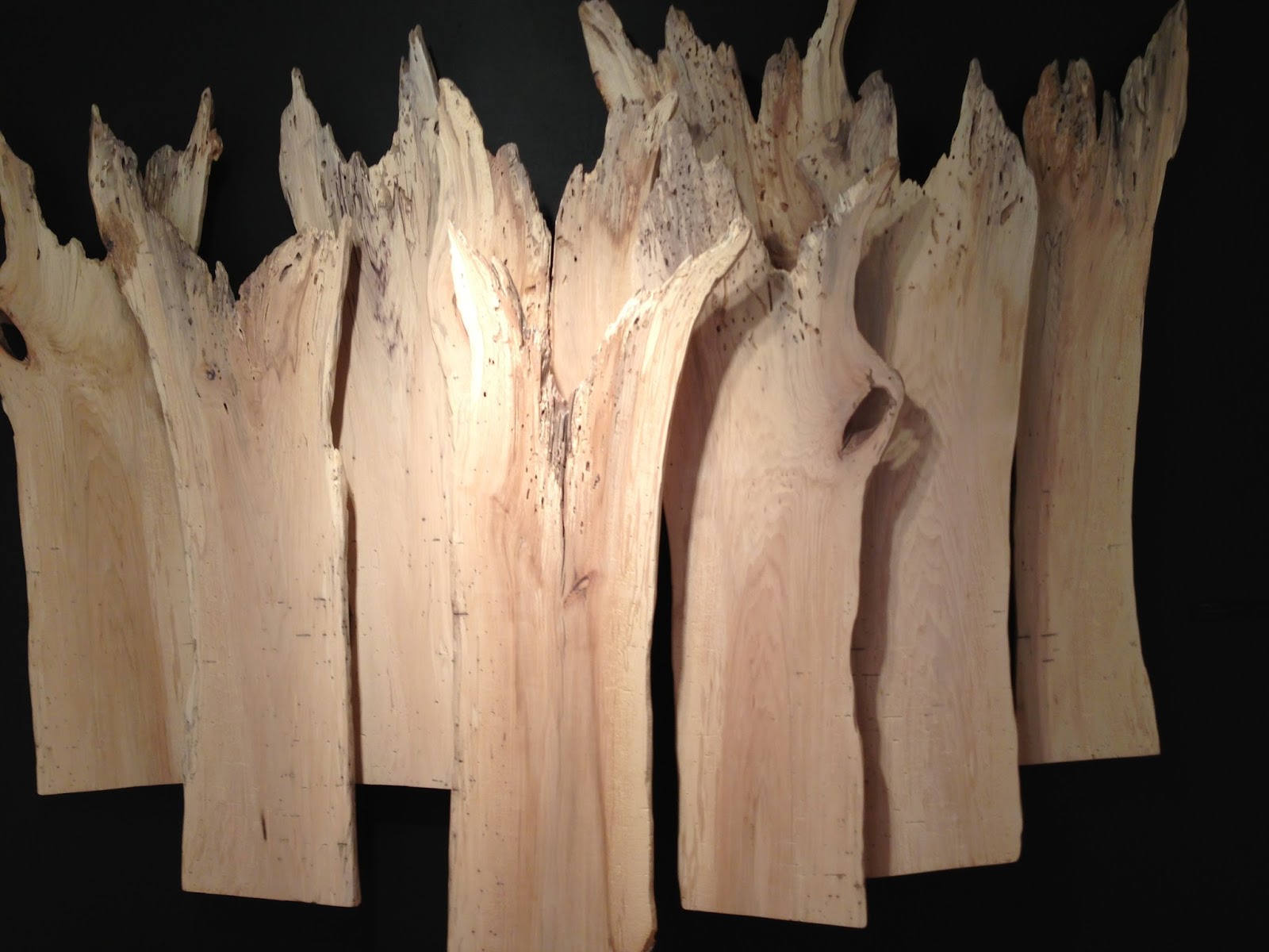
| William Alburger, Forest, 2013, 65″ x 108″ x 9″ rescued spalted birch, in an solo exhibition at GRACE |
Eco-friendly art is meeting the world of high art, if we’re to take a cue from what’s showing at local art centers and galleries. It can be stated that the earliest environmental art started with the artists’ visions and applied those visions to the environment, with little interest in sustainability.
Quite the opposite trend is developing now. Several emerging artists, the “environmental artists” of the 21
st century put nature in the center–not the artist or the idea. Nature is the subject and the artist is nature’s follower. The following artists’ creations are about the land and earth; other artists interested in the environment have been more concerned with a world under
the sea.
 |
William Alburger, Non-traditional Backwards
One-Door, 2012, 27″ x. 13.5″ x 5.25
reclaimed Pennsylvania barn wood, specialty
glass and fabric |
William Alburger lives in rural Pennsylvania, where he picks up scraps of wood from fallen trees and mixes them with discarded barn doors. He is a passionate conservationist with an addiction to collecting what otherwise would be burned, decayed or discarded in landfills. Largely self-taught, Alburger formerly worked as a painting contractor. His art is both pictorial and practical. Some sculptures almost look like two-dimensional works, while others function as shelves or furniture. Hidden doors, cubbyholes and cabinets create surprises, making the natural world his starting point for expression. Intrusions of man-made items are minor. The knots, whirls, colors and textures of wood speak for themselves, revealing rustic beauty.
 |
William Alburger, Synapse, 2013,
65″ x 23″ x 5.25″ rescued spalted
poplar and Pennsylvania barn wood |
Currently the Greater Reston Area Arts Center (GRACE) is hosting a solo exhibition of Alburger’s works. In Synapse, Alburger cut into the interesting grain and patterns of fallen poplar. He framed top and bottom with old barn wood and reconfigured the form to suggest the space where two forms meet and form connection. Allburger finds what is already there in nature, but, through presentation, teaches us how to see it in a new way. Otherwise, we might not notice what nature can evoke and teach us.
 |
Pam Rogers, Tertiary Education, 2012, handmade
soil, mineral and plant pigments, ink, watercolor
and graphite on paper. Courtesy Greater
Reston Area Art Association |
Dedication to the natural world is second nature to Pam Rogers, whose day job is as an illustrator in the Natural History Museum of the Smithsonian Institution. “I’m inclined to see environment as shaping all of us,” Rogers explains, noting the importance of where we come from, and how our natural surroundings mark our stories and connections. While drawing natural specimens, she sees as much beauty in decay is as in birth, growth and development. We’re reminded that everything that comes alive, by nature or made by man, will turn to dust. Rogers’ drawings combine plants, animals and occasional pieces of hardware. Some of the pigments spring from nature, the red soil of North Georgia and plant pigments.
As in Alburger’s Synapse, above, Rogers seeks to form connections between man and the environment. She inserts nails and other links into the drawings from nature for this purpose, as in Stolen Mythology, below. At the moment, Pam Rogers’ art is in the show, {Agri Interior} in the Wyatt Gallery at the Arlington Arts Center. One of her paintings is now in a group exhibition, Strictly Painting, at McLean Project for the Arts.
 |
Pam Rogers, Stolen Mythology, 2009 mixed media
|
Rogers mixes traditional art techniques with abstraction, natural with man-made, sticks and strings, and does both delicate two-dimensional works and vigorous three-dimensional art. Her sculptures and installations explore some of the same themes. At the end of last year, she had an exhibition at GRACE called Cairns. Cairns refer to a Gaelic term to describe a man-made pile of stones that function as markers. Her work, whether two-dimensional or three-dimensional, is also about the markers signifying the connections in her journey.
 |
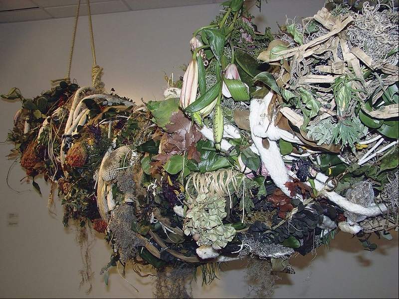
| Pam Rogers, SCAD Installation (detail), plants, wire, metal fabric, 2009 |
“There are landmarks and guides that permeate my continuing journey and my exploration of the relationship between people, plants and place. I continually try to weave the strings of agriculture, myth and magic, healing and hurting.” Several of her paintings have titles referring to myths, including Stolen Mythology, above, and another one called Potomac Myths. Originally from Colorado, Rogers also lived in Massachusetts and studied in Savannah for her Masters in Fine Art. It’s not surprising that, in college, she had a double major in Anthropology and Art History.
 |
Henrique Oliveira, Bololô, Wood, hardware, pigment
Site-specific installation, National Museum of African Art, Smithsonian Institution
Photograph by Franko Khoury, National Museum of African Art |
Artists cite the spiritual and mythic connection we have to environment. As a student, Brazilian artist Henrique Oliveira noted the beauty of wood fences which screened construction sites in São Paolo. Observing these strips being taken down, he collected them and re-used the weathered, deteriorating sheets of woods for some of his most interesting sculpture. Oliveira was asked to do an installation in dialogue with Sandile Zulu for the Museum of African Art in Washington, DC. His project, Bololô, refers to a Brazilian term for life’s twists and tangles, bololô. The weathered strips can act like strokes of the paint brush, with organic and painterly expression, reaching from ceiling to wall and around a pole but usually not touching the ground. Oliveira’s installation is a reflection of the difficulty in staying grounded in life, in this tangle of confusion.
 |
Danielle Riede, Tropical Ring, 2012, temporary installation in the Museum of Merida, Mexico
photo courtesy of artist |
|
|
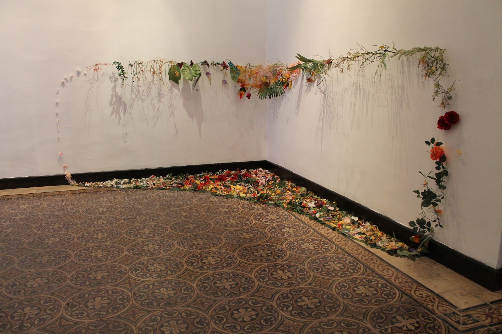
Environmental concerns played a part in the collaboration of Colombian artist Alberto Baraya and Danielle Riede, at the Indianapolis Museum of Contemporary Art, shown in 2011. Expedition Bogotá-Indianapolis was “an examination of the aesthetics of place and its plants” in central Indiana. For two years, the artists collected artificial plants from second-hand stores, yard sales and neighborhoods in around Indianapolis. Last year Riede did an installation for the City Museum of Merida, Mexico, Tropical Ring. It’s made of artificial plants garnered from second-hand crafts in from Indiana and Mexico. The plants were cut and reconfigured to evoke the pattern of an ecosystem, indoors. Currently, the artist is looking for a community partner to participate in Sustainable Growths, an art installation of crafts and other re-used objects destined for abandoned homes in Indianapolis.
 |
Danielle Riede, My Favorite Colors, 2006, photo courtesy
http://www.jardin-eco-culture.com/
|
|
|
|
Originally, Riede’s primary medium was discarded paint, which she gathered from the unused waste of other artists or the pealing pigments of dilapidated structures. My Favorite Colors, right, follows several paths of recycled paint along the wall of the Regional Museum of Contemporary art Serignan, France. Beauty comes from the color, light, pattern, and even from the shadows cast on walls to deliberate effect. The memory landscape is uniquely described in the eco-jardin-culture website. The installation is permanent, although much of what we consider environmental art is temporary.
 |
Sustainable Growths: Painting with Recycled Materials is Riede’s
project to bring meaning to abandoned homes in Indianapolis. Artist’s photo |
Fallen trees, branches and other wastes of nature are tools of drawing to artist R L Croft. Some artists feel they have no choice but to re-use and re-claim discarded goods or fallen debris, as many folk artists and untrained artists have always been doing. The need to draw or create is innate and a constant in one’s identity as an artist, but it’s not easy to get commissions, jobs or sell art. Art materials are very expensive, so there is a practical objective to using environmental objects which do not need to be stored.
 |
| R L Croft, Portal, 2011, Oregon Inlet, North Carolina |
To Croft, using the environment is a means of drawing, but on a very large scale. His outdoor, impromptu drawings-in-the-wild are images grounded in his style of painting and sculpture. Croft has made a number of sculptures called “portals” and/or “fences,” most of which have been carried away by rising tides or decay. He makes these assemblages out of debris found along the beaches, particularly those of the Outer Banks, in North Carolina. Portal at Oregon Inlet, NC, left, was constructed of found lumber, nails, driftwood, plastic, rope, bottles, netting, etc.
Environmentalism is not the primary content of his art. Croft says: “Making art for the purpose of being an environmentalist doesn’t interest me. Making art whose process is environmentally friendly does interest me.” He works in rivers, woods and on beaches. In the aftermath of one natural disaster, Hurricane Irene, he brought meaning to the incident–both personal and anthropological.
.jpg) |
R.L. Croft, Shipwreck Irene, in Rocky Mount, N.C. Built in October, 2012, it’s still there but
less recognizable as a ship form. The location is in Battle Park
off of Falls Road near the Route 64 overpass. Photo courtesy of artist.
|
Croft made Shipwreck Irene in Rocky Mountain, NC, when the Maria V. Howard Art Center held a sculpture competition and allowed him the use of fallen debris after Hurricane Irene, which left as much physical devastation as his sculptures allude to metaphorically. The shipwreck is a very old icon in the history of art, usually associated with 17th century Dutch seascapes. But to Croft, who in childhood found healing in the Outer Banks after the death of his mother, the meaning is deep. The area known as the “Graveyard of the Atlantic” fed his early sense of adventure and aesthetic appreciation for texture, decay and the abrasive effects of wind, sand and water.
Hurricane Irene “is much like the resilient community frequently raked over by severe hurricanes, yet plunging forward. The current art center is world class and it is the replacement for an earlier one destroyed when still new. ” Croft said. Shipwreck Irene is still there, but decay renders it increasingly unrecognizable as a ship form. The temporary aspect is expected. “People of the region know grit and impermanence,” the artist explained. “I’m told that Shipwreck Irene became a habitat for small animals and small birds but that is a happy accident.”
 |
| R L Croft, Sower, 2013, 22 x 14 courtesy artist |
|
Croft has also said: “Nothing can be taken for granted. Constant change proves to be the only reliable point of reference. Equilibrium being as fleeting as life itself, one fuses an array of thought fragments retrieved from memories into a drawing of graphite, metal or wood. By doing so, the artist builds a fragile mental world of metaphor that lends meaning to his largely unnoticed visit among the general population.” Croft did an installation in the Virginia Center for the Creative Arts, a drawing in the wild entitled Sower, in homage to Van Gogh He worked in wattle to make a large drawing that, in a metaphorical, abstracted way, resembles a striding farmer sowing his seed. The farmer is the winged maple seed and it references Vincent’s wonderful ink line drawings.
Nature has been the subject of art by definition and a curiosity about the natural world has defined a majority of artists since the Renaissance. The first wave of Environmental Artists applied their vision to the environment by directly making changes to the environment–permanent (Robert Smithson, James Turrell) or temporary (Christo and Jeanne-Claude) Turrell ,whose most famous work is the Roden Crator in Arizona, is the subject of a major
retrospective now in New York, at the Guggenheim.
It is one thing for art to alter the environment, as the earliest environmental artists did. It is another thing to make art to call attention to the problems of waste and depletion of the earth’s resources. Yet, it’s an even stronger statement when professional artists exclusively make art that re-uses discarded items and turns them into art. Environmental Art today addresses waste reduction and stands up against the problems caused by environmental damage to our rapidly changing world. Designers are getting into this process, as explained in the previous blog. For example, Nani Marquina and Ariadna Miguel design and sell a rug made of discarded bicycle tubes, Bicicleta.
In the future, I hope to blog on how artists address sustainable agriculture. Currently, the main exhibition at Arlington Arts Center, Green Acres: Artists Farming Fields, Greenhouses and Abandoned Lots.
Copyright Julie Schauer 2010-2016
by Julie Schauer | Dec 5, 2012 | Contemporary Art, Exhibition Reviews, Fiber Arts, Folk Art Traditions, National Museum of Women in the Arts, Women Artists
 |
| Photo courtesy of Rachael Matthews from the UK Crafts Council |
“High fiber” usually refers to a type of diet, but High Fiber at the National Museum for Women in the Arts demonstrates how “high art” integrates with the everyday world of a Folk Art. In the multi-media world of contemporary art, Fiber Art has gained recognition as a serious art form over the last fifty years. Like the art of glass making, fiber art was invented milleniums ago for utilitarian purposes. Knitting, sewing and weaving developed to meet basic needs of warmth and clothing, but as soon as pattern and design were involved, the process of making art began.
 |
| Knitted objects are often in Matthews’ work |
When the ancient artists/crafters knitted, knotted, wove or stitched to follow patterns or innate designs in their heads, they tied together movements between the left and right hands, bridging the creative left side of the brain with the analytical right side of the brain.
Contemporary fiber art may or may not have definite recognizable patterns and designs, but fiber art by definition is very tactile and textural. It may also be sculptural.
The National Museum for Women in the Arts’ exhibition of contemporary fiber artists, on view until January 6, 2013, features seven contemporary fiber artists, each working in styles completely different from the next one. High Fiber is the third installment of NMWA biennial Women to Watch exhibition series, in which regional outreach committees of the museum meet with local curators to find artists. The NMWA made a final selection of the seven artists representing different states and countries.
Rachael Matthews was a leader in a revival of knitting movement in the UK about 10 years ago. She is co-owner of a knit shop in London, Prick Your Finger, where one is more likely to see objects crafted of yarn, rather than a sweater. In Knitted Seascape, 2004, Matthews used illusionism much the way painters do; her hanging curtains, lace-like and pleated, open onto the seascape seen through a false window. She created depth similar to that in Raphael’s visionary painting. The vigorous texture into those waves, making their foam as real as in a Winslow Homer seascape, is not painted but knitted. Matthews also did a floor sculpture to which an hourglass and skull and crossbones attach. We are reminded of death in A Meeting Place for a Sacrifice to the Ultimate Plan, 2010. Another piece she supplied in the exhibition is a wedding dress, made as a collaborative effort where the individual pieces knit by different women form the whole. Collaboration and connection is certainly a part of emerging trend in Fiber Art.
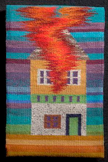
Louise Halsey, from the Arkansas council, is a weaver, who has spent years studying the ancient art of weaving, while teaching and doing workshops. Her work demonstrates vivid color and technical perfection, but also shares the artist’s own narrative ideas. The four works in this show are images of homes. On her website, she explains, “Recently I have been weaving tapestries using the house as a symbol for what I cherish. These images of houses include placing the house amidst what I see as threats that are present in the environment.” Dream Facade, at right, may warn of being too strongly possessed and owned by vanity, while Supersize My House, 2011, questions the dream of bigger and bigger homes.
Louise Halsey, Dream Facade, 2005
wool weft on linen warf – tapestry technique
The house becomes sculpture in large, colorful constructions by Laure Tixier, from France and representing Les amis du NMWA, are based on architecture from around the world. Like children’s forts out of blankets, architecture meets the basic need for shelter with imagination in design. She stitches the forms out of felt and very large Plaid House reflects the classical architecture of Amsterdam. Smaller houses are also on display and they reveal her domestic interpretations of diverse types of architecture, including that of the future. Tixier clearly has an interest in the symbolism and meaning of architecture in history.
Laure Tixier’s Plaid House , 2008, wool felt and thread, 90-1/2″ x 33-1/2″
Collection of Mudam Luxembourg
Debra Folz of Boston combines sophisticated cross-stitch patterns on furniture and mirrors with a sleek modern look. Her works are a contrast to the homespun beauty of some of the works described above, but she was trained in Interior Design. The threads are small and look mechanical but can have depth, control, color harmony and pattern. Mixing thread with a industrial materials may sound discordant, but this harmony of opposites is beauty!
Debra Folz, XStitch Stool, 2009. Steel base,
perforated steel and nylon thread, 20 x 14 x 12 in
Steel is the canvas for embroidery.
 |
| Beili Liu, Toil, 2008, Silk organza,72 x 36 x 8 in |
Homes and their contents give security and comfort, but not all works of art in the exhibition have a domestic meaning. There are sculptural wall hangings and installations in the NMWA’s show. Beili Liu, recommended by the Texas State committee, spun strips of silk, a material traditionally associated with China, her country of origin. For Toil, she burned the edges of silk fabric with incense before winding the strips into the funnel-shaped projections that point off the wall. These forms twist and turn in various directions — like miniature tornadoes — creating paths and shadows on the wall. A variety of beige and brown tones add to the richness of this view. Liu’s larger Lure Series (not on view) installations use thread to recall Chinese folklore, she has that is said her work highlights the tensions between her Eastern origins and Western influences. She bridges these gaps well. In fact, fiber art is all about connecting.
Fiber Art seems to be on the verge of asserting new importance into the world of art. Jennifer Lindsay, one of my former students from the Smithsonian Associates and Corcoran College of Art and Design’s Masters Program in the History of Decorative Arts, coordinated the public outreach, the design and collaborative installation of the Smithsonian Community Reef. The replica of a coral reef in crochet made expressly for the Smithsonian National Museum of Natural History’s 2010-2011
expressly for the Smithsonian National Museum of Natural History’s 2010-2011 Hyperbolic Crochet Coral Reef project, is now on view in the Putman Museum of History and Natural Science in Davenport, Iowa, until 2016.
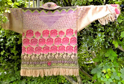 |
| Jennifer Lindsay, Cowgirl Jacket is a memento mori to Frida Kahlo, photo by Judy Licht |
Jennifer also dyes her own wool yarns and uses them to make intricate knitted and crocheted clothing, examples of which are shown here. She calls her cowgirl jacket a memento mori for Frida Kahlo. It uses nearly every knitting stitch available. Note the skeletons which link this design to El Dia de los Muertos. Memento mori is a reminder of death.
 |
| Lindsay’s Russian Star, photo by Judy Licht |
Getting back to the women’s museum, in the permanent collection, there are other works of fiber or those that remind us of fiber. On the 3rd floor of the NMWA, Remedios Varo’s Weaving of Space and Time is on loan along with two other works by Varo. The oil on masonite painting uses a symbolic circle to magically pull together the opposites of male and female figures, representing time and space. Within the circle are threads, not real threads but painted threads in light glazes that weave together ideas. Nearby is also a Judy Chicago painting whose circular painted form in acrylic and airbrush resembles the type of patterning with which traditional fiber artist created.
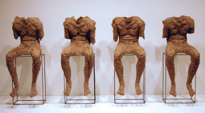
NMWA also has a piece by Magdalena Abakanowicz, one of the best known fiber artists of today. Four Seated Figures are of her recognizable life-size figural types made of fabric. The same, yet different, these abakans are representative the anonymity and uniformity of communist society in Poland, what she has known during the bulk of her life. Born in 1929, to Abakanowicz is accustomed to living in conditions which repressed individual creativity and intellect in favor of the collective interest.
 |
Magdalena Abakanowicz, Four Seated Figures, 1974-2002, burlap, resin, metal pedestal
figure: 115 cm, 55 cm, 63 cm pedestal: 76 cm, 47 cm, 23 cm
coll. The National Museum of Women in the Arts |
Finally, we can be reminded of the diverse women came together for their quilt-making art who in a film of 1995 called How to Make An American Quilt, including Maya Angelou, Anne Bancroft, Ellen Burstyn, Alfre Woodard and Winona Ryder. Quilting is one the most lasting forms of Fiber Art, embedded into so many folk art traditions. In the end, the making of a quilt is compared to life: “As Anna says about making a quilt, you have to choose your combination carefully. The right choices will enhance your quilt. The wrong choices will dull the colors, hide their original beauty. There are no rules you can follow. You have to go by your instinct. And you have to be brave.”
It’s with fibers that women can connect and that the women of history are tied to the women of today.
Copyright Julie Schauer 2010-2016
by Julie Schauer | Nov 16, 2012 | Collage, Conceptual Art, Contemporary Art, Modern Art, Picasso, Pop Art
Semen Fridliand, Die kaüfliche Presse (The Venal Press) 1929 halftone reproduction,
6 1/4 x 8 1/4 in. (16 x 21 cm) National Gallery of Art Library, David K.E. Bruce Fund
At least four exhibitions on the Mall, at the National Gallery of Art and Hirshhorn Museum, take a look at printed word in painting and other art forms of the past century. Chronologically, these exhibits begin with the avant-garde artists of circa 1910 at the National Gallery of Art’s “Shock of the News” exhibition. They end with today’s leading provocateur-artist, Ai Weiwei of China, at the Smithsonian’s contemporary art museum, the Hirshhorn. So we search for the meaning of the word in art.
 |
| Jean-Léon Gérôme, O Pti Cien, 1902, is an academic style |
|
|
|
|
|
|
In 1902, Jean-Léon Gérôme, a leading academic artist of the day, painted O PTI CIEN, a puppy wearing a monacle. The letters suggest a reading of “au petit chien” (“at the little dog”), which would sound approximately like Oh P T shee-en to the French. But the letters also form the French word for an optician. This work actually was a competition for an advertisement, but Gérôme’s humorous pun set the stage for the Cubists, Surrealists and other artists who brought the painted word into prominence: Picasso and Georges Braque, Dada artists and even Surrealists like Magritte.

The intersection of the news media and visual art is the subject of the National Gallery’s Shock of the News. This cultural force burst onto the scene around the 2nd decade of the 20th century, when an Italian group, the Futurists, published their manifesto in 1909. Pablo Picasso and Georges Braque were soon incorporating collage into Cubism and using words from the newsprint to articulate their artwork. Guitar, Sheet Music and Glass, 1912 has the masthead from “Le Journal,” a Paris daily. The letters Jou appear as reminders of le jour, meaning day, journal, the daily newspaper and jouer, which means to play.
Pablo Picasso, Guitar, Sheet Music, and Glass, 1912 sheet music, newspaper, colored and white paper, charcoal, and hand-painted faux-bois paper on wallpaper 47.9 x 36.5 cm (18 7/8 x 14 3/8 in.)Collection of the McNay Art Museum, Bequest of Marion Koogler McNay ©2012
Estate of Pablo Picasso/Artists Rights Society (ARS), NewYork
That last word is the key, because modern art, if anything, is playful and ironic. If you can’t make the world better, why not laugh about it? The Dadaists, who followed Picasso, were despondent over the established civilization and the horrors of World War I. Particularly in urban centers of Germany and in Paris and New York, they couldn’t fight the world, so ridiculed it. Their art is full of newsprint, ready-made objects and things not expected to part of aesthetics. Hannah Hoch’s collages are particularly playful and interesting
Hannah Höch Von Oben (From Above), 1926-1927 photomontage and collage on paper 30.5 x 22.2 cm
(12 x 8 3/4 in.)Des Moines Art Center’s Louise Noun Collection of Art by Women through Bequest, 2003
Semen Fridliand’s photo halftone image, The Venal Press, above center, is a commentary on the public’s capability to let the press influence their to beliefs in everything. How much greater that power is with the blogs, the facebook and Twitter of today!
Of course, Picasso continued to respect the power of print media in Guernica, of 1937 (not in the exhibition), which is his commentary the first time a bomb was dropped from air, hitting the Basque city of Guernica in Spain. He wanted the monumental, 25-foot painting to have journalistic quality and therefore imitated the lettering of newspapers, while painting only blacks, whites and grays.
 |
On Kawara,Oct. 26, 1971 (Today series no. 97), 1971
cardboard box, newspaper, and liquitex on canvas
painting: 10 1/8 x 13 in., box bottom: 10 1/2 x 13 3/8 x 1 3/4 in. box lid: 10 5/8 x 13 1/4 x 1 3/16 in. Hirshhorn Museum and Sculpture Garden, Smithsonian Institution, Joseph H. Hirshhorn Purchase Fund, 2007. The Panza Collection |
On Kawara painted the date, October 27, 1971, in white on a black canvas. It is one of over 5,000 such images his has done over many years. Each painting goes along with a cardboard box and cover and the packing functions as a time capsule, because the news of that day is place in the box with the painting. After leaving the Shock of the News exhibition, National Gallery visitors move onto the next exhibition, Roy Lichtenstein: A Retrospective.
 |
|
Roy Lichtenstein, Look Mickey, 1961, oil on canvas, 121.9 x 175.3 cm (48 x 69 in.)
National Gallery of Art, Washington, Gift of Roy and Dorothy Lichtenstein in Honor of the 50th Anniversary of the National Gallery of Art © Board of Trustees, National Gallery of Art, Washington
|
First and foremost, we think of Roy Lichtenstein (1923-1997) as the artist who transformed the art of the comic book into a higher form of art. As a Pop artist, he is often eclipsed in reputation by Warhol. This large exhibition brings together works from his entire career, encompassing several themes. Throughout his long career, he used bold colors and ben-day dots. The dots imitative of a printer’s dots for the comics and newsprint remain a consistent signature of his style, but Lichtenstein’s late work parodies earlier art history using few words. His images of the 1960s borrow from cartoons, but he added captions and details to complete the compositions. His captions capture the spirit and humor of certain cultural icons like Mickey Mouse and Donald Duck. Other large cartoon-like images fill rooms on the specific themes of war and romance. He uses boldness, humor and a surprising amount of emotion in a simplified style.
 |
| Barbara Kruger, an installation at the Hirshhorn Museum, Washington, through 2014 |
The bold, sans serif letters of Barbara Kruger overwhelm the ground floor of the Hirshhorn right now. The exhibition, called Belief + Doubt = Sanity, uses words in every way to make us think. Kruger was a graphic artist before she became a fine artist and the heritage of graphic art remains part of her style and her appeal, much like it did for the Pop Artists before her. The stairs and adjoining rooms are dressed in bold letters using only black, yellow, red and white, an overwhelming effect. Her messages are arresting, questioning thought about politics, consumerism and all sorts of aspects of contemporary life. We realize the dichotomy of much in the world in which political banter stems from belief in one truth. The only sane way to evaluate it is with a blend of belief and doubt. Her art functions to ask questions, to question the cultural norms and to make us stop to think. As we ponder one of her bold messages, we recognize ourselves in the lines: “YOU WANT IT, YOU BUY IT, YOU FORGET IT.”
 |
|
Ai Weiwei, Coca-Cola Vase, 2007, paint on Qing Dynasty
ceramic at Hirshhorn Museum until February 24, 2013 |
The Ai Weiwei exhibition, According to What (named after a painting by Jasper Johns currently in a Philadelphia Museum of Art exhibition, Dancing around the Bride), is on the 3rd and 4th floors of the Hirshhorn. Like many contemporary artists, Ai Weiwei doesn’t limit himself to one medium; he does photographs, sculptures installations. He critiques American and Chinese governments, most notably the shoddy building construction which led to the death of 4,000 plus children in an earthquake. Ancient culture and modern life clash, but come together in Coco-Cola vase. He disrespects tradition but forces us to think how consumerism, corporate marketing and globalism meet ancient culture.
The works of Ai Weiwei and Barbara Kruger entertain, but those artists also challenge us and make us think more than Pop Art does. This summer I saw another contemporary, conceptual artist’s work at the Institute of Contemporary Art in of University of Pennsylvania, Philadelphia. Stefan Sagmeister’s The Happy Show, is also the work of a graphic artist, like Kruger. The words printed are in black on a yellow ground, the typeface combination that can be read most easily in the mode of the yellow pages. Yellow is the happiest of colors. Sagmeister made me think of a modern “pursuit of happiness” written into the Declaration of Independence. The exhibition questioned, provoked, entertained, tried to make us laugh and added one more valuable asset, encouraging happiness. If we recognize the paradoxes that Barbara Kruger and Ai Weiwei demonstrate, it’s possible to use the art of the word to promote not just “JOU” (play), but also joy in the world, or joy in the word.
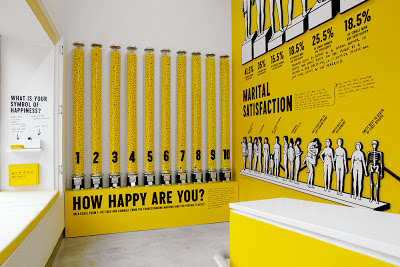 |
| Stefan Sagmeister, The Happy Show, at Institute of Contemporary Art, Philadelphia, April 4 – August 12, 2012 |
Copyright Julie Schauer 2010-2016
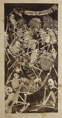
by Julie Schauer | Oct 31, 2012 | Contemporary Art, Mexican Art, Nicolas de Jesus, Printmaking
 |
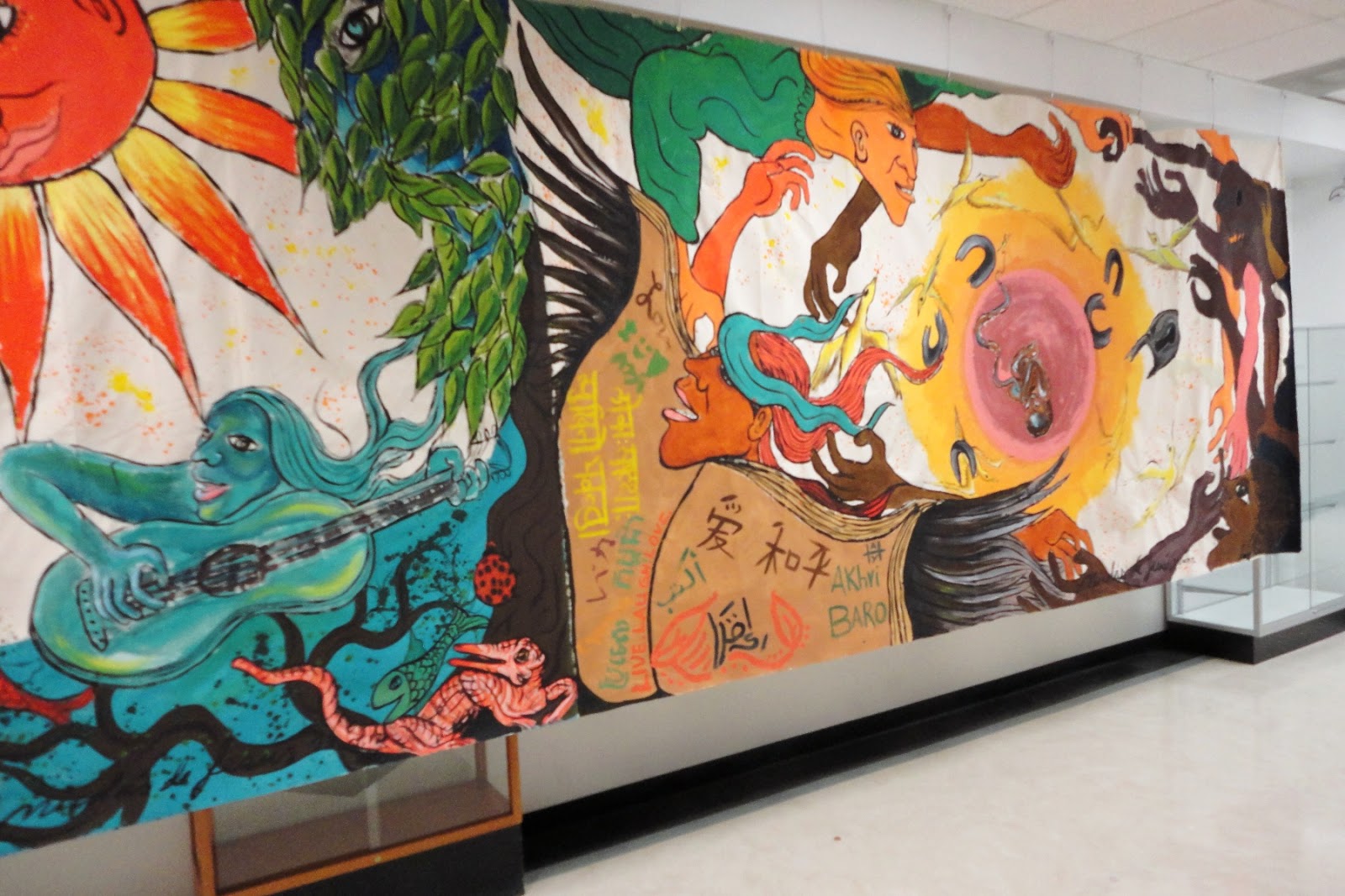
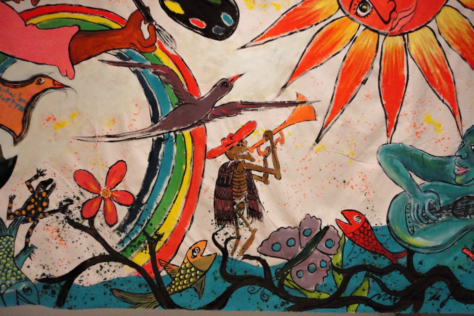
| Nicolás de Jésus and students, October 2012, NVCC, Annandale, VA, right side |
The day of the Dead ( Día de los Muertos) is a starting point for Mexican artist Nicolás de Jésus, who visited and demonstrated his work in my Art Appreciation Class on October 17th. Since today is Halloween, it’s a good time to explore how Nicolás de Jésus uses this theme. A mural he completed with students has been hung on the second floor of the CM Building.Is it a coincidence or not to discover this past weekend that someone near and dear to me turned out to be in an art exhibition on the El Dia de los Muertos theme?
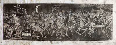 |
| Nicolás de Jésus, Fiesta de los Muertos, etching and aquatint |
Nicolás de Jésus mesmerized the class as he explained his prints, impressive for their beauty, meaning and the textures. The skeletons of his prints are very animated and life-like. His art dips into memories of his childhood in the Amayaltepec region, where he learned to make art at a very young age and his father was among the most notable folk artists. At first his art seems immersed in imagery of Día de los Muertos, but closer examination reveals that the holiday becomes a means to an end. His meanings go much deeper, because the subjects of the vernacular, folkloric tradition apply as well to other themes.
 |
| Dia de la Muerta, etching, aquatint
|
The celebration of the Day of the Dead recalls our own Halloween, but it is celebrated on November 1 (for deceased infants and children) and November 2 (for elders) in Mexico. Typically families go the cemeteries where deceased members of their families are buried. In some parts of the country they dance in the graveyards. They build altars to the deceased and present offerings of food, like sugared skulls, and decorations such as trinkets or flowers, preferably orange marigolds. They bring toys to the children, essentially blurring the boundaries between life and death. The celebration combines aspects of an ancient Aztec celebration with the Catholic feast days. The lines between the living and the dead become blurred, as I had recently witnessed in an exhibition at the National Mexican Fine Arts Museum in Chicago, where there were installations with food offerings to the dead, Hanan Pixal. Art is life and the art of this theme is for both the living and the deceased.
But in the art of Nicolás de Jésus, the skeletons can be powerful metaphors for the living. The skeletons dance and celebrate, taking on the qualities of living people. They act out the human comedy, or, at times they partake in the human tragedy and satirize human behavior. His meanings can be critical and provocative. He is concerned with the lives of Mexicans on both sides of the border.
 |
| Left side detail with skeleton in NVCC/Annandale’s new mural |
 |
|
Maicidio refers to the death of corn, a gift
from Mexico, through modification
|
|
|
|
Nicolás de Jésus prints his works from amate bark, native to his Guerrero region of Mexico, which is west of the Yucatan peninsula. Though he did not demonstrate in our class how to do his technique, it is a combination of etching and aquatints. In etching, the artist sketches the lines of an image into a waxy substance over the metal plate. For broad areas of shading, aquatint is used. Aquatint is a printmaking process that uses rosin, a natural lubricant produced by from tree sap, melted on a zinc plate to give a grainy quality to the tones. A acid bath ‘bites’ the images into the metal plate in both etching and aquatint, before the scene can be inked and printed in reverse of the drawn image. De Jesús uses the aquatint process frequently to create the grainy, textural backgrounds of many works.
One print that really strikes me is Maicidio, suggesting death to corn, one of Mexico’s great gifts to the world. The United States has now changed the nature of corn, overproducing it and turning it into cattle feed or high fructose corn syrup, things it was never meant to be. Its by-products become additives in almost all processed food. With American corn now is 85% genetically modified, it’s no wonder the skeletons attack and pull it apart. Let us remember this fact next Tuesday, when Californians go to the polls and vote on Proposition 37 which will require labeling for genetically-modified food (GMOs). As our industrialized US agricultural system is dominating and killing corn, people in the US become increasingly disconnected to land.
 |
| En El Tran recalls when the artist lived in Chicago. |
|
Nicolás de Jésus lived in Chicago from 1989-1994, and he has at least 60 works of art in the Mexican Fine Arts Museum in the Pilsen neighborhood of Chicago. En el Tran brings his familiar skeletons into the elevated train of Chicago’s mass transit system, while skyscrapers are seen out the window behind. He implies a deeper truth behind the scene, the fate that awaits all of us in the end. Although not mentioned, Mexico has a tradition of Surrealism and de Jésus also seems to be connected to Surrealists.
In many ways his prints follow in the tradition of socially and politically active artists from Mexico in first half of the twentieth century: Diego Rivera, Jose Clemente Orozco and David Alfaro Siqueiros. A full-blooded Nahua Indian from a small village in the state of Guerrero, Mexico, he is an advocate for the rights of indigenous peoples. Themes of struggle meet the themes of celebration in his work. Though he is critical of much in society, he is above all a humanist who recognizes our foibles but understands our humanity.
Copyright Julie Schauer 2010-2016
by Julie Schauer | Nov 2, 2011 | Contemporary Art, Encaustic, Exhibition Reviews, Local Artists and Community Shows, Painting Techniques
 Georgia Nassikas’s triptych, Stone Wall, is in the very old technique of encaustic..
McLean Project for the Arts is currently exhibiting three contemporary artists whose techniques involve layering. I was initially attracted there to look at Georgia Nassikas’ paintings made in an encaustic technique. In this medium, paint pigment mixes with beeswax to create a very thick and rugged texture, as seen in Stone Wall, above. Paint must be kept hot during application and it sets quickly. The technique was introduced in Egypt during the Roman Empire, in portraits of the deceased encased in mummies. Nassikas uses the wax from the hives of bees she keeps, as it is necessary to cover the large areas of the multi-layered canvases she paints. Many diverse, uneven shades of color show through the wax in both abstract and landscape paintings.
Carolyn Case has small intimate paintings of oil which also feature layering of a different kind. Her exhibition is called Accidently, On Purpose, suggesting the the works are spontaneous. However, portions of her paintings seem to be cut out or stenciled with different patterns. Even if we cannot figure out how she gets her multi-layered effect with different colors and patterns appearing in front and behind each other, we can get lost in the intricacies and details of her paintings.


Carolyn Case’s intimate paintings are 12″ x 12″
They are Part Potion, left, and Blue vs Blue, right, featuring multiple layers
Finally, Seth Rosenberg’s paintings do not have the layers and textures of paint that Carolyn Case and Georgia Nassikas give to their oils and encaustics. However, his paintings from the “Cleveland Years: 2005-2009” give the illusion of overlapping of abstract and realistic forms.
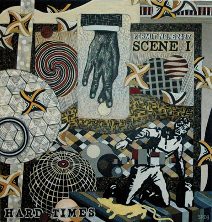
 Hard Times represents the muted colors from Seth Rosenberg’s Cleveland years, a change from the colorful style of his Washington years.
He mastered making compositions which combine several different patterns in single paintings which resemble collages. Colors are minimal, almost monochromatic. This artist lived in Washington, DC, for twenty years, but spent five years in Cleveland until his sudden death in 2009. The Rosenberg exhibition originated at the Cleveland Museum of Contemporary Art. Kudos to a small community art center, McLean Project for the Arts, for bringing in such a good traveling exhibition.
Copyright Julie Schauer 2010-2016


.jpg)


 1929 halftone reproduction Des Moines Art Center Louise Noun Collection of Art by Women through Bequest, 2003")


Recent Comments