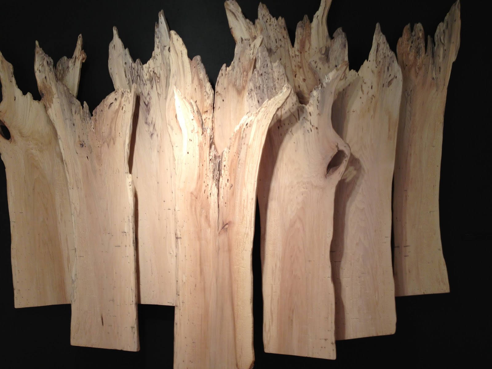
William Alburger, Forest, 2013, 65″ x 108″ x 9″ rescued spalted birch, in an solo exhibition at GRACE
Eco-friendly art is meeting the world of high art, if we’re to take a cue from what’s showing at local art centers and galleries. It can be stated that the earliest environmental art started with the artists’ visions and applied those visions to the environment, with little interest in sustainability.
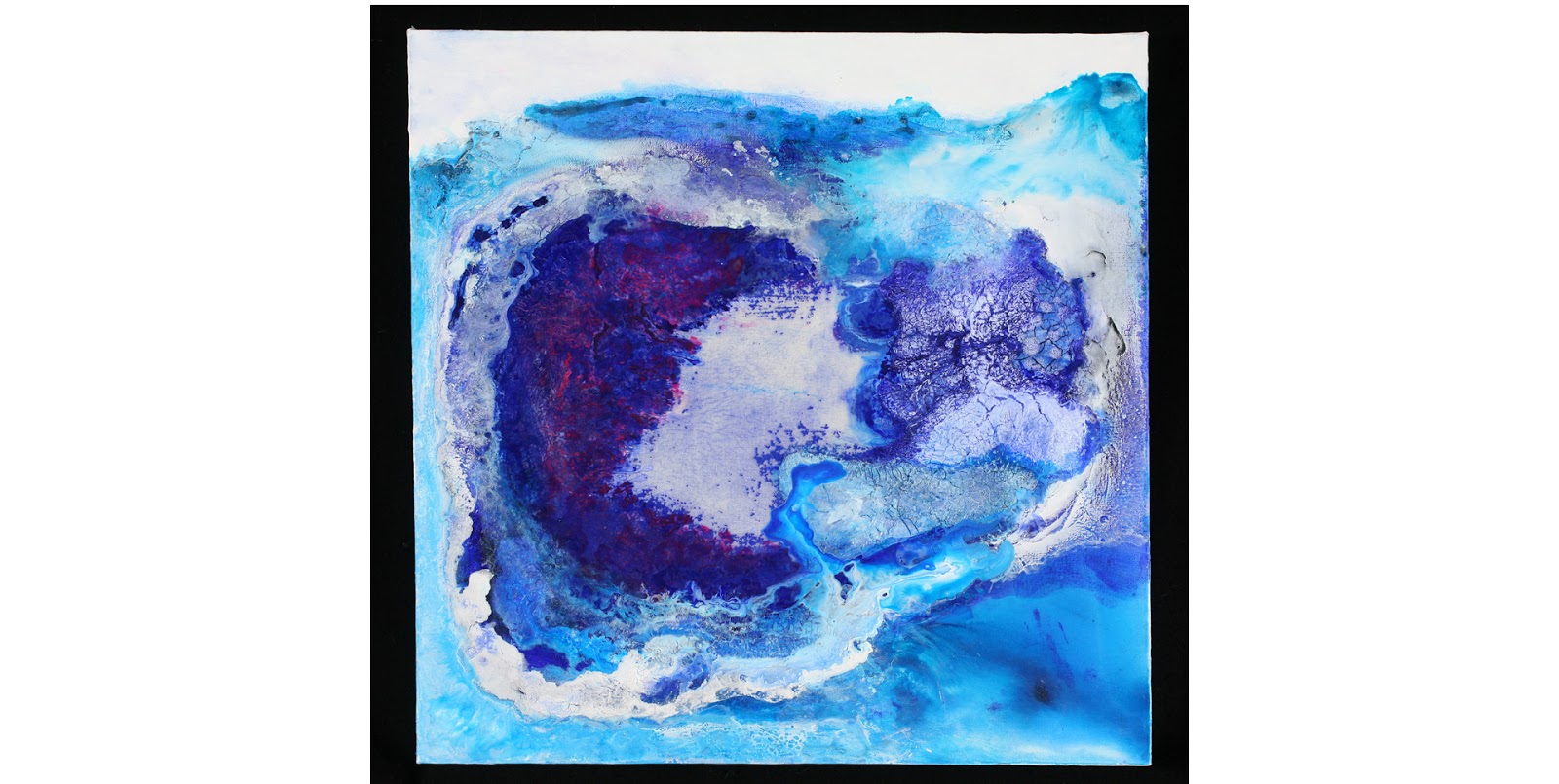
Quite the opposite trend is developing now. Several emerging artists, the “environmental artists” of the 21st century put nature in the center–not the artist or the idea. Nature is the subject and the artist is nature’s follower. The following artists’ creations are about the land and earth; other artists interested in the environment have been more concerned with a world under the sea.
William Alburger, Non-traditional Backwards One-Door, 2012, 27″ x. 13.5″ x 5.25 reclaimed Pennsylvania barn wood, specialty glass and fabric
William Alburger lives in rural Pennsylvania, where he picks up scraps of wood from fallen trees and mixes them with discarded barn doors. He is a passionate conservationist with an addiction to collecting what otherwise would be burned, decayed or discarded in landfills. Largely self-taught, Alburger formerly worked as a painting contractor. His art is both pictorial and practical. Some sculptures almost look like two-dimensional works, while others function as shelves or furniture. Hidden doors, cubbyholes and cabinets create surprises, making the natural world his starting point for expression. Intrusions of man-made items are minor. The knots, whirls, colors and textures of wood speak for themselves, revealing rustic beauty.
William Alburger, Synapse, 2013, 65″ x 23″ x 5.25″ rescued spalted poplar and Pennsylvania barn wood
Currently the Greater Reston Area Arts Center (GRACE) is hosting a solo exhibition of Alburger’s works. In Synapse, Alburger cut into the interesting grain and patterns of fallen poplar. He framed top and bottom with old barn wood and reconfigured the form to suggest the space where two forms meet and form connection. Allburger finds what is already there in nature, but, through presentation, teaches us how to see it in a new way. Otherwise, we might not notice what nature can evoke and teach us.
Pam Rogers, Tertiary Education, 2012, handmade soil, mineral and plant pigments, ink, watercolor and graphite on paper. Courtesy Greater Reston Area Art Association
Dedication to the natural world is second nature to Pam Rogers, whose day job is as an illustrator in the Natural History Museum of the Smithsonian Institution.“I’m inclined to see environment as shaping all of us,” Rogers explains, noting the importance of where we come from, and how our natural surroundings mark our stories and connections.While drawing natural specimens, she sees as much beauty in decay is as in birth, growth and development.We’re reminded that everything that comes alive, by nature or made by man, will turn to dust.Rogers’ drawings combine plants, animals and occasional pieces of hardware. Some of the pigments spring from nature, the red soil of North Georgia and plant pigments.
As in Alburger’s Synapse, above, Rogers seeks to form connections between man and the environment. She inserts nails and other links into the drawings from nature for this purpose, as in Stolen Mythology, below. At the moment, Pam Rogers’ art is in the show, {Agri Interior} in the Wyatt Gallery at the Arlington Arts Center. One of her paintings is now in a group exhibition, Strictly Painting, at McLean Project for the Arts.
Pam Rogers, Stolen Mythology, 2009 mixed media
Rogers mixes traditional art techniques with abstraction, natural with man-made, sticks and strings, and does both delicate two-dimensional works and vigorous three-dimensional art. Her sculptures and installations explore some of the same themes. At the end of last year, she had an exhibition at GRACE called Cairns. Cairns refer to a Gaelic term to describe a man-made pile of stones that function as markers. Her work, whether two-dimensional or three-dimensional, is also about the markers signifying the connections in her journey.
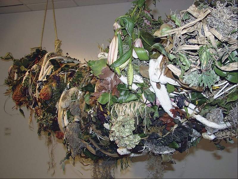
Pam Rogers, SCAD Installation (detail), plants, wire, metal fabric, 2009
“There are landmarks and guides that permeate my continuing journey and my exploration of the relationship between people, plants and place. I continually try to weave the strings of agriculture, myth and magic, healing and hurting.” Several of her paintings have titles referring to myths, including Stolen Mythology, above, and another one called Potomac Myths. Originally from Colorado, Rogers also lived in Massachusetts and studied in Savannah for her Masters in Fine Art. It’s not surprising that, in college, she had a double major in Anthropology and Art History.
Henrique Oliveira, Bololô, Wood, hardware, pigment Site-specific installation, National Museum of African Art, Smithsonian Institution Photograph by Franko Khoury, National Museum of African Art
Artists cite the spiritual and mythic connection we have to environment. As a student, Brazilian artist Henrique Oliveira noted the beauty of wood fences which screened construction sites in São Paolo.Observing these strips being taken down, he collected them and re-used the weathered, deteriorating sheets of woods for some of his most interesting sculpture.Oliveira was asked to do an installation in dialogue with Sandile Zulu for the Museum of African Art in Washington, DC. His project, Bololô, refers to a Brazilian term for life’s twists and tangles, bololô. The weathered strips can act like strokes of the paint brush, with organic and painterly expression, reaching from ceiling to wall and around a pole but usually not touching the ground. Oliveira’s installation is a reflection of the difficulty in staying grounded in life, in this tangle of confusion.
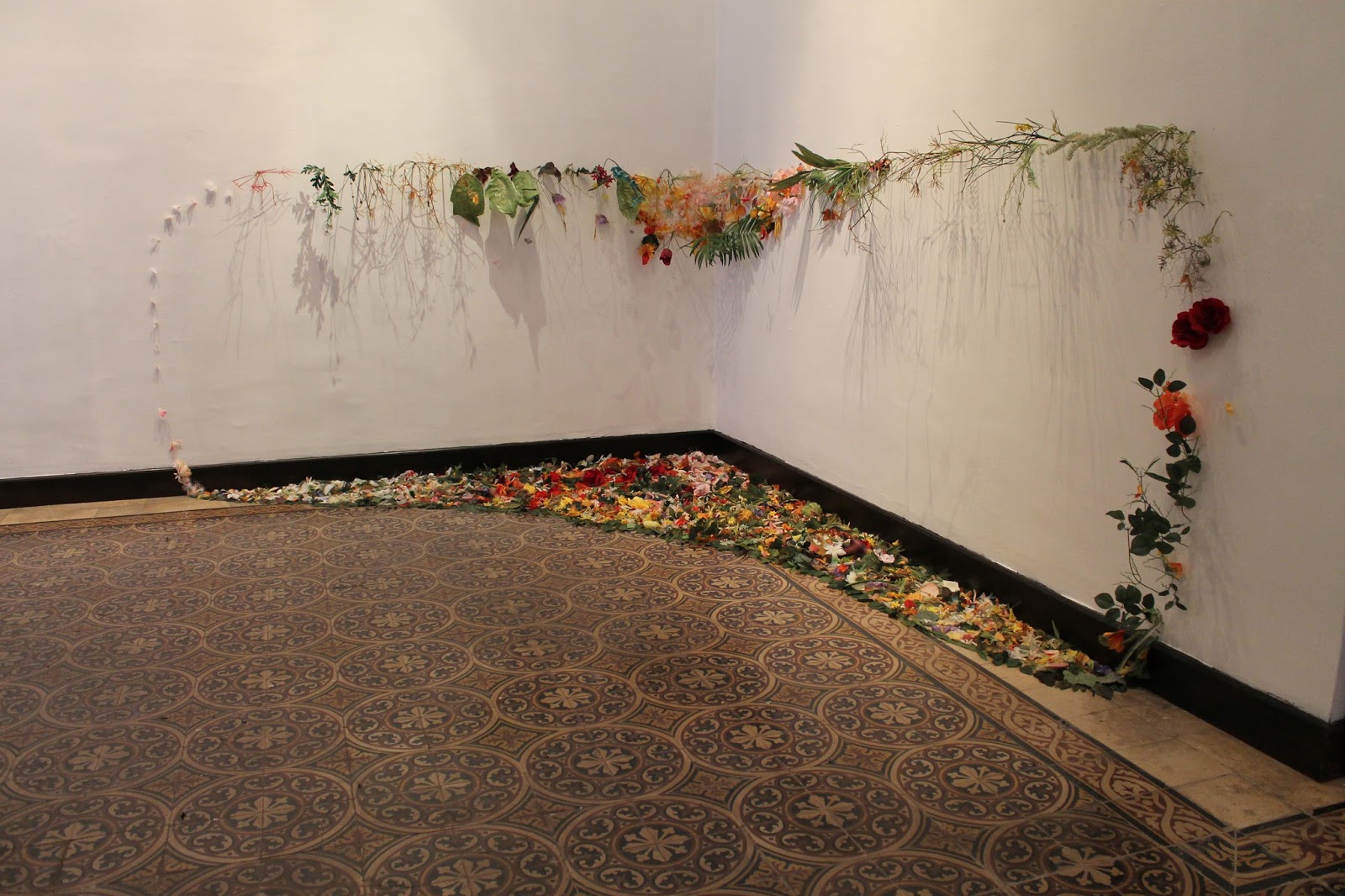
Danielle Riede, Tropical Ring, 2012, temporary installation in the Museum of Merida, Mexico photo courtesy of artist
Environmental concerns played a part in the collaboration of Colombian artist Alberto Baraya and Danielle Riede, at the Indianapolis Museum of Contemporary Art, shown in 2011. Expedition Bogotá-Indianapolis was “an examination of the aesthetics of place and its plants” in central Indiana. For two years, the artists collected artificial plants from second-hand stores, yard sales and neighborhoods in around Indianapolis. Last year Riede did an installation for the City Museum of Merida, Mexico, Tropical Ring. It’s made of artificial plants garnered from second-hand crafts in from Indiana and Mexico. The plants were cut and reconfigured to evoke the pattern of an ecosystem, indoors. Currently, the artist is looking for a community partner to participate in Sustainable Growths, an art installation of crafts and other re-used objects destined for abandoned homes in Indianapolis.
Danielle Riede, My Favorite Colors, 2006, photo courtesy http://www.jardin-eco-culture.com/
Originally, Riede’s primary medium was discarded paint, which she gathered from the unused waste of other artists or the pealing pigments of dilapidated structures. My Favorite Colors, right, follows several paths of recycled paint along the wall of the Regional Museum of Contemporary art Serignan, France. Beauty comes from the color, light, pattern, and even from the shadows cast on walls to deliberate effect. The memory landscape is uniquely described in the eco-jardin-culture website. The installation is permanent, although much of what we consider environmental art is temporary.
Sustainable Growths: Painting with Recycled Materials is Riede’s project to bring meaning to abandoned homes in Indianapolis. Artist’s photo
Fallen trees, branches and other wastes of nature are tools of drawing to artist R L Croft. Some artists feel they have no choice but to re-use and re-claim discarded goods or fallen debris, as many folk artists and untrained artists have always been doing. The need to draw or create is innate and a constant in one’s identity as an artist, but it’s not easy to get commissions, jobs or sell art. Art materials are very expensive, so there is a practical objective to using environmental objects which do not need to be stored.
R L Croft, Portal, 2011, Oregon Inlet, North Carolina
To Croft, using the environment is a means of drawing, but on a very large scale. His outdoor, impromptu drawings-in-the-wild are images grounded in his style of painting and sculpture. Croft has made a number of sculptures called “portals” and/or “fences,” most of which have been carried away by rising tides or decay. He makes these assemblages out of debris found along the beaches, particularly those of the Outer Banks, in North Carolina.Portal at Oregon Inlet, NC, left, was constructed of found lumber, nails, driftwood, plastic, rope, bottles, netting, etc.
Environmentalism is not the primary content of his art. Croft says: “Making art for the purpose of being an environmentalist doesn’t interest me. Making art whose process is environmentally friendly does interest me.” He works in rivers, woods and on beaches. In the aftermath of one natural disaster, Hurricane Irene, he brought meaning to the incident–both personal and anthropological.
R.L. Croft, Shipwreck Irene, in Rocky Mount, N.C. Built in October, 2012, it’s still there but less recognizable as a ship form. The location is in Battle Park
off of Falls Road near the Route 64 overpass. Photo courtesy of artist.
Croft made Shipwreck Irene in Rocky Mountain, NC, when the Maria V. Howard Art Center held a sculpture competition and allowed him the use of fallen debris after Hurricane Irene, which left as much physical devastation as his sculptures allude to metaphorically. The shipwreck is a very old icon in the history of art, usually associated with 17th century Dutch seascapes. But to Croft, who in childhood found healing in the Outer Banks after the death of his mother, the meaning is deep. The area known as the “Graveyard of the Atlantic” fed his early sense of adventure and aesthetic appreciation for texture, decay and the abrasive effects of wind, sand and water. Hurricane Irene “is much like the resilient community frequently raked over by severe hurricanes, yet plunging forward. The current art center is world class and it is the replacement for an earlier one destroyed when still new. ” Croft said. Shipwreck Irene is still there, but decay renders it increasingly unrecognizable as a ship form. The temporary aspect is expected. “People of the region know grit and impermanence,” the artist explained. “I’m told that Shipwreck Irene became a habitat for small animals and small birds but that is a happy accident.”
R L Croft, Sower, 2013, 22 x 14 courtesy artist
Croft has also said: “Nothing can be taken for granted. Constant change proves to be the only reliable point of reference. Equilibrium being as fleeting as life itself, one fuses an array of thought fragments retrieved from memories into a drawing of graphite, metal or wood. By doing so, the artist builds a fragile mental world of metaphor that lends meaning to his largely unnoticed visit among the general population.” Croft did an installation in the Virginia Center for the Creative Arts, a drawing in the wild entitled Sower, in homage to Van Gogh He worked in wattle to make a large drawing that, in a metaphorical, abstracted way, resembles a striding farmer sowing his seed. The farmer is the winged maple seed and it references Vincent’s wonderful ink line drawings.
Nature has been the subject of art by definition and a curiosity about the natural world has defined a majority of artists since the Renaissance. The first wave of Environmental Artists applied their vision to the environment by directly making changes to the environment–permanent (Robert Smithson, James Turrell) or temporary (Christo and Jeanne-Claude) Turrell ,whose most famous work is the Roden Crator in Arizona, is the subject of a major retrospective now in New York, at the Guggenheim.
It is one thing for art to alter the environment, as the earliest environmental artists did. It is another thing to make art to call attention to the problems of waste and depletion of the earth’s resources. Yet, it’s an even stronger statement when professional artists exclusively make art that re-uses discarded items and turns them into art. Environmental Art today addresses waste reduction and stands up against the problems caused by environmental damage to our rapidly changing world. Designers are getting into this process, as explained in the previous blog. For example, Nani Marquina and Ariadna Miguel design and sell a rug made of discarded bicycle tubes, Bicicleta. In the future, I hope to blog on how artists address sustainable agriculture. Currently, the main exhibition at Arlington Arts Center, Green Acres: Artists Farming Fields, Greenhouses and Abandoned Lots.
Diego Velázquez, Las Hilanderas (The Spinners), oil on canvas, H: 220 cm (86.6 in) x W: 289 cm (113.8 in)
The Prado, Madrid
The study of myth, like the study of art, may seem obscure but it can illuminate some truths about humanity. Around the world, the beauty of weaving has some association with magic. So we look to Diego Velázquez’s Las Hilanderas (also called The Spinners, The Tapestry Weavers or The Fable of Arachne) which focuses on the weaving contest between Pallas Minerva and Arachne described in Ovid’s Metamorphoses. The foreground scene is about a competition that includes spinning and carding, preparations that come before the weaving of tapestries. The outcome of the story is implied, not shown. Velázquez used a complex composition of diagonals to weave a tale, a fable that lovers of Charlotte’s Web should appreciate.
Velázquez often put humor into his mythological scenes, and The Spinners is no different when we see its conclusion in the back. It’s related in theme to Las Meninas (The Maids of Honor), considered by a majority of art experts to be the greatest secular painting of all time. The painterly effects of hair and material that dazzle us in Las Meninas go even further in The Spinners, whichhas a similarly complicated meaning. Its format is horizontal rather than vertical, but it also features a foreground and background for two tiers of storytelling connected by an opening of light and stairs. As Las Meninas is a group portrait disguised as everyday life in Velázquez El Escorial Palace studio, Las Hilanderas is a narrative posed as a genre scene in the dress styles of 17th century Spain. It’s dated one year after Las Meninas, 1657.
Detail of Pallas Athena (Minerva) and a “spinning” wheel
Ovid’s Myth
According to Ovid, Arachne was a girl born to humble parents in Lydia (an area of Turkey famous for beautiful weavings). She was known for her remarkable skill, but did not see her art as a gift from the goddess of weaving. Arachne believed she was better than Pallas Minerva (Pallas Athena–also the goddess of wisdom) in the art of weaving. She said, “Let her compete with me, and if she wins I’ll pay whatever penalty.” So Pallas Athena disguised herself as an old crone, saying “Old age is not to be despised for with it wisdom comes…..seek all the fame you wish as best of mortal weavers, but admit the goddess as your superior in skill.”
Arachne refused. She said, “Why won’t (the goddess) come to challenge me herself?” Then the old lady revealed herself as Athena, casting off old age. Arachne was not scared and immediately took up the challenge of the competition. In the foreground of Velázquez’s canvas, Athena (in a headscarf) and Arachne set up their spinning and carding operations in preparation for the weaving competition. At least three assistants are helping with the task. There are balls and balls of wool and thread and even a cat, but no looms in sight.
Just as Shakespeare inserted plays within his plays to elucidate the story, Velázquez was fond of putting secondary scenes in his paintings. Another episode takes place in the background. There are the same number of people in front as in back, five. It would be reasonable to believe that the young women in the back are the same assistants who help in the foreground, but have changed their clothing into fancy dresses. Athena is back again, but wears her goddess of war helmut. Only the lowly-born Arachne, furthest from the viewer, is modestly dressed.
From the girl “Fate” in shadow, we peer into a scene where Athena is about to strike Arachne.
Arachne’s belly is the center of the painting, hinting of the spider’s belly she will become.
The Outcome of the Contest between Athena (Minerva) and Arachne
According to Ovid’s tale, when the goddess and the girl had completed their tasks, Athena revealed her tapestry with its central subject of Athena winning her competition with Poseidon to be the patron of Athens. She wove an olive vine from her sacred tree into the tapestry’s border. Secondary scenes showed the power of gods and goddesses as they triumphed over humans. The subject of Arachne’s tapestry was stories of trickeries by gods and goddesses, at the expense of mortals. Her central subject is the rape of Europa by Zeus in the form of a bull. This scene is recognized in the back of this painting as a replica of Titian’s famous painting of that subject in the Spanish royal collection. (The Titian painting is in the Isabella Stewart Gardner Museum, Boston.)
“Bitterly resenting her rival’s success, the goddess warrior ripped it, with its convincing evidence of celestial misconduct, all asunder; and with her shuttle of Cytorian boxwood, struck at Arachne’s face repeatedly.” In the painting, Athena holds her shuttle in the foreground, not the background, but Velázquez cleverly placed it in Athena’s left hand where it points to the next image of Athena — in her armor. Velázquez highlighted the goddess’s anger against a light blue background and emphasized the force of Athena’s striking arm. Arachne’s head is nearly the center of the painting, but the viewer realizes she will exist no longer. “She could not bear this, the ill-omened girl, and bravely fixed a noose around her throat: while she was hanging, Pallas, stirred to mercy, lifted her up and said:
“Though you will hang, you must indeed live on, you wicked child; so that your future will be no less fearful than your present is, may the same punishment remain in place for you and yours forever!” Then, as the goddess turned to go, she sprinkled Arachne with the juice of Hecate’s herb, and at the touch of that grim preparation, she lost her hair, then lost her nose and ears; her head got smaller and her body, too; her slender fingers were now legs that dangled close to her sides; now she was very small, but what remained of her turned into belly, from which she now continually spins a thread, and as a spider, carries on the art of weaving as she used to do.”
The Origin of Spiders
Note that the belly of Arachne which will be the spider’s core is at the exact center of the painting.
The Spinners, right side, detail of Arachne
With the fable explaining the origin of spiders, it makes sense that the preparatory activity in the foreground is all about the thread (and the spinning of fate), because there is so much winding to that thread. I interpret the young helpers to Arachne and Pallas Athena as the three Fates. The Fates can be described as Moira, in singular name, or Moirai. Their specific names are Clotho meaning “Spinner,” Lachesis, who measures the thread, and Atropos who is inflexible and cuts it off. The three Fates are goddesses and daughters of Zeus who are sometimes considered more important than Zeus in their ability to seal destiny. They come in various disguises, and wouldn’t be surprising if these young women seen as helpers are the ones who ultimately are in charge. In myth and life, there is always the question of how much free will or fate determines outcomes.
Velázquez uses highlights and shadows strategically. Arachne stands out because she is highlighted to a much greater degree than Minerva is, yet we see nothing of her face. How ironic that he, Velázquez who proudly showed his face in Las Meninas, his allegory of painting, does not allow Arachne to show hers. Her back is to us, as she labors deftly and diligently. Both Athena and Arachne are barefoot. The goddess, who is older though not an old lady, even shows some leg!
One of the women in the background is looking back to the foreground, a complexity that pulls the composition together. Perhaps she had been the only one of three Fates who supported Arachne and was pulling strings for her. The woman or Fate dressed in blue shows her back to the viewer, but she appears again immediately below in the foreground, though separated by stairs. Here Velázquez has deliberately darkened her face in shadow, in deeper shadow than is necessary for the composition. As in other Velázquez paintings, shadowed figures can signify that a character in the painting is an actor, an actor who is playing a role in an act of deception. Though she aids Arachne in the guise of a common peasant girl, her concern with thread could actually be in the process of spinning a different fate.
Peter Paul Rubens, Pallas and Arachne, oil, 1634, at Virginia Museum of Fine Arts, Richmond
Velazquez was familiar with the fable of Arachne from a Peter Paul Rubens painting of Pallas and Arachne which was owned by the Spanish royal family. The Rubens composition is more violent, with Pallas Athena striking Arachne to the ground. A copy of this painting was in the background of Las Meninas, Velázquez’s most famous painting of 1656, a composition that raises the status of art and the artist. Velázquez must have thought of the art of weaving as a noble pursuit, similar to the art of painting. Both require exceptional talent and skill. Weaving and spinning have additional, magical connotations in mythology, such as the woven clothing of goddesses, the weavings of Odysseus’ wife and the thread which let Theseus out of the labyrinth. Velázquez was a great artist, but, like the prodigy Arachne, he was not of noble birth.
Las Meninas — which contains a portrait of the artist in the act of painting — is about the role of the artist, the origins of creativity and the attainment of status. The Spinners further explores these subjects and elucidates some of the same ideas. Our talents are divine gifts and, as mortals, there are limitations on us. No matter what the artist’s genius is, there are warnings against boasting. In the end, we are left with a reminder of the punishment that comes from carrying pride too far.
The paintings compare artistry and skill, and the status of the artist, to the non-negotiable status of higher beings, i.e., the Spanish Royal family, and an Olympian goddess. There is a crucial difference, however. Arachne, an upstart weaver, was just a girl when she challenged the goddesses of wisdom and weaving and the Fates. Velázquez, on the other hand, was 56 when he painted Las Meninas, and his self-portrait looks outward asserting the importance due to him. Remember how Athena in the guise of an old lady had warned Arachne that with old age comes wisdom.
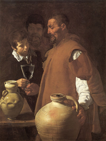
Velázquez, The Water Seller of Seville, c. 1620
Apsley House, London
Compared with one of his earliest paintings
Velázquez had also been an extraordinary prodigy, only about 20 when he painted The Water Seller of Seville. There, an elderly man is passing a glass of water to an adolescent boy while a young adult man stands behind. It was nearly 40 years later that he finally gained knighthood status, the Order of Santiago. A red cross, painted on his chest three years after completing Las Meninas, indicates that title he attained shortly before death in 1660. However, from Velázquez’s other paintings, we know he treated royals and peasants with equal respect and dignity. The old man in The Water Seller of Seville wears a torn cloak indicating his humble means compared to the young boy he serves. So it is not Arachne’s lowly birth, but her youthful pride which denied the wisdom of age that Velázquez sees as her ultimate downfall. The attainment of greatness is possible if one waits, for only with age comes wisdom.
Velázquez’s stylistic change over the years from tight and controlled to very painterly is typical. He painted two allegories of deception, one mythological, when he was around 30 and in Rome, a turning point in his career. (You can some of the changes of his style from early to middle and late in a blog about him.)
Copyright Julie Schauer 2010-2016 A few years ago, The Prado reframed “The Spinners.”
The Hyperbolic Coral Reef project has spread around the globe
Nature is mysterious and some of the magical colors and patterns of the coral reef are a wonder of nature’s artistry. Surprisingly, vegetables such as kale, frissée and other lettuces mimic the free-flowing, wild patterns found in the coral reef. These products of nature form hyperbolic planes, not explained by Euclidean Geometry.
Crochet, a fiber art that traditionally has utilitarian purpose, holds the power to make this mystery visible to our eyes. With this in mind, various hyperbolic coral reef projects have sprung up around the globe, bringing together crochet artists to call attention to the fact that this natural wonder — something akin to the oceans’ natural forest — is vastly disappearing as a result of pollution, human waste and climate change.
Photo of satellite reef, Föhr, Germany, courtesy Uta Lenk
The Hyperbolic Coral Reef Project is the brainstorm of Margaret and Christine Wertheim, who founded the Institute for Figuring in Los Angeles to highlight this phenomenon. They based their idea on the discovery of a mathematician at Cornell University, Daina Taimina. Taimina used crochet to unlock a mathematical means to explain the parallel nature of crochet lines in 1997, while the Wertheims further developed a repetoire of reef-life forms: loopy “kelps”, fringed “anemones”, crenelated “sea slugs”, and curlicued “corals.” A simple pattern or algorithm, which has a pure shape can be changed slightly to produce variations and permutations of color and form. The Crochet Reef project began in 2005 and the experiment has involved communities of Reefers, which, like the reef itself, have become worldwide. The Wertheim sisters come from Australia, where the Great Barrier Reef is located, while Taimina is originally from Latvia.
Photo of Actual Coral Reef, from www.thenowpass.com
These handmade, collaborative works of fiber art have brought together art, science and math to a worldwide community — for the purpose of the sharing a wonder of nature that could be lost. The replica of a coral reef for the Smithsonian Community Reef was a satellite of the Hyperbolic Crochet Coral Reef Project installed at the Smithsonian National Museum of Natural History in 2010-2011. This project has moved and is on view in the Putnam Museum of History and Natural Science in Davenport, Iowa, where it will remain for 5 years. A former student, Jennifer Lindsay supervised the installation and the public outreach at the Smithsonian and the Putman and is currently coordinating the Artisphere Yarn Bomb in Arlington, Va.
Postcard from the coral reef project in Föhr, Germany
This past summer, there was an installation at the Museum Kunst der Westkuste on island of Föhr, in Germany. Over 700 artists from the island, and the mainland of Germany and Denmark came together and contributed to the largest of over 20 worldwide projects around the world. At this moment, there is a satellite of the Hyperbolic Crochet Coral Reef Project at Roanoke College in Salem, Va. It will remain there at the Olin Gallery until March 1, 2013, reminding students at this Liberal Arts College of the fragility of the coral reef.
Artist Elise Richman — who lives on the Puget Sound and teaches at the University of the Puget Sound in Tacoma, Wa — also reminds us that changes are afloat at sea. Richman has different processes of painting, each of which reflect environmental systems and states of flux. In the water-based paintings, she applies inks, acrylics and a liquified powder pigment that has been mixed with powder gum arabic. She pours pools of these paints onto thick sheets of watercolor paper, allowing them to expand, evaporate, be absorbed or intermingle, while using minimum control.
Elise Richman, Each Form Overflows its Present, mixed media on canvas, 2013, photo by Richard Nicol
The poured paint dries into forms that evoke the contours of islands, water bodies, and/or fluid dynamics. Richman then takes these contours as boundaries that she can transgress in subsequent layers. “I assert my will by deepening the color, adjusting the quality of particular edges and unifying the compositions while maintaining the dynamic sense of flux that the materials activate,” she explains.
More recently, she has used this technique on large-scale canvases. Her newest water-based paintings, such as Each Form Overflows its Present, I, represent an active state of flux as well as topographical formations. They comment, through implication, on the threat of accelerated changes humans have induced on the environment.
Elise Richman, Isle I, oil, 12 x 12, 2008 photo by Richard Nicol
Richman also has a body of three-dimensional oil paintings made of organic dots which seem to grown from the canvases. As one moves around the small, intricately-detailed paintings, the topographies and colors change in visually dynamic ways, maintaining their aesthetic beauty. These forms represent non-hierarchical environments. “They evoke tide-pools of miniature islands; intimate marine scapes act as
Elise Richman, detail of Pool I, 2010, photo by Richard Nicol
meditations on the processes of painting, an embodiment of time’s passage, and models of the material world’s interconnectedness,” Richman explained. Each mark, point or dot has its own integrity, yet each is subsumed into a larger whole that has an ethical as well as aesthetic dimension. In short, imbalances of power create exploitations of the natural world and groups of people. Yet this largeness of nature can be maintained in works of art that are personal and meditative. Richman’s website includes works in the encaustic and acrylic paint media. The encaustics have multiple layers, from which she scrapes to represent geological formations.
This pastel is believed to be Bianca Sforza, age 13. A fingerprint matches that of Leonardo, and the left-handed hatching is also a signature of his style
Since 1993, Martin Schongauer’s 10″ x 13″ drawing of Peonies has been in the Getty Museum, Los Angeles..
A painting of peonies came up for auction in 1990 under the vague label of Northern Italian. However, a museum curator at the Albertina in Vienna recognized it as an important drawing from about 1472-73 by Martin Schongauer, an artist who lived in Alsace on the French-German border. The drawing, now in the Getty Museum, is a study for the flowers in Madonna of the Rosary, 1473, painted by Schongauer for a church in Colmar (now in France). Albrecht Durer traveled to Colmar to visit Schongauer in 1491, but the great Alsatian master had died by the time 21-year old Durer arrived. Martin’s brothers met with him and gave him some of the master’s drawings. This drawing may have been one of the drawings owned by Durer; the same Viennese curator recognized a flower similar to one of the peonies in a Durer painting of 1501.
In 2007, a pastel drawing came up on the auction market and it was labeled as 19th century German. An astute Canadian collector who bought it had other ideas and sought expert opinion. Most experts now attribute this drawing to Leonardo da Vinci, and it is called La Bella Principessa. The sitter may be the 13-year old daughter of the Duke of Milan, Bianca Sforza. Interestingly, a fingerprint on the paper matches a fingerprint in Leonardo’s unfinished painting of St. Jerome. The technique is ink with black, white and red chalk on yellow vellum to give the flesh tones. Leonardo is said to have learned the pastel technique from a French artist.
A badly damaged painting supposedly by a student of Leonardo sold for 45 British pounds in 1958. Only in the past year has it been cleaned and recognized as an authentic Leonardo da Vinci. Called the Salvator Mundi, it was recently part of an exhibition at the National Gallery in London. In the frontal image, Jesus holds a glass globe and stares directly at the viewer while using the blessed gesture. His calm face is full of compassion and kindness. The penetrating sense of life in this image is clearly palpable, as revealed after its cleaning. It has Leonardo’s recognizable sfumato, the smoky quality which gives a dark softness to the shadows. It has the iconic and mysterious qualities reminiscent of as the Mona Lisa. Cleaning revealed this Salvator Mundi to be an authentic
Leonardo da Vinci dating to c. 1500
Martin Kemp, Leonardo expert in England, has identified the rock crystal orb to show the crystalline cosmos in Jesus’s hand as something only Leonardo could have painted with accuracy. Leonardo was quite the geologist and Kemp compared the painted example to crystal orbs in the geology collection of the Ashmolean Museum. Therefore, the painting could not have been done by a follower. The last time a painting was discovered to be by Leonardo was 100 years ago.
Only the master Leonardo, who intimately studied nature,
could have portrayed this rock crystal so accurately
Even more remarkable is the fact that a lost painting by Leonardo’s young rival, Michelangelo appeared in 2009. This Temptation of St. Anthony is now in the Kimbell Art Museum of Fort Worth. Michelangelo painted this oil and tempera when he was only about 13 years old. The first writer of art history in 1570, Giorgio Vasari described a painting that copied an engraving by Martin Schongauer.
The fact that the two greatest artistic prodigies born in Europe during the 1470s, Albrecht Durer and the divine Michelangelo, admired Martin Schongauer, speaks to that master’s incredible reputation as an artist in the 15th century. He died young, but his contribution to later art cannot be overlooked. Although Schongauer’s travels probably took him only to the center of Europe: Alsace, Burgundy, Flanders and the Rhineland, his prints gave him a reputation throughout Italy, France, Spain and even England. Italians called him Bel Martino. Perhaps he was born around 1448, a few years before another great observer of nature, Leonardo da Vinci. His drawings inspired the great drawings of nature by Durer, namely The Rabbit and Large Piece of Turf.
Michelangelo’s newly discovered Temptation of St. Anthony, c. 1487, copies an engraving by Martin Schongauer
Georgia Nassikas’s triptych, Stone Wall, is in the very old technique of encaustic..
McLean Project for the Arts is currently exhibiting three contemporary artists whose techniques involve layering. I was initially attracted there to look at Georgia Nassikas’ paintings made in an encaustic technique. In this medium, paint pigment mixes with beeswax to create a very thick and rugged texture, as seen in Stone Wall, above. Paint must be kept hot during application and it sets quickly. The technique was introduced in Egypt during the Roman Empire, in portraits of the deceased encased in mummies. Nassikas uses the wax from the hives of bees she keeps, as it is necessary to cover the large areas of the multi-layered canvases she paints. Many diverse, uneven shades of color show through the wax in both abstract and landscape paintings.
Carolyn Case has small intimate paintings of oil which also feature layering of a different kind. Her exhibition is called Accidently, On Purpose, suggesting the the works are spontaneous. However, portions of her paintings seem to be cut out or stenciled with different patterns. Even if we cannot figure out how she gets her multi-layered effect with different colors and patterns appearing in front and behind each other, we can get lost in the intricacies and details of her paintings.
Carolyn Case’s intimate paintings are 12″ x 12″ They are Part Potion, left, and Blue vs Blue, right, featuring multiple layers
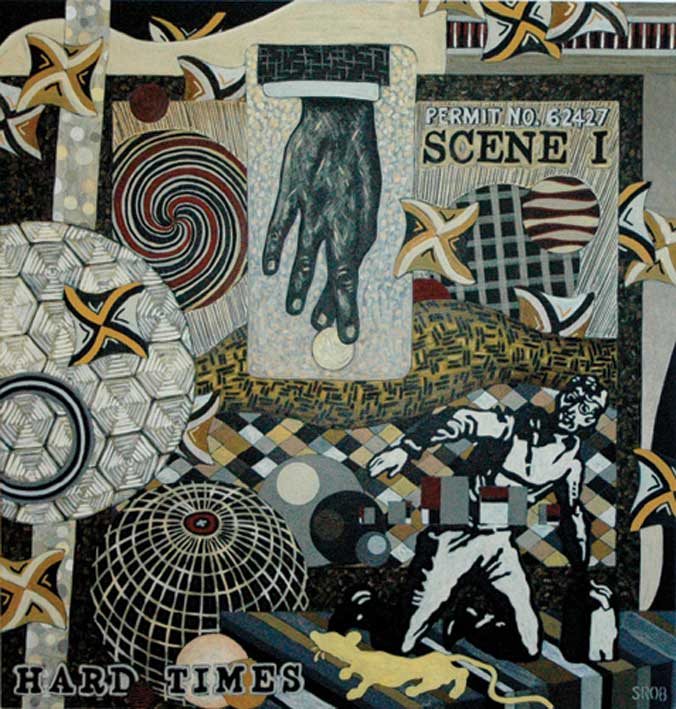
Finally, Seth Rosenberg’s paintings do not have the layers and textures of paint that Carolyn Case and Georgia Nassikas give to their oils and encaustics. However, his paintings from the “Cleveland Years: 2005-2009” give the illusion of overlapping of abstract and realistic forms.
Hard Times represents the muted colors from Seth Rosenberg’s Cleveland years, a change from the colorful style of his Washington years.
He mastered making compositions which combine several different patterns in single paintings which resemble collages. Colors are minimal, almost monochromatic. This artist lived in Washington, DC, for twenty years, but spent five years in Cleveland until his sudden death in 2009. The Rosenberg exhibition originated at the Cleveland Museum of Contemporary Art. Kudos to a small community art center, McLean Project for the Arts, for bringing in such a good traveling exhibition.
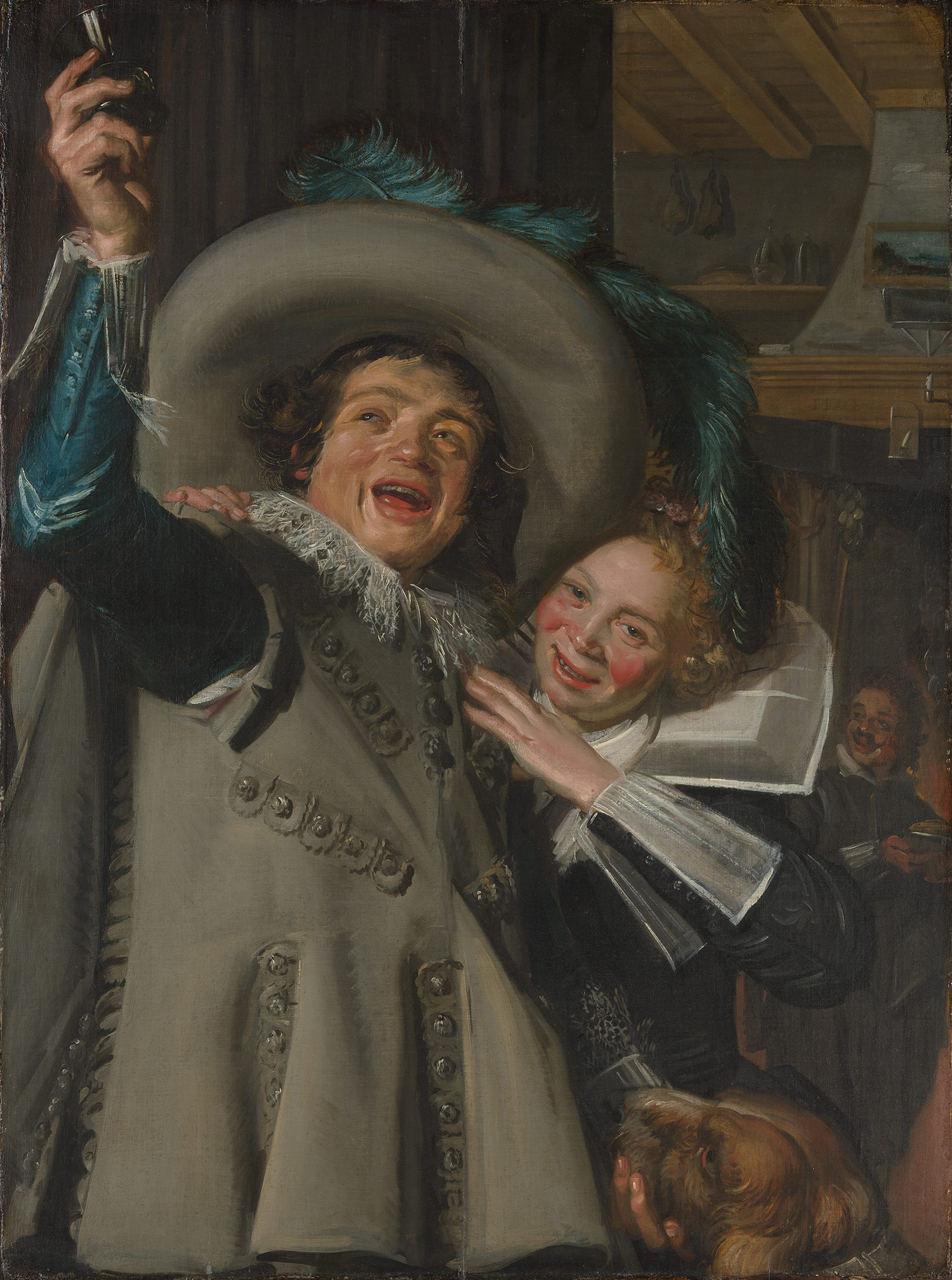
Frans Hals, Young Man and Woman at Inn, 1623 Metropolitan Museum of Art
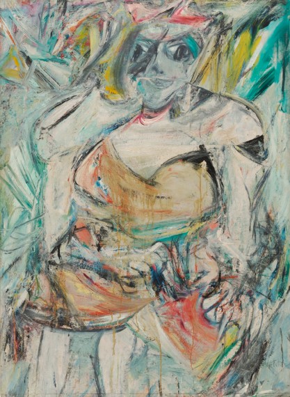
Willem de Kooning, Merritt Parkway, 1959, from the Detroit Institute of Art, Bequest of Hawkins Ferry, is in an exhibition at the Museum of Modern Art (called MoMA), New York
At first glance, Frans Hals and Willem de Kooning have nothing in common, other than being artists who originally came from the Netherlands. More than three hundred years separate their art and two very different New York Museums, the Met and MoMA, have exhibitions of their work. Hals was vividly realistic and de Kooning was a founder of Abstract Expressionism, but their common grounds are looseness of brushwork, luscious paint and bold energies going in all directions. In short, it is their painterly techniques.
Women, II, in MoMA, part of the Blanchette Hooker Rockefeller Collection, is one of many paintings of women that de Kooning did in the 50s
Analyzing the radiating diagonals of Hals’ compositions and paint quality, we might wonder if de Kooning ‘s thick, diagonal brushstrokes, sometimes overlapping and transparent, were inspired by Frans Hals’ compositions. Both artists give the viewer a texture we would want to touch.
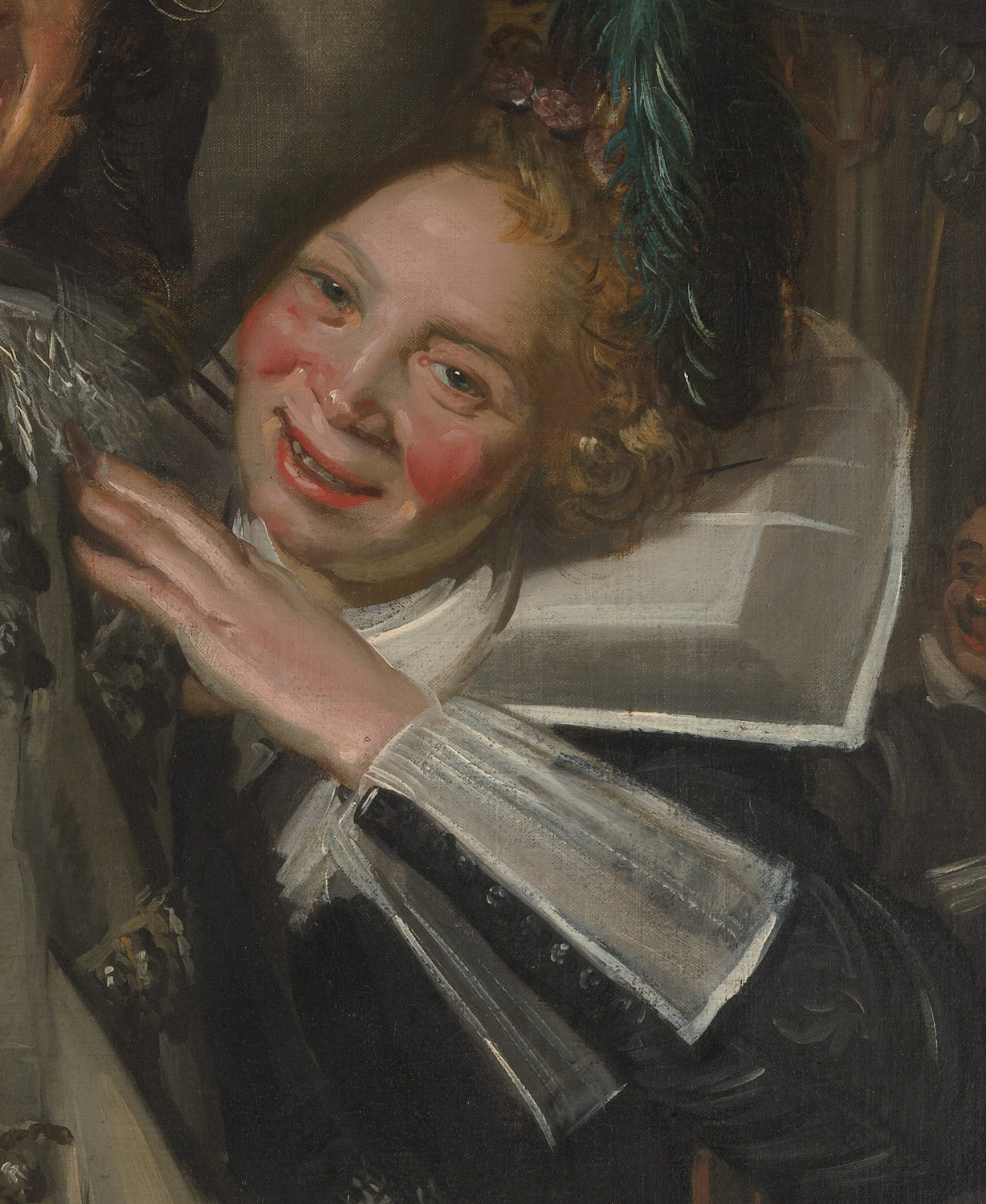
Frans Hals, detail of woman, from Young Man and Woman in an Inn
And then there is color; in Hals, it’s the beautiful blue sleeve and feathers of the man leaving a bar and the flushed cheeks of a woman grabbing his arm. Hals soaked her cheeks with redness from too much drink, but at a time when artists did not exaggerate color. Perhaps a coincidence, but de Kooning, particularly in paintings of women, dared to make the reds quite strong. Women, II, shown above, also has a tactile quality to its blues, greens, red and white.
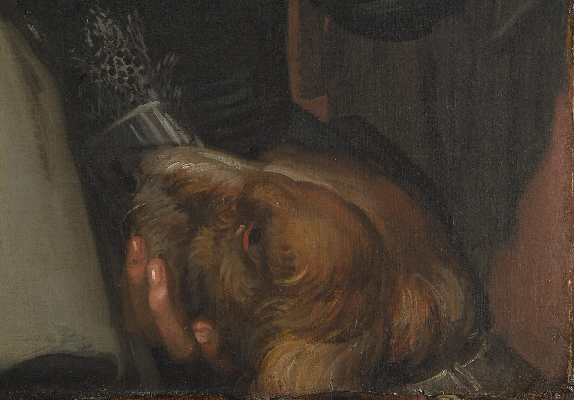
The soft and furry dog is typical of Hals’ ability to paint wonderful, tactile effects
In Young Man and Woman at the Inn, we witness Hals’ desire was to create a snapshot of time, a vivid realism that looks fresh and unplanned. He used a close-up view, a foreshortened upper arm and a jump into deeper space. The arm holding a glass pokes out of the picture frame. This view looks spontaneous, as if the couple did not know they’re being caught by the artist. A dog in the lower right hand corner completes Hals’ soft, painterly picture. This Dutch master is known mainly for his portraits.
De Kooning, on the other hand, immigrated to the United States and made his fame with the New York School, the Abstract Expressionists of the mid-20th century. The Met’s show of Frans Hals will end soon, but MoMA’s very large exhibition of de Kooning will continue until January 9.


.jpg)


Recent Comments