by Julie Schauer | Apr 29, 2017 | 19th Century Art, Impressionism and Post-Impressionism, Printmaking, Toulouse-Lautrec
 |
The Artisan Moderne. 1896, Lautrec was asked to advertise a jeweler/home goods designer
He manages to add some of his own thoughts and observations about human nature. |
This is the last weekend of Phillips Collection’s exhibition,Toulouse-Lautrec Illustrates the ‘Belle Epoque.’ The Phillips organized the show with the Montreal Museum of Fine Arts, its only other venue North America. This exhibition is different and distinguished from other exhibitions of Henri de Toulouse-Lautrec (and I’ve seen a few of them), because it’s primarily graphic art and contains some works that we don’t normally see. There are trial proofs alongside the finished prints, and a few very rare prints. The entire show comes from one private collector in France and we’re very lucky to have it for a short time in Washington.
 |
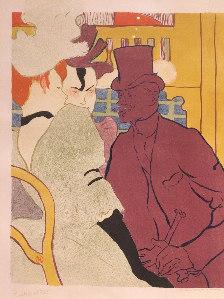
Mademoiselle Eglantine’s Troupe, 1895- 1896 Brush, spatter and crayon
lithograph in three colors. The dance troup included Jane Avril, seen below |
Toulouse-Lautrec’s color is magical but it’s really his sensational line that was his greatest gift. He follows a string of other great 19th century line artists: Ingres, Daumier, Degas and Hokusai, but he broke entirely new ground in the world of graphic art. In this exhibition, some of the familiar posters are shown in different stages, and it’s a great starting point to understand something of the lithographic process. Lautrec mastered the medium of color lithography, using multiple stones for the different colors of ink.
He’s best known for creating poster advertisement for entertainers and other highlights of Paris night life. Certainly he did a lot to bolster the careers of certain singers and performers such “La Goulue,” Jane Avril and Aristide Bruant. His posters were all over the kiosks of Paris and his work began a new trend. Although Lautrec was from an aristocratic background, he reveled in the demimonde and the bohemian lifestyle. He captured the people, places and events with so much vitality that the viewer almost wishes he or she could be there. The “Belle Epoque” is the beautiful era and in the USA it reflects the time of “The Gilded Age or “The Gay Nineties.”
 |
| Jane Avril, 1899 |
Depicting the subjects with wit and whimsy, and it’s clear that Lautrec’s art always captured much more than a photograph could. Sometimes his faces seem to be sneering at us. His expressive, calligraphic line is pure magic in how it captures a quick impression. He also masters the integration of letters into design, an essential for good graphic art. He portrayed Jane Avril several different times — in 1893, in t
he Divan Japonais, with
Mademoiselle Eglantine’s Troupe and again in 1899. The poster of Jane Avril from 1899 is particularly effective in design. Her undulating lines take up the entire picture from top to bottom, twisting to the right and then off the page on the left. It’s utterly simple, but effective design
Furthermore, it’s not only performers and night clubs that he enjoys. One of his friends, Sescau asked him to advertise his photography studio. He sets the fashionable lady in the foreground, running away from the photographer. With his sly humor, he makes suggests that photographer friend is looking at her in other ways, too. In a brilliant display of his design talent, the frills of this woman’s flowing cape match the rhythms of design in her fan, flowing in the opposite direction off the edge of the page.
 |
Photographer Sescau, 189 Brush, crayon and spatter lithograph, printed in five
colors. Key stone printed in blue; color stones in red, yellow and green |
Like other artists of his time — Van Gogh and Munch — he used jumps in space to heighten the meaning. It works well with the poster; the graphic artist’s challenge is to say a great deal with a minimal amount of detail and definition. In one of his most famous works, La Goulue at the Moulin Rouge, the master of ceremonies is at the picture plane. He’s merely a silhouette with pointed fingers, pointing to the artist’s signature put also to the celebrity whose dancing a can-can. Le Moulin Rouge was a 1890s version of “Dancing with the Stars.” Guests were able to mix and mingle with their favorite celebrities, and to dance alongside them.
 |
| La Goulue (Louise Weber) |
Of course the Moulin Rouge was also memorialized with a fictional character played by Nicole Kidman in Baz Luhrmann’s 2001 movie, Moulin Rouge. The story, but not the aesthetics in the move, fit with the time and place. John Leguizamo played Toulouse-Lautrec as an affable, good-natured character. Since childhood accidents and perhaps a genetic disease kept him from growing to normal adult height, he felt comfortable with other outsiders.
In actuality, La Goulue was Louise Weber, who had moved from the country (Alsace) into the city as a teen. She was approximately 24 at the time of her stardom as one of the most popular dancers in Paris. Her nickname, “the glutton” probably refers to how she took from others — food and drink.By the time she was 30, she was tired, wasted, impoverished and alcoholic. (In his prints, and paintings, she’s always recognized by her topknot. ) Unfortunately, there’s similar sad tales played out by some young stars today.
 |
La Goulue at the Moulin Rouge, Brush and Spatter lithograph, printed
on two sheets of wove paper. Final print
|
Many other famous posters are on view in full splendor, including images of Aristide Bruant and Marcelle Lender. This must-see exhibition is pure visual delight. It also offers a great deal of technical information about Lautrec’s astounding graphic techniques. This is just a small sampling of the many fantastic posters, paintings and graphics that are part of the exhibition.
Copyright Julie Schauer 2010-2016
by Julie Schauer | Oct 31, 2012 | Contemporary Art, Mexican Art, Nicolas de Jesus, Printmaking
 |
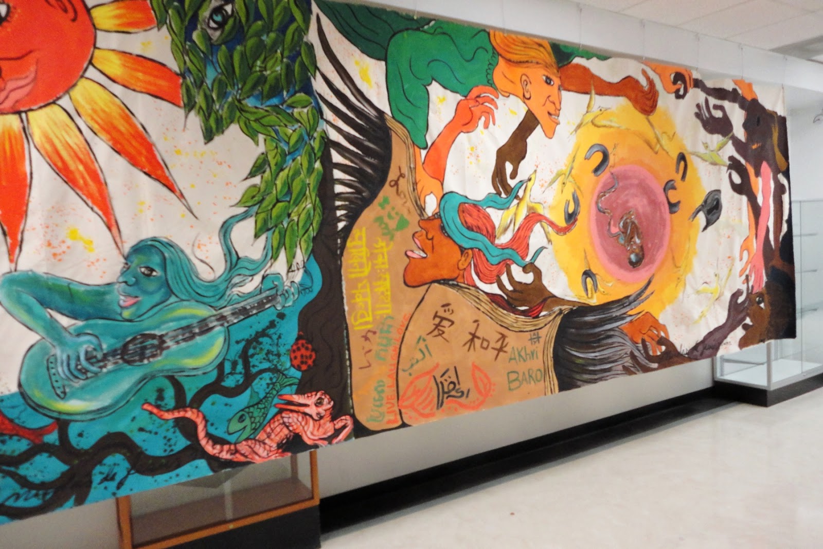
| Nicolás de Jésus and students, October 2012, NVCC, Annandale, VA, right side |
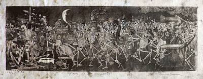
The day of the Dead ( Día de los Muertos) is a starting point for Mexican artist Nicolás de Jésus, who visited and demonstrated his work in my Art Appreciation Class on October 17th. Since today is Halloween, it’s a good time to explore how Nicolás de Jésus uses this theme. A mural he completed with students has been hung on the second floor of the CM Building.Is it a coincidence or not to discover this past weekend that someone near and dear to me turned out to be in an art exhibition on the El Dia de los Muertos theme?
 |
| Nicolás de Jésus, Fiesta de los Muertos, etching and aquatint |
Nicolás de Jésus mesmerized the class as he explained his prints, impressive for their beauty, meaning and the textures. The skeletons of his prints are very animated and life-like. His art dips into memories of his childhood in the Amayaltepec region, where he learned to make art at a very young age and his father was among the most notable folk artists. At first his art seems immersed in imagery of Día de los Muertos, but closer examination reveals that the holiday becomes a means to an end. His meanings go much deeper, because the subjects of the vernacular, folkloric tradition apply as well to other themes.
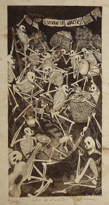 |
| Dia de la Muerta, etching, aquatint
|
The celebration of the Day of the Dead recalls our own Halloween, but it is celebrated on November 1 (for deceased infants and children) and November 2 (for elders) in Mexico. Typically families go the cemeteries where deceased members of their families are buried. In some parts of the country they dance in the graveyards. They build altars to the deceased and present offerings of food, like sugared skulls, and decorations such as trinkets or flowers, preferably orange marigolds. They bring toys to the children, essentially blurring the boundaries between life and death. The celebration combines aspects of an ancient Aztec celebration with the Catholic feast days. The lines between the living and the dead become blurred, as I had recently witnessed in an exhibition at the National Mexican Fine Arts Museum in Chicago, where there were installations with food offerings to the dead, Hanan Pixal. Art is life and the art of this theme is for both the living and the deceased.
But in the art of Nicolás de Jésus, the skeletons can be powerful metaphors for the living. The skeletons dance and celebrate, taking on the qualities of living people. They act out the human comedy, or, at times they partake in the human tragedy and satirize human behavior. His meanings can be critical and provocative. He is concerned with the lives of Mexicans on both sides of the border.
 |
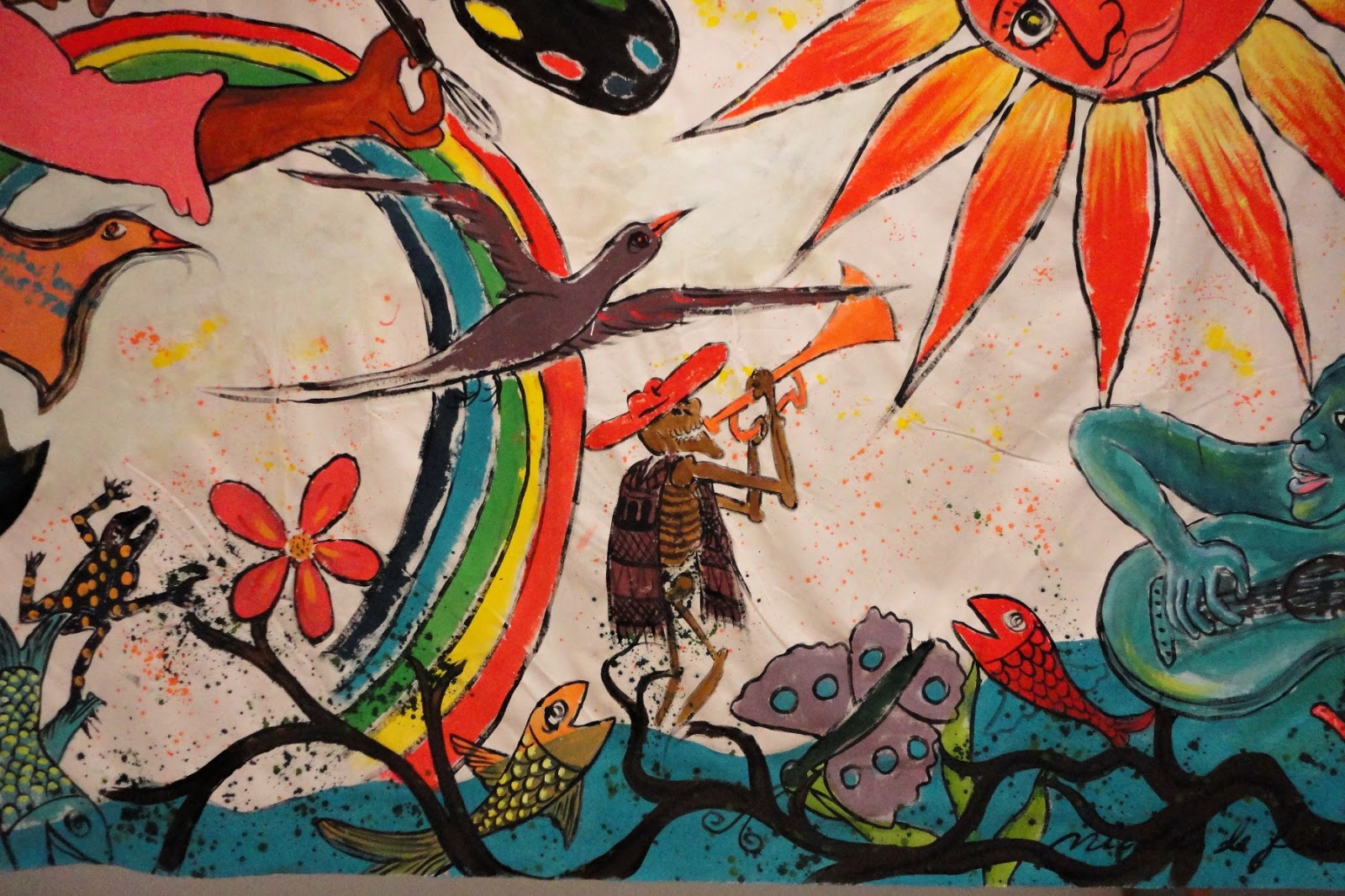
| Left side detail with skeleton in NVCC/Annandale’s new mural |
 |
|
Maicidio refers to the death of corn, a gift
from Mexico, through modification
|
|
|
|
Nicolás de Jésus prints his works from amate bark, native to his Guerrero region of Mexico, which is west of the Yucatan peninsula. Though he did not demonstrate in our class how to do his technique, it is a combination of etching and aquatints. In etching, the artist sketches the lines of an image into a waxy substance over the metal plate. For broad areas of shading, aquatint is used. Aquatint is a printmaking process that uses rosin, a natural lubricant produced by from tree sap, melted on a zinc plate to give a grainy quality to the tones. A acid bath ‘bites’ the images into the metal plate in both etching and aquatint, before the scene can be inked and printed in reverse of the drawn image. De Jesús uses the aquatint process frequently to create the grainy, textural backgrounds of many works.
One print that really strikes me is Maicidio, suggesting death to corn, one of Mexico’s great gifts to the world. The United States has now changed the nature of corn, overproducing it and turning it into cattle feed or high fructose corn syrup, things it was never meant to be. Its by-products become additives in almost all processed food. With American corn now is 85% genetically modified, it’s no wonder the skeletons attack and pull it apart. Let us remember this fact next Tuesday, when Californians go to the polls and vote on Proposition 37 which will require labeling for genetically-modified food (GMOs). As our industrialized US agricultural system is dominating and killing corn, people in the US become increasingly disconnected to land.
 |
| En El Tran recalls when the artist lived in Chicago. |
|
Nicolás de Jésus lived in Chicago from 1989-1994, and he has at least 60 works of art in the Mexican Fine Arts Museum in the Pilsen neighborhood of Chicago. En el Tran brings his familiar skeletons into the elevated train of Chicago’s mass transit system, while skyscrapers are seen out the window behind. He implies a deeper truth behind the scene, the fate that awaits all of us in the end. Although not mentioned, Mexico has a tradition of Surrealism and de Jésus also seems to be connected to Surrealists.
In many ways his prints follow in the tradition of socially and politically active artists from Mexico in first half of the twentieth century: Diego Rivera, Jose Clemente Orozco and David Alfaro Siqueiros. A full-blooded Nahua Indian from a small village in the state of Guerrero, Mexico, he is an advocate for the rights of indigenous peoples. Themes of struggle meet the themes of celebration in his work. Though he is critical of much in society, he is above all a humanist who recognizes our foibles but understands our humanity.
Copyright Julie Schauer 2010-2016
by admin | Apr 20, 2012 | 19th Century Art, Hokusai, Printmaking
 Some of Henri Riviere’s “36 Views of the Eiffel Tower.” are in the Phillips’ exhibition, Snapshot: Paintings and Photography, from Bonnard to Vuillard. Five Metro stops away, the Smithsonian’s Sackler Gallery is hosting an exhibition of Katsushika Hokusai’s “36 Views of Mt. Fuji.” The Cherry Blossom Festival just celebrated the100th anniversary of Japan’s gift of cherry trees to Washington, DC, a capital city based on French urban design patterns. These exhibitions coincided with that event.
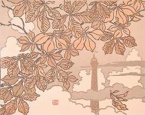
The top of the Eiffel Tower seen beyond the leaves is from Henri Riviere’s 36 Views of the Eiffel Tower, its Frontispiece,
published in 1902. Hokusai’s 36 Views of Mt. Fuji, 1830-1832, inspired him. The scene below, Mt. Fuji
from Goten-yama has Spring cherry blossoms opening to a distant view of the peak.
The Sackler exhibition has selected the most vivid images available of Hokusai’s woodblock prints and the colors are vibrant. Blues predominate, but most prints have at least 4 other hues. Riviere’s images are printed as color lithographs with more neutral color harmonies. French artists admired Japanese woodblock prints and Riviere owned at least 800 of them. The Phillips’ exhibition–definitely worth the visit–also has small paintings and many photographs by Post-Impressionist artists such as Edouard Vuillard, Pierre Bonnard, Maurice Denis, George Hendrik Breitner, Henri Evenepoel and Felix Valloton.
Both artists create different atmospheric effects, including the effects of wind, snow and various cloud formations. In many prints by each artist, the subjects, Mt. Fuji or the Eiffel Tower, are subordinated to other scenery. Yet, Riviere used Hokusai’s examples as inspiration rather than imitation.
Through rooftops and chimneys of Paris’ many buildings we vaguely see the Eiffel Tower. A cat pokes through the diagonal zigzag of lines in the foreground as a dog runs away. Their silhouettes remind me
that Riviere did shadow plays for
Le Chat Noir (the Black Cat).
Warehouses line a canal to form diagonal lines which lead first, to Edo Castle, then to Mt. Fuji, on the upper left corner, (No 31 – Nihonbashi at Edo)
A large Mt. Fuji dominates the upper left, as a strong wind blows. In this Autumn view, the people look
small compared to the force of the wind (No. 18 – Sunshū Ejiri, in Suruga Province). Both
Hokusai and Riviere take the viewers through a yearly cycle of changing
weather conditions. Hokusai’s work dates to 1830-32.
Riviere also creates the sensation of Autumn wind surrounding a lonely man on a park bench. The
Eiffel Tower stands directly above him.
Riviere spent a year watching the building of the Eiffel Tower. During that time, he was able to go up into the construction and take photographs from the inside out. Twelve of these photos are in the Phillips’
exhibition, along with the lithograph above based on one of those pictures
The Phillips’ exhibition compares these prints to photographs Riviere shot of workers constructing the Eiffel Tower. Riviere’s primary profession was as a theatre set designer for Le Chat Noir, where he created shadow plays. As an artist, he is less well-known than Hokusai, although there is something magical about his style, perhaps a reflection of his work with silhouettes in the theatre and with photography. His prints were published in 1902 several years after he had taken the pictures of the Eiffel Tower.
Hokusai is one of Japan’s greatest artists. There are two more exhibitions of paintings and screens by Hokusai in the Freer Gallery of Asian Art, which holds the world’s largest collection of Hokusai and is attached to the Sackler Gallery. The rarely-seen Boy Viewing Mt. Fuji, ink on silk, is in a medium too fragile for continuous display, but it is included with the Hokusai paintings.
It is an interesting to see that Hokusai, as an eastern artist, identifies with the power of pure nature, a volcanic mountain which dominates the Japanese landscape, while the western artist’s symbol is a man-made construction, built for the World’s Fair of 1889 and still a dominant symbol of Paris today.
Hokusai’s Boy Viewing Mt. Fuji, 1846, is a peaceful painting which expresses the grandeur of Mt. Fuji in color and ink on silk. It is part of the Smithsonian’s Freer Gallery of Asian art and will be on view until June 24, 2012 .
by Julie Schauer | Nov 24, 2011 | Kimbell Art Museum Ft. Worth, Martin Schongauer, Michelangelo, Printmaking, Renaissance Art
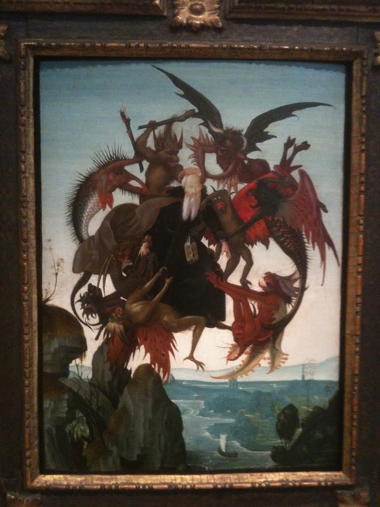
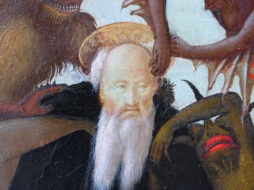
St Anthony Torment by the Demons, c. 1487, was painted by Michelangelo when he was only 13. The panel, 18 x 12 inches, is warped as happens to many panels over time.
The Torment of Saint Anthony is a small panel painting which was recently discovered to have been painted by Michelangelo in 1487/88. Intensive cleaning in 2008/9 led experts to believe that Michelangelo painted it when he was 12 or 13 years of age. Only four easel paintings by Michelangelo are known, and this one of is in North America, at Fort Worth’s Kimbell Art Museum.
Michelangelo’s St. Anthony looks remarkably calm despite the demons who are scratching him
St. Anthony was an early Christian of the 4th century who lived as a hermit for many years. According to his biographer, the rigorous asceticism practiced by St Anthony in the Egyptian desert allowed him to float in the air, where he was attacked by devils trying to beat him to the ground. Anthony defeated these demons on more than one occasion, but not without a big struggle. It is not at all surprising that a young Michelangelo would have been attracted to this subject, because the artist always seemed to be battling his own internal demons, as the poetry he wrote and certain sculptures of slaves he made later in life would suggest.
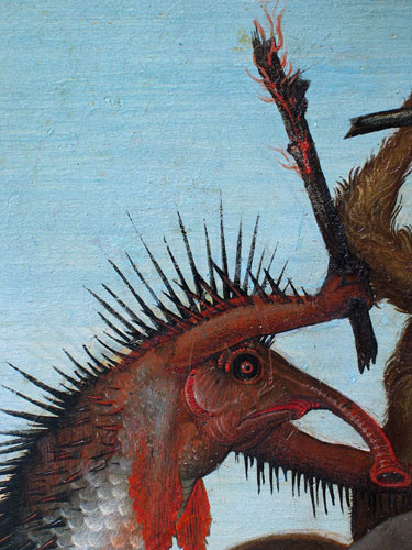
Schongauer’s masterly engraving, St. Anthony Tormented by Demons, c. 1480, gave inspiration to the young Michelangelo
Michelangelo copied an engraving by a French-German artist, Martin Schongauer, who was Europe’s greatest practitioner of printmaking at that time. Schongauer used a vivid imagination and great technical ability to show light, shadow and texture. These beasts are composite creatures of fanciful reptiles, fish and flying monsters, who scratch, pull and club the holy man. Schongauer left the landscape minimal, a small edge of rocks in the lower right-hand corner which describe the mountain he lived on in isolation. Saint Anthony seems to be suspended in the air, in a radiating, circular composition. Schongauer used short dots or stipples to get his deepest shadows into the small metal plate used for engraving.
We don’t know the date of
Schongauer’s engraving–perhaps about 1480–but we know that his prints traveled throughout Europe. Michelangelo’s biographers said that he made a painting after a Schongauer print when he was 13, and this new attribution fulfills that void in our knowledge. This connection also shows the important role of prints in spreading artistic ideas and iconography, with the engraving passed into Italy from Germany.I have seen the Schongauer original in the print room of the National Gallery and its details are incredible. No wonder the young genius was impressed.
Although Michelangelo borrowed many details
from the great German engraver, he went to
the fish market to observe. According to the
Kimball Art Museum, Michelangelo scraped away
lines of paint in the body of the fish-like creature,
revealing the primer beneath the paint in the
parallel lines of hatching.
When Michelangelo copied Schongauer, he was equally adept at detail. He straightened Saint Anthony’s head, gave him a shorter beard and added an interesting landscape background. The brown-gray foreground is rocky and craggy, and in pristine detail. Critics of the Michelangelo attribution do not like the background. The painting has a high viewpoint just like St. Anthony who lived on a mountain near the Nile when the demons attacked and lifted him. So this landscape is a bird’s eye view of river, hills and sky with a low horizon line. Using aerial perspective, it gets more and more indistinct as it goes back into space and turns n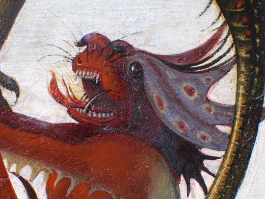 early white as it hits the horizon. The cool colors of the background and the low horizon line allow the figures to come forward and stand out with warm colors. This setting may be more reminiscent of the Arno in Florence than the Nile River, but European artists of the time were not familiar with the desert.
Photos above and right were taken by the Kimball to AP. This demon was painted in tempera and oil with magnificent detail. Color changes and the meticulous line technique are visible.
His mouth is ferocious.
Copyright Julie Schauer 2010-2016
by admin | Nov 24, 2011 | Printmaking, Renaissance Art
St Anthony Torment by the Demons, c. 1487, was painted by Michelangelo when he was only 13. The panel, 18 x 12 inches, is warped as happens to many panels over time.
The Torment of Saint Anthony is a small panel painting which was recently discovered to have been painted by Michelangelo in 1487/88. Intensive cleaning in 2008/9 led experts to believe that Michelangelo painted it when he was 12 or 13 years of age. Only four easel paintings by Michelangelo are known, and this one of is in North America, at Fort Worth’s Kimbell Art Museum.
Michelangelo’s St. Anthony looks remarkably calm despite the demons who are scratching him
St. Anthony was an early Christian of the 4th century who lived as a hermit for many years. According to his biographer, the rigorous asceticism practiced by St Anthony in the Egyptian desert allowed him to float in the air, where he was attacked by devils trying to beat him to the ground. Anthony defeated these demons on more than one occasion, but not without a big struggle. It is not at all surprising that a young Michelangelo would have been attracted to this subject, because the artist always seemed to be battling his own internal demons, as the poetry he wrote and certain sculptures of slaves he made later in life would suggest.
Schongauer’s, masterly engraving, St. Anthony Tormented by Demons, c. 1480, gave inspiration to the young Michelangelo
Michelangelo copied an engraving by a German artist, Martin Schongauer, who was Europe’s greatest practitioner of printmaking at that time. Schongauer used a vivid imagination and great technical ability to show light, shadow and texture. These beasts are composite creatures of fanciful reptiles, fish and flying monsters, who scratch, pull and club the holy man. Schongauer left the landscape minimal, a small edge of rocks in the lower right-hand corner which describe the mountain he lived on in isolation. Saint Anthony seems to be suspended in the air, in a radiating, circular composition. Schongauer used short dots or stipples to get his deepest shadows into the small metal plate used for engraving.
We don’t know the date of

Schongauer’s engraving–perhaps about 1480–but we know that his prints traveled throughout Europe. Michelangelo’s biographers said that he made a painting after a Schongauer print when he was 13, and this new attribution fulfills that void in our knowledge. This connection also shows the important role of prints in spreading artistic ideas and iconography, with the engraving passed into Italy from Germany.I have seen the Schongauer original in the print room of the National Gallery and its details are incredible. No wonder the young genius was impressed.
Although Michelangelo borrowed many details
from the great German engraver, he went to
the fish market to observe. According to the
Kimball Art Museum, Michelangelo scraped away
lines of paint in the body of the fish-like creature,
revealing the primer beneath the paint in the
parallel lines of hatching.
When Michelangelo copied Schongauer, he was equally adept at detail. He straightened Saint Anthony’s head, gave him a shorter beard and added an interesting landscape background. The brown-gray foreground is rocky and craggy, and in pristine detail. Critics of the Michelangelo attribution do not like the background. The painting has a high viewpoint just like St. Anthony who lived on a mountain near the Nile when the demons attacked and lifted him. So this landscape is a bird’s eye view of river, hills and sky with a low horizon line. Using aerial perspective, it gets more and more indistinct as it goes back into space and turns n early white as it hits the horizon. The cool colors of the background and the low horizon line allow the figures to come forward and stand out with warm colors. This setting may be more reminiscent of the Arno in Florence than the Nile River, but European artists of the time were not familiar with the desert.
Photos above and right were taken by the Kimball to AP. This demon was painted in tempera and oil with magnificent detail. Color changes and the meticulous line technique are visible.
His mouth is ferocious.
by Julie Schauer | Aug 13, 2010 | 19th Century Art, Art Appreciation: Visual Analysis, Exhibition Reviews, Expressionism, Modern Art, Munch, National Gallery of Art Washington, Printmaking
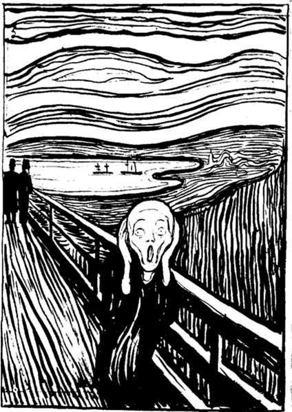
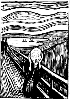 Edvard Munch’s The Scream is so powerful that the other works of this great Norwegian artist are overlooked. Other art by Munch articulated his feelings about the sad passages of life–sickness, death and breakups. Currently at The National Gallery of Art in Washington is an exhibition of Munch’s graphic art which represents many of the other themes he dealt with intensely, including illness, love, loss, and loneliness. The museum has pulled together prints from its own collection with images from two private collections to present a fuller view of the real artist. In fact, the sounds of silence in Munch’s work are as frequent and powerful as the voices of pain.
Munch also can be subtle. He explores the possibilities of images morphing into something else. In Waves of Love, we see a floating woman but don’t notice the man right away. Yet, when we discover him, the work becomes even more powerful.
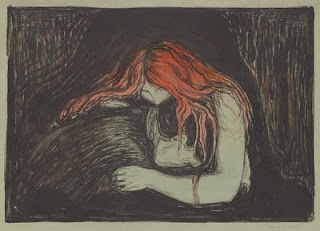 Munch, Vampire II, 1895, lithograph with watercolor, from the National Gallery of Art
Whether there is silence or pain depends on who you are and when you see these works. Vampire II, above, can be seen as a comforting relationship, but the playwright August Strindberg renamed it with a more provocative title and Munch let it stand. Munch’s original title was Love and Pain, suggesting that falling in love ultimately causes pain, or, more optimistically, that love will console you from the other pains of life.The Vampire series of prints, three prints entitled Sin, and a group of images from the Ashes and Madonna series may suggest unkind, fearful views of women or anxiety in regards to relationships. However, Munch was deeply hurt by the loss of his mother at age five and his older sister when he was 14, both of whom he adored. They died of tuberculosis and he feared the same for himself. Interpreting his images as misogyny is too simplistic.
The Ashes series of prints, above, explores the turmoil after a breakup.
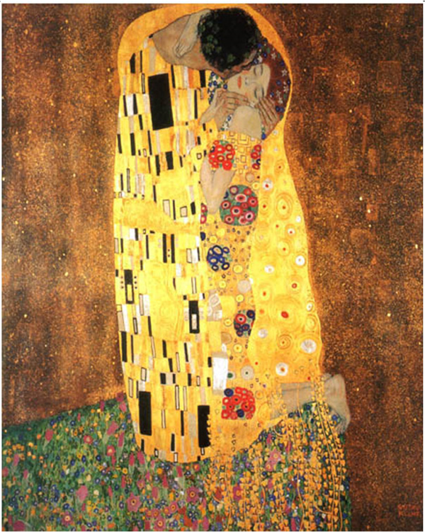
A group of prints entitled The Kiss can be seen as more harmonious symbols of love. One of these prints, an early intaglio example of The Kiss, is sensual in a idealized, classical form. You can see how it became a precursor to Munch’s symbiotic, unified idea of love in the woodcut versions, such as the one on the left, The Kiss IV of 1902. Here, Munch used different colors of ink and exploited the grain of wood to replicate the curves of the couple. Notice that the side view of “his” face is the front of “her” face. This print was certainly an inspiration for Gustav Klimt’s The Kiss–with its colors and mosaic patterns– much more popular and famous than Munch’s versions. Klimt borrowed Munch’s vertical emphasis and upward sweep of motion ending in the curving form of “oneness,” the back of a man’s head and the front of a woman’s face. In Munch’s version the man and woman’s face become one, a prelude to the unity of form that Constantin Brancu
 si used for his abstract rectangular block sculpture of The Kiss in 1910, where the eye of two becomes the eye of one.
Klimt’s The Kiss shows the influence of Munch, above left
The beauty of seeing these graphic images is to see how he reworked themes over many years, changing the content as he made minor changes to the works. His prints are done in multiple colors and states, and vary in graphic techniques, from woodcut to etching, lithograph, aquatint and more. The Impressionists influenced his color and Van Gogh inspired his line, but he tried to reduce expressions even further than Van Gogh, making each of his images powerful symbols of human experiences.
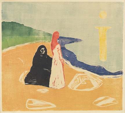
Two Women on the Shore focuses on one central standing woman, with the seated person behind her — perhaps alluding to an elderly figure in her life, a ghost from her past, an alter ego, or a projection of whom she will become. Munch probably wished to evoke different viewpoints and we are likely to experience her differently depending on our individual conception. The colors changed a great deal from print to print, and this series of prints evokes variety of meanings. I am particularly fond of the way Munch repeatedly used a large bright symbol resembling the letter i — the sunlight or moonlight reflecting on water.
 Two Women on the Shore, 1920s, color woodcut National Gallery of Art
Often the power in Munch’s imagery comes from the push-pull effect of space: figures in front, space rushing behind, or figures in both places so we can’t help but be aware of the drama of their distance. Ashes explores the debris left over at the end of a relationship. Repeatedly, Munch used the figure in a landscape as a vehicle to summarize feeling. His women can be brash, his men often hurting.
It’s likely that two of the great images of the early 20th century, Matisse’s Blue Nude and Picasso’s Les desmoiselles d’Avignon fell under the influence of Munch’s slightly earlier, unforgettable figures, the women in Ashes and Madonna. Some find Munch’s art too pessimistic; others say his art was less inspired after a breakdown at age 45 after which he gave up drinking.
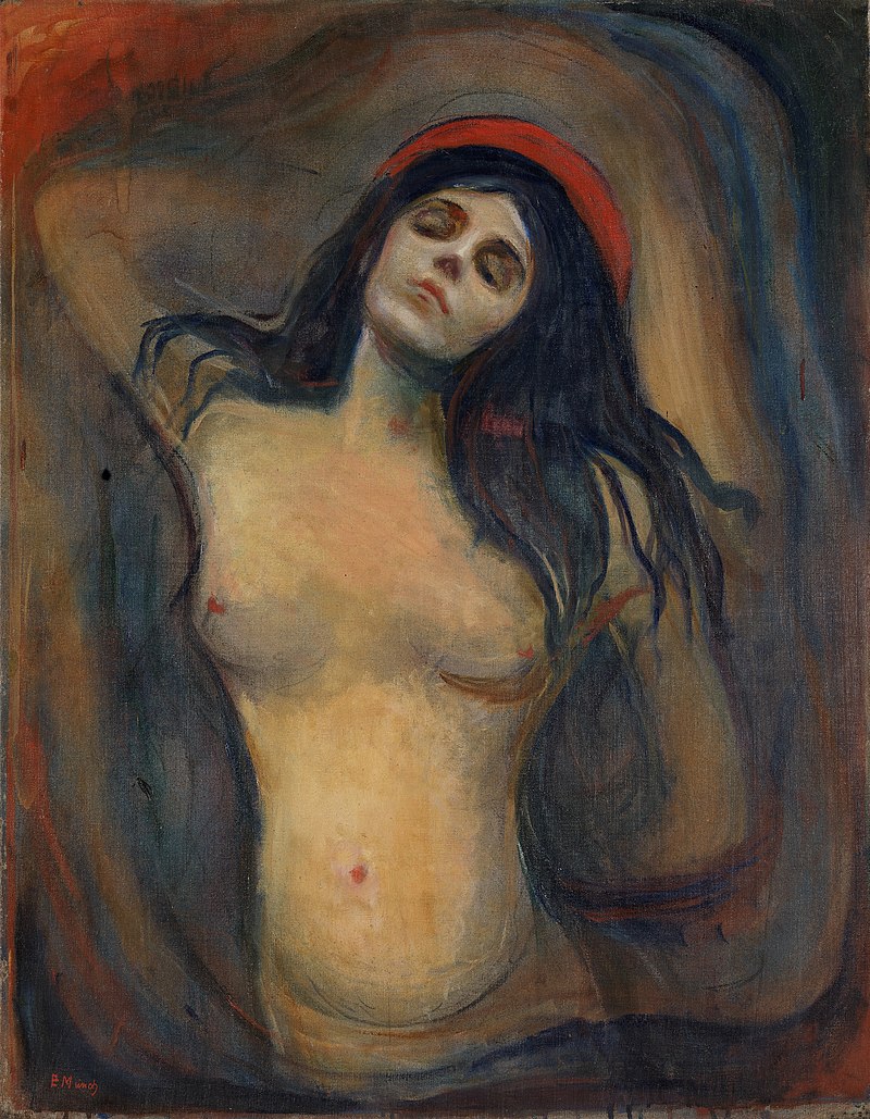
Madonna
Copyright Julie Schauer 2010-2022


Recent Comments