by Julie Schauer | Feb 1, 2014 | Exhibition Reviews, Fiber Arts, Folk Art Traditions, Greater Reston Arts Center, Local Artists and Community Shows, National Museum of Women in the Arts, Women Artists
 |
Rania Hassan, Pensive I, II, III, 2009, oil, fiber, canvas, metal wood, Each piece
is 31″h x 12″w x 2-1/2″ It’s currently on view at Greater Reston Arts Center. |
There’s a revival of status and attention given to traditional, highly-skilled arts and crafts made of yarn, thread and materials. “Stitch,” a new show at Greater Reston Arts Center (GRACE), proves that traditional sewing arts are at the forefront of contemporary art, and that fiber is a forceful vehicle for expression. Meanwhile, the National Museum of Women in the Arts puts the historical spin on traditional women’s art in “Workt by Hand,” a collection of stunning quilts from the Brooklyn Museum which were shown in exhibition at their home museum last year.
 |
Bars Quilt, ca. 1890, Pennsylvania; Cotton and wool, 83 x 82″;
Brooklyn Museum,
Gift of Mr. and Mrs. H. Peter Findlay, 77.122.3;
Photography by Gavin Ashworth,
2012 / Brooklyn Museum |
Quilts are normally very large and utilitarian in nature. To some historians, American quilts are appreciated as material culture with possible stories of the people who made them, but they also have some vivid abstract patterns and strong color harmonies. Their bold geometric shapes vary and change with different color combinations. Quilting is a folk art since it is a passed down tradition, and the patterns may seem stylized and highly decorative. Yet there is room for tremendous variation, creativity and individual style.
Within the United States there are important regional folk groups whose quilts have a distinctive style, like the Amish quilt, above. Amish designs can have a sophisticated abstraction deeply appreciated during the period of Minimal Art of the 1960s and 1970s. The exhibition outlines distinctions and also shows styles popular at certain times, including Mariners’ Knot quilts around 1840-1860, the Crazy Quilts of the Victorian period and the Double Wedding Ring pattern popular in the Midwest after World War I.
 |
| Victoria Royall Broadhead, Tumbling Blocks quilt–detail, 1865-70 Gift of Mrs Richard Draper, Brooklyn Museum of Art. Photo by Gavin Ashworth/Brooklyn Museum. This silk/velvet creation won first place in contests at state fairs in St. Louis and Kansas City. |
, |
|
|
|
|
One beautifully patterned quilt is from Sweden, but the rest of them are made in the USA. The patterns change like an optical illusions when we move near to far, or when we view in real life or in reproduction. There’s the Maltese Cross pattern, Star of Bethlehem pattern, Log Cabin pattern, Basket pattern and Flying Geese pattern, to name a few. The same patterns can come out looking very differently, depending on the maker. An Album Quilt has the signatures of different people who worked on different squares. We know the names of a handful of the quilting artists.
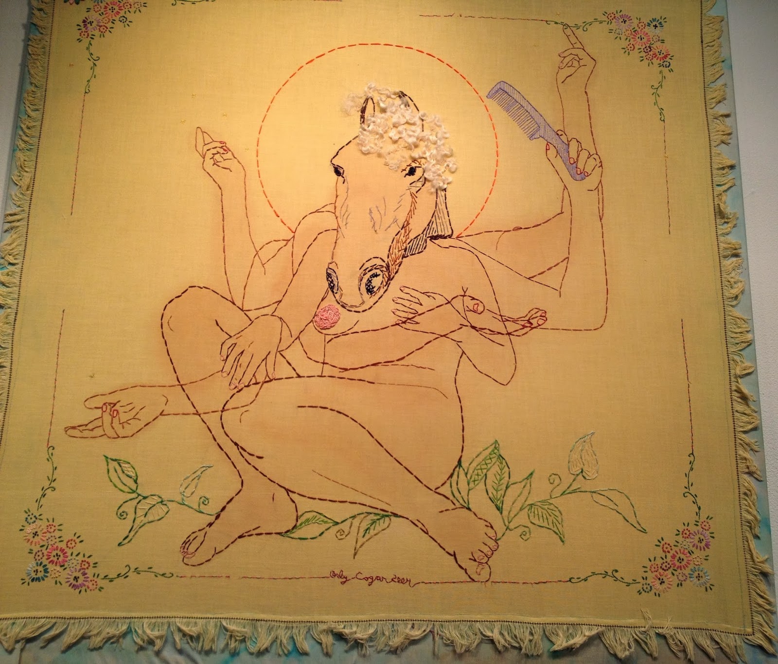 |
Orly Cogan, Sexy Beast, Hand stitched embroidery
and paint on vintage table cloth, 34″ x 34″ |
While most of the quilts featured in the exhibition were made by anonymous artists, the Reston exhibition includes well-known national figures in fiber art, such as Orly Cogan and Nathan Vincent. Cogan uses traditional techniques on vintage fabrics to explore contemporary femininity and relationships. Her works appear to be large-scale drawings in thread. She adds paint and sews into old tablecloths. I loved the beautiful Butterfly Song Diptich and Sexy Beast, a human-beast combination with multiple arms, like the god Shiva. Vincent, the only man in the show, works against the traditional gender role, crocheting objects of typically masculine themes, such as a slingshot.
 |
Pam Rogers, Herbarium Study, 2013, Sewn leaves, handmade
soil and mineral pigments, graphite,
on cotton paper, 22″ x 13-1/2″ |
Most “Stitch” artists are local. Pam Rogers stitches the themes of people, place, nature and myth found in her other works. Kate Kretz, another local luminary of fiber art, embroiders in intricate detail, expressing feelings about motherhood, aging and even the art world.
Kretz’s own blog illuminates her work, including many of the pieces in “Stitch. The pictures there and the detailed photos on an embroidery blog display in sharper detail and explain some of her working methods.
Often she embroiders human hair into the designs and materials, connecting tangible bits of a self with an audience. Kretz explains, “One of the functions of art is to strip us bare, reminding us of the fragility common to every human being across continents and centuries.”
Kretz adds, “The objects that I make are an attempt to articulate this feeling of vulnerability.” Yet some of the works also make us laugh and chuckle, like Hag, a circle of gray hair, Unruly, and Une Femme d’Un Certain Age. Watch out for a dagger embroidered from those gray hairs!
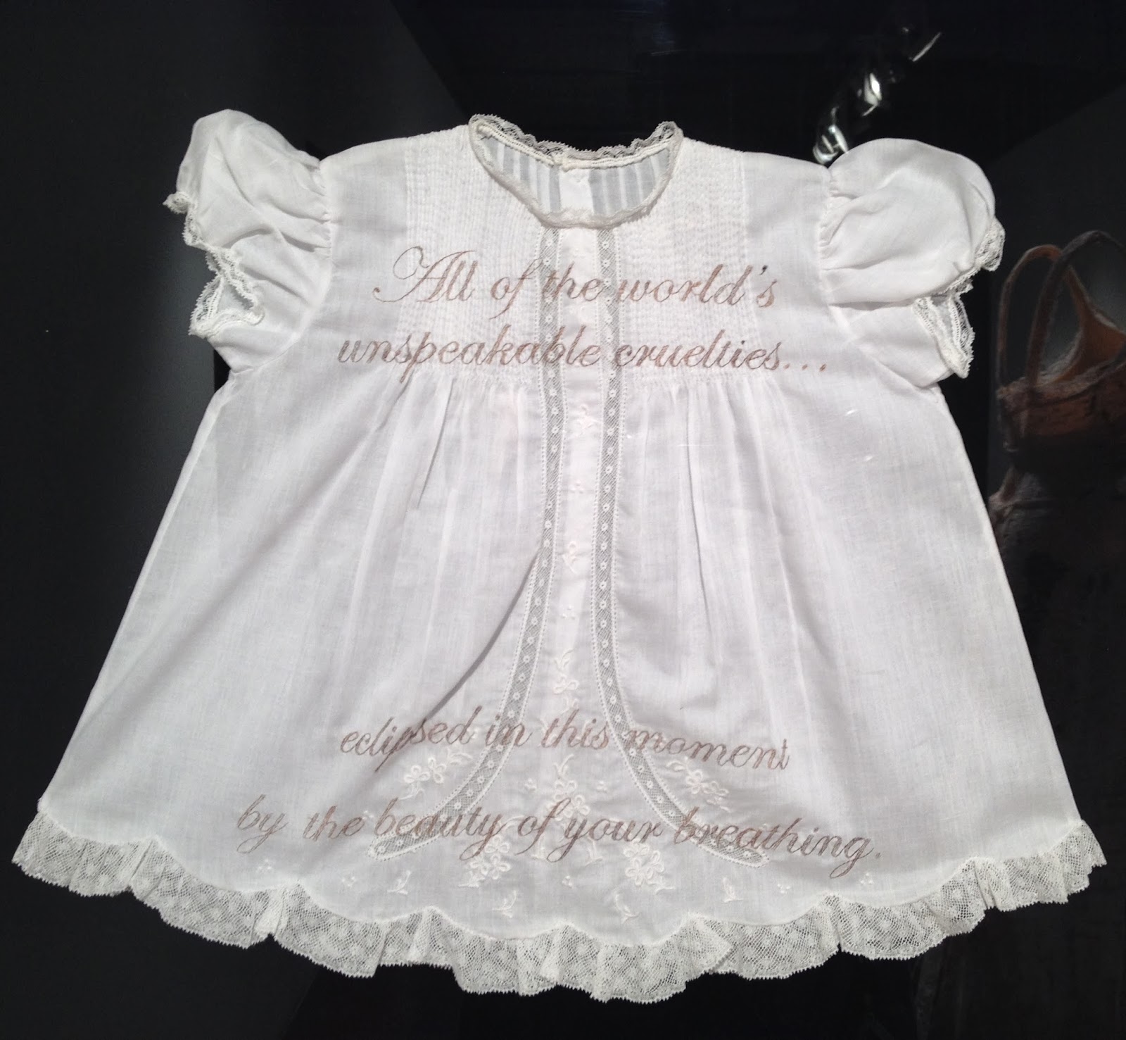 |
Kate Kretz, Beauty of Your Breathing, 2013, Mothers hair from gestation
period embroidered on child’s garment, velvet, 20″ x 25″ x 1″ |
 |
Suzi Fox, Organ II, 2014, Recycled
motor wire, canvas, embroidery hoop
12-1/2″ x 8″ x 1-1/2″ |
Kretz is certainly not the only artist who punches us with wit and irony, and/or human hair, into the seemingly delicate stitches. Stephanie Booth combines real hair fibers with photography, and her works relate well to the family history aspect alluded to in NMWA’s quilting exhibition. Rania Hassan is also a multimedia artist who brings together canvas paintings with knitted works. In Dream Catcher and the Pensive series of three, shown at top of this page, she alludes to the fact that knitting is a pensive, meditative act. She painted her own hands on canvases of Pensive I, II, III and Ktog, using the knitted parts to pull together the various parts of three-dimensional, sculptural constructions. She adds wire to the threads for stiffness, although the wires are indiscernible. Suzi Fox uses wire, also, but for delicate, three-dimensional embroideries of hearts, lungs and ribcages (right).
There’s an inside to all of us and an outside. Erin Edicott Sheldon reminds us that stitches are sutures, and she calls her works sutras. Stitches heal our wounds. “I use contemporary embroidery on antique fabric as a canvas to explore the common threads that bind countless generations of women.” Her “Healing Sutras” have a meditative quality, recalling the ancient Indian sutras, the threads that hold all things together.
 |
Erin Endicott Sheldon, Healing Sutra#26, 2012, hand
embroidery on antique fabric stained with walnut ink |
In this way she relates who work to the many unknown artists who participated in a traditional arts of quilting. Like the Star of Bethlehem quilt now at the National Museum of Women in the Arts, the traditional “Stitch” arts remind us to follow our stars while staying grounded in our traditions.
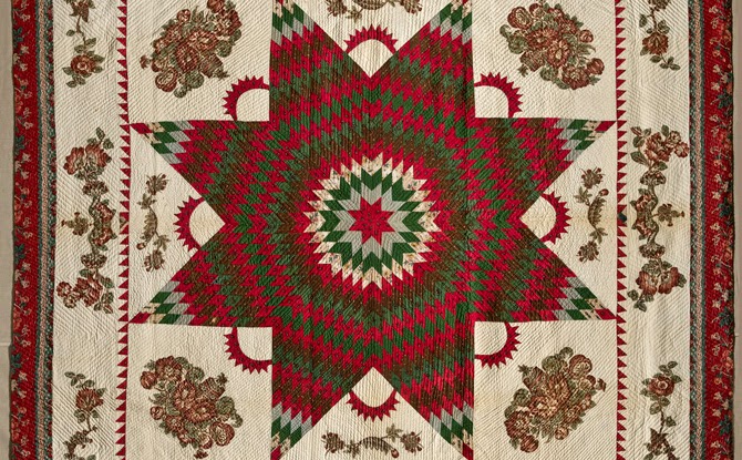 |
| Star of Bethlehem Quilt, 1830, Brooklyn Museum of Art Gift of Alice Bauer Frankenberg. Photo by Gavin Ashworth/Brooklyn Museum |
Copyright Julie Schauer 2010-2016
by Julie Schauer | Jul 26, 2013 | Contemporary Art, Eco-Art, Environmental Art, Greater Reston Arts Center, Local Artists and Community Shows, Painting Techniques, Sculpture
 |
| William Alburger, Forest, 2013, 65″ x 108″ x 9″ rescued spalted birch, in an solo exhibition at GRACE |
Eco-friendly art is meeting the world of high art, if we’re to take a cue from what’s showing at local art centers and galleries. It can be stated that the earliest environmental art started with the artists’ visions and applied those visions to the environment, with little interest in sustainability.
Quite the opposite trend is developing now. Several emerging artists, the “environmental artists” of the 21
st century put nature in the center–not the artist or the idea. Nature is the subject and the artist is nature’s follower. The following artists’ creations are about the land and earth; other artists interested in the environment have been more concerned with a world under
the sea.
 |
William Alburger, Non-traditional Backwards
One-Door, 2012, 27″ x. 13.5″ x 5.25
reclaimed Pennsylvania barn wood, specialty
glass and fabric |
William Alburger lives in rural Pennsylvania, where he picks up scraps of wood from fallen trees and mixes them with discarded barn doors. He is a passionate conservationist with an addiction to collecting what otherwise would be burned, decayed or discarded in landfills. Largely self-taught, Alburger formerly worked as a painting contractor. His art is both pictorial and practical. Some sculptures almost look like two-dimensional works, while others function as shelves or furniture. Hidden doors, cubbyholes and cabinets create surprises, making the natural world his starting point for expression. Intrusions of man-made items are minor. The knots, whirls, colors and textures of wood speak for themselves, revealing rustic beauty.
 |
William Alburger, Synapse, 2013,
65″ x 23″ x 5.25″ rescued spalted
poplar and Pennsylvania barn wood |
Currently the Greater Reston Area Arts Center (GRACE) is hosting a solo exhibition of Alburger’s works. In Synapse, Alburger cut into the interesting grain and patterns of fallen poplar. He framed top and bottom with old barn wood and reconfigured the form to suggest the space where two forms meet and form connection. Allburger finds what is already there in nature, but, through presentation, teaches us how to see it in a new way. Otherwise, we might not notice what nature can evoke and teach us.
 |
Pam Rogers, Tertiary Education, 2012, handmade
soil, mineral and plant pigments, ink, watercolor
and graphite on paper. Courtesy Greater
Reston Area Art Association |
Dedication to the natural world is second nature to Pam Rogers, whose day job is as an illustrator in the Natural History Museum of the Smithsonian Institution. “I’m inclined to see environment as shaping all of us,” Rogers explains, noting the importance of where we come from, and how our natural surroundings mark our stories and connections. While drawing natural specimens, she sees as much beauty in decay is as in birth, growth and development. We’re reminded that everything that comes alive, by nature or made by man, will turn to dust. Rogers’ drawings combine plants, animals and occasional pieces of hardware. Some of the pigments spring from nature, the red soil of North Georgia and plant pigments.
As in Alburger’s Synapse, above, Rogers seeks to form connections between man and the environment. She inserts nails and other links into the drawings from nature for this purpose, as in Stolen Mythology, below. At the moment, Pam Rogers’ art is in the show, {Agri Interior} in the Wyatt Gallery at the Arlington Arts Center. One of her paintings is now in a group exhibition, Strictly Painting, at McLean Project for the Arts.
 |
Pam Rogers, Stolen Mythology, 2009 mixed media
|
Rogers mixes traditional art techniques with abstraction, natural with man-made, sticks and strings, and does both delicate two-dimensional works and vigorous three-dimensional art. Her sculptures and installations explore some of the same themes. At the end of last year, she had an exhibition at GRACE called Cairns. Cairns refer to a Gaelic term to describe a man-made pile of stones that function as markers. Her work, whether two-dimensional or three-dimensional, is also about the markers signifying the connections in her journey.
 |
| Pam Rogers, SCAD Installation (detail), plants, wire, metal fabric, 2009 |
“There are landmarks and guides that permeate my continuing journey and my exploration of the relationship between people, plants and place. I continually try to weave the strings of agriculture, myth and magic, healing and hurting.” Several of her paintings have titles referring to myths, including Stolen Mythology, above, and another one called Potomac Myths. Originally from Colorado, Rogers also lived in Massachusetts and studied in Savannah for her Masters in Fine Art. It’s not surprising that, in college, she had a double major in Anthropology and Art History.
 |
Henrique Oliveira, Bololô, Wood, hardware, pigment
Site-specific installation, National Museum of African Art, Smithsonian Institution
Photograph by Franko Khoury, National Museum of African Art |
Artists cite the spiritual and mythic connection we have to environment. As a student, Brazilian artist Henrique Oliveira noted the beauty of wood fences which screened construction sites in São Paolo. Observing these strips being taken down, he collected them and re-used the weathered, deteriorating sheets of woods for some of his most interesting sculpture. Oliveira was asked to do an installation in dialogue with Sandile Zulu for the Museum of African Art in Washington, DC. His project, Bololô, refers to a Brazilian term for life’s twists and tangles, bololô. The weathered strips can act like strokes of the paint brush, with organic and painterly expression, reaching from ceiling to wall and around a pole but usually not touching the ground. Oliveira’s installation is a reflection of the difficulty in staying grounded in life, in this tangle of confusion.
 |
Danielle Riede, Tropical Ring, 2012, temporary installation in the Museum of Merida, Mexico
photo courtesy of artist |
|
|
Environmental concerns played a part in the collaboration of Colombian artist Alberto Baraya and Danielle Riede, at the Indianapolis Museum of Contemporary Art, shown in 2011. Expedition Bogotá-Indianapolis was “an examination of the aesthetics of place and its plants” in central Indiana. For two years, the artists collected artificial plants from second-hand stores, yard sales and neighborhoods in around Indianapolis. Last year Riede did an installation for the City Museum of Merida, Mexico, Tropical Ring. It’s made of artificial plants garnered from second-hand crafts in from Indiana and Mexico. The plants were cut and reconfigured to evoke the pattern of an ecosystem, indoors. Currently, the artist is looking for a community partner to participate in Sustainable Growths, an art installation of crafts and other re-used objects destined for abandoned homes in Indianapolis.
 |
Danielle Riede, My Favorite Colors, 2006, photo courtesy
http://www.jardin-eco-culture.com/
|
|
|
|
Originally, Riede’s primary medium was discarded paint, which she gathered from the unused waste of other artists or the pealing pigments of dilapidated structures. My Favorite Colors, right, follows several paths of recycled paint along the wall of the Regional Museum of Contemporary art Serignan, France. Beauty comes from the color, light, pattern, and even from the shadows cast on walls to deliberate effect. The memory landscape is uniquely described in the eco-jardin-culture website. The installation is permanent, although much of what we consider environmental art is temporary.
 |
Sustainable Growths: Painting with Recycled Materials is Riede’s
project to bring meaning to abandoned homes in Indianapolis. Artist’s photo |
Fallen trees, branches and other wastes of nature are tools of drawing to artist R L Croft. Some artists feel they have no choice but to re-use and re-claim discarded goods or fallen debris, as many folk artists and untrained artists have always been doing. The need to draw or create is innate and a constant in one’s identity as an artist, but it’s not easy to get commissions, jobs or sell art. Art materials are very expensive, so there is a practical objective to using environmental objects which do not need to be stored.
 |
| R L Croft, Portal, 2011, Oregon Inlet, North Carolina |
To Croft, using the environment is a means of drawing, but on a very large scale. His outdoor, impromptu drawings-in-the-wild are images grounded in his style of painting and sculpture. Croft has made a number of sculptures called “portals” and/or “fences,” most of which have been carried away by rising tides or decay. He makes these assemblages out of debris found along the beaches, particularly those of the Outer Banks, in North Carolina. Portal at Oregon Inlet, NC, left, was constructed of found lumber, nails, driftwood, plastic, rope, bottles, netting, etc.
Environmentalism is not the primary content of his art. Croft says: “Making art for the purpose of being an environmentalist doesn’t interest me. Making art whose process is environmentally friendly does interest me.” He works in rivers, woods and on beaches. In the aftermath of one natural disaster, Hurricane Irene, he brought meaning to the incident–both personal and anthropological.
.jpg) |
R.L. Croft, Shipwreck Irene, in Rocky Mount, N.C. Built in October, 2012, it’s still there but
less recognizable as a ship form. The location is in Battle Park
off of Falls Road near the Route 64 overpass. Photo courtesy of artist.
|
Croft made Shipwreck Irene in Rocky Mountain, NC, when the Maria V. Howard Art Center held a sculpture competition and allowed him the use of fallen debris after Hurricane Irene, which left as much physical devastation as his sculptures allude to metaphorically. The shipwreck is a very old icon in the history of art, usually associated with 17th century Dutch seascapes. But to Croft, who in childhood found healing in the Outer Banks after the death of his mother, the meaning is deep. The area known as the “Graveyard of the Atlantic” fed his early sense of adventure and aesthetic appreciation for texture, decay and the abrasive effects of wind, sand and water.
Hurricane Irene “is much like the resilient community frequently raked over by severe hurricanes, yet plunging forward. The current art center is world class and it is the replacement for an earlier one destroyed when still new. ” Croft said. Shipwreck Irene is still there, but decay renders it increasingly unrecognizable as a ship form. The temporary aspect is expected. “People of the region know grit and impermanence,” the artist explained. “I’m told that Shipwreck Irene became a habitat for small animals and small birds but that is a happy accident.”
 |
| R L Croft, Sower, 2013, 22 x 14 courtesy artist |
|
Croft has also said: “Nothing can be taken for granted. Constant change proves to be the only reliable point of reference. Equilibrium being as fleeting as life itself, one fuses an array of thought fragments retrieved from memories into a drawing of graphite, metal or wood. By doing so, the artist builds a fragile mental world of metaphor that lends meaning to his largely unnoticed visit among the general population.” Croft did an installation in the Virginia Center for the Creative Arts, a drawing in the wild entitled Sower, in homage to Van Gogh He worked in wattle to make a large drawing that, in a metaphorical, abstracted way, resembles a striding farmer sowing his seed. The farmer is the winged maple seed and it references Vincent’s wonderful ink line drawings.
Nature has been the subject of art by definition and a curiosity about the natural world has defined a majority of artists since the Renaissance. The first wave of Environmental Artists applied their vision to the environment by directly making changes to the environment–permanent (Robert Smithson, James Turrell) or temporary (Christo and Jeanne-Claude) Turrell ,whose most famous work is the Roden Crator in Arizona, is the subject of a major
retrospective now in New York, at the Guggenheim.
It is one thing for art to alter the environment, as the earliest environmental artists did. It is another thing to make art to call attention to the problems of waste and depletion of the earth’s resources. Yet, it’s an even stronger statement when professional artists exclusively make art that re-uses discarded items and turns them into art. Environmental Art today addresses waste reduction and stands up against the problems caused by environmental damage to our rapidly changing world. Designers are getting into this process, as explained in the previous blog. For example, Nani Marquina and Ariadna Miguel design and sell a rug made of discarded bicycle tubes, Bicicleta.
In the future, I hope to blog on how artists address sustainable agriculture. Currently, the main exhibition at Arlington Arts Center, Green Acres: Artists Farming Fields, Greenhouses and Abandoned Lots.
Copyright Julie Schauer 2010-2016
by Julie Schauer | May 13, 2013 | Eco-Art, Industrial Design, Local Artists and Community Shows
 |
| Various artists designed soundproof wall panels in The Next Wave, 21st century design show |
Congratulations to the Artisphere in Arlington, Va. for showcasing the latest in contemporary industrial design. The Next Wave: Industrial Design Innovation in the 21st Century is an exhibition curated by Douglas Burton of Apartment Zero. It’s a kaleidoscope of many different designers from around the world, brought together in a pleasing, well-integrated exhibition.
 |
| Stacking Drawers by Yael Mer and Shay Alkalay, Israel |
The objects and furniture taken together become a peaceful setting to make us dream and think about where and how good design and convenient living can come together. Sleek black and white are mixed with a selection of greens, reds and yellows. This exhibition’s design is superb; it’s a treat for the eyes. Considering that these designers did not plan their pieces to be shown with other designers, this installation is one that shows well as an ensemble.
Most objects were functional, but the only “machine” to catch my eye was a vacuum cleaner. My photos show some objects, but there was also a selection of light fixtures which didn’t make the pictures.
According the Burton, the curator: “Industrial design is the creation and development of concepts that optimize the function, value and appearance of products for our mutual benefit.” Since the Bauhaus was founded in Germany in the early 20th century, the marriage of form and function in industrial design has been strong. At times, architects have enjoyed playing the role of sociologist and have gotten into the process, too. Good industrial design propelled Apple Computer to great success, because its founder, Steve Jobs, was obsessive about good design. It paid off!
 |
| Bodo Sperlein of Germany designed the Re-Cyclos Equus Set, while Lladro of Spain made it. |
The cleverness of designers always intrigues me, and ingenious ideas abound in this show. Josh Owens’ SOS Stool doubles a stool with cup holders, or as a table (photo on bottom). The Re-Cyclos Equus Set (above) features teapots and cups composed of horses’ heads and legs. It puts an ultra modern spin on an age-old practice in furniture design, reminding me how the ancient Egyptians uses lions’ claws for the feet of their chairs.
 |
| Happy Family by Beau Oyler, Jared Aller |
Admittedly, I like all of these designs but am slow to buy it and live with it. It is so clean, so perfect and how many of us actually live so orderly? Most of these designs are a great look for urban apartment living. Even if I wouldn’t necessarily buy the products, it’s inspiring to think about good design and restful to ponder the results. As Burton asserts at the entrance to the exhibit: “It is innovation in design that allows us to experience moments of engagement and inquiry.”
There are several examples of fiber arts. Many of the designers work with recycled materials. One of the most interesting was a rug made out of the inner tubes of used bicycles. Mani Marquina and Ariadna Miguel of Spain designed Bicicleta Rug. Made of rubber, it’s easy on the feet. I’d like to have it on my kitchen floor to cushion my feet while cooking. If I need more shelf space, or a places to put utensils, books and plants, Happy Family (shown above right) is a modular hanging shelf made of recyclable polypropene and connected with magnets. When there is company, Kaleido-Trays (below) is colorful and makes for easy storage.
 |
| Clara Von Zeigbergk of Denmark designed Kaleido Trays, while Thomas Shiner designed Seminar Bench |
 |
| A mix of accessories by various designers |
Arlington is to be congratulated and thanked for its commitment to supporting the arts, with its numerous theaters, gallery spaces for emerging artists and for educational outreach. The Artisphere Yarn Bomb is up now, too, carving a trail for pedestrians to follow with its vivid colors. Just across the Potomac from Washington, DC, Arlington’s art scene, along with the Torpedo Factory in Alexandria, add to the rich art scene that’s already in DC.
The exhibition closes on Sunday, May 19th. It has already been up around 3 months, so I thank designer friend Amanpreet Birgisson for telling me about it. For more information contact: [email protected] or www.apartmentzero.com.
 |
| Josh Owen designed the SOS stools; behind is the Passion Chair by Philippe Starcke |
Copyright Julie Schauer 2010-2016
by Julie Schauer | Nov 2, 2011 | Contemporary Art, Encaustic, Exhibition Reviews, Local Artists and Community Shows, Painting Techniques
 Georgia Nassikas’s triptych, Stone Wall, is in the very old technique of encaustic..
McLean Project for the Arts is currently exhibiting three contemporary artists whose techniques involve layering. I was initially attracted there to look at Georgia Nassikas’ paintings made in an encaustic technique. In this medium, paint pigment mixes with beeswax to create a very thick and rugged texture, as seen in Stone Wall, above. Paint must be kept hot during application and it sets quickly. The technique was introduced in Egypt during the Roman Empire, in portraits of the deceased encased in mummies. Nassikas uses the wax from the hives of bees she keeps, as it is necessary to cover the large areas of the multi-layered canvases she paints. Many diverse, uneven shades of color show through the wax in both abstract and landscape paintings.
Carolyn Case has small intimate paintings of oil which also feature layering of a different kind. Her exhibition is called Accidently, On Purpose, suggesting the the works are spontaneous. However, portions of her paintings seem to be cut out or stenciled with different patterns. Even if we cannot figure out how she gets her multi-layered effect with different colors and patterns appearing in front and behind each other, we can get lost in the intricacies and details of her paintings.


Carolyn Case’s intimate paintings are 12″ x 12″
They are Part Potion, left, and Blue vs Blue, right, featuring multiple layers
Finally, Seth Rosenberg’s paintings do not have the layers and textures of paint that Carolyn Case and Georgia Nassikas give to their oils and encaustics. However, his paintings from the “Cleveland Years: 2005-2009” give the illusion of overlapping of abstract and realistic forms.
 Hard Times represents the muted colors from Seth Rosenberg’s Cleveland years, a change from the colorful style of his Washington years.
He mastered making compositions which combine several different patterns in single paintings which resemble collages. Colors are minimal, almost monochromatic. This artist lived in Washington, DC, for twenty years, but spent five years in Cleveland until his sudden death in 2009. The Rosenberg exhibition originated at the Cleveland Museum of Contemporary Art. Kudos to a small community art center, McLean Project for the Arts, for bringing in such a good traveling exhibition.
Copyright Julie Schauer 2010-2016


.jpg)


Recent Comments