by Julie Schauer | Nov 24, 2011 | Kimbell Art Museum Ft. Worth, Martin Schongauer, Michelangelo, Printmaking, Renaissance Art
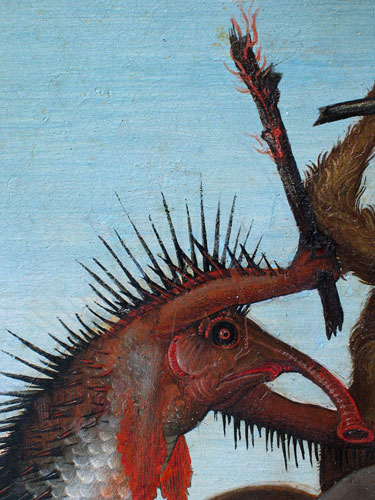
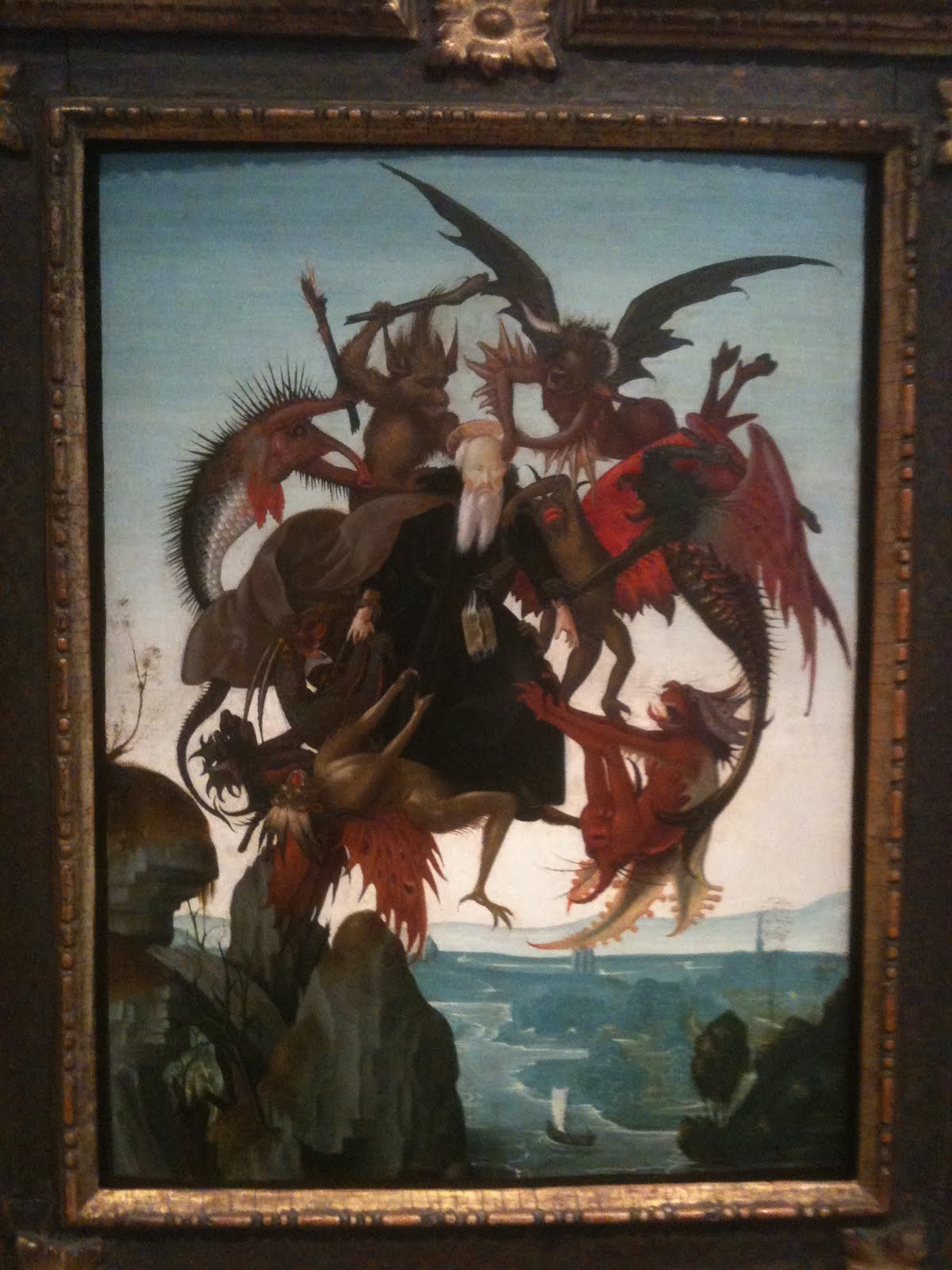
St Anthony Torment by the Demons, c. 1487, was painted by Michelangelo when he was only 13. The panel, 18 x 12 inches, is warped as happens to many panels over time.
The Torment of Saint Anthony is a small panel painting which was recently discovered to have been painted by Michelangelo in 1487/88. Intensive cleaning in 2008/9 led experts to believe that Michelangelo painted it when he was 12 or 13 years of age. Only four easel paintings by Michelangelo are known, and this one of is in North America, at Fort Worth’s Kimbell Art Museum.
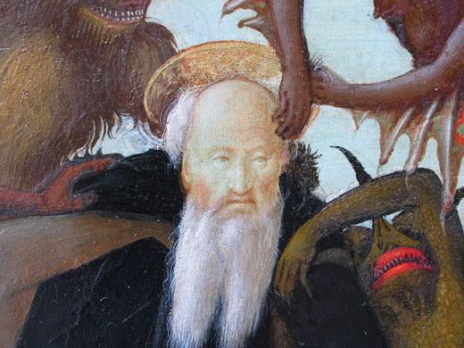
Michelangelo’s St. Anthony looks remarkably calm despite the demons who are scratching him
St. Anthony was an early Christian of the 4th century who lived as a hermit for many years. According to his biographer, the rigorous asceticism practiced by St Anthony in the Egyptian desert allowed him to float in the air, where he was attacked by devils trying to beat him to the ground. Anthony defeated these demons on more than one occasion, but not without a big struggle. It is not at all surprising that a young Michelangelo would have been attracted to this subject, because the artist always seemed to be battling his own internal demons, as the poetry he wrote and certain sculptures of slaves he made later in life would suggest.
Schongauer’s masterly engraving, St. Anthony Tormented by Demons, c. 1480, gave inspiration to the young Michelangelo
Michelangelo copied an engraving by a French-German artist, Martin Schongauer, who was Europe’s greatest practitioner of printmaking at that time. Schongauer used a vivid imagination and great technical ability to show light, shadow and texture. These beasts are composite creatures of fanciful reptiles, fish and flying monsters, who scratch, pull and club the holy man. Schongauer left the landscape minimal, a small edge of rocks in the lower right-hand corner which describe the mountain he lived on in isolation. Saint Anthony seems to be suspended in the air, in a radiating, circular composition. Schongauer used short dots or stipples to get his deepest shadows into the small metal plate used for engraving.
We don’t know the date of
Schongauer’s engraving–perhaps about 1480–but we know that his prints traveled throughout Europe. Michelangelo’s biographers said that he made a painting after a Schongauer print when he was 13, and this new attribution fulfills that void in our knowledge. This connection also shows the important role of prints in spreading artistic ideas and iconography, with the engraving passed into Italy from Germany.I have seen the Schongauer original in the print room of the National Gallery and its details are incredible. No wonder the young genius was impressed.
Although Michelangelo borrowed many details
from the great German engraver, he went to
the fish market to observe. According to the
Kimball Art Museum, Michelangelo scraped away
lines of paint in the body of the fish-like creature,
revealing the primer beneath the paint in the
parallel lines of hatching.
When Michelangelo copied Schongauer, he was equally adept at detail. He straightened Saint Anthony’s head, gave him a shorter beard and added an interesting landscape background. The brown-gray foreground is rocky and craggy, and in pristine detail. Critics of the Michelangelo attribution do not like the background. The painting has a high viewpoint just like St. Anthony who lived on a mountain near the Nile when the demons attacked and lifted him. So this landscape is a bird’s eye view of river, hills and sky with a low horizon line. Using aerial perspective, it gets more and more indistinct as it goes back into space and turns n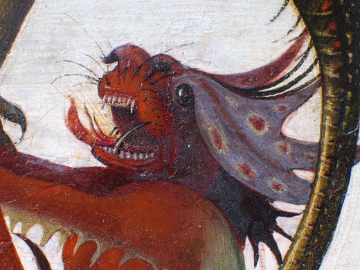 early white as it hits the horizon. The cool colors of the background and the low horizon line allow the figures to come forward and stand out with warm colors. This setting may be more reminiscent of the Arno in Florence than the Nile River, but European artists of the time were not familiar with the desert.
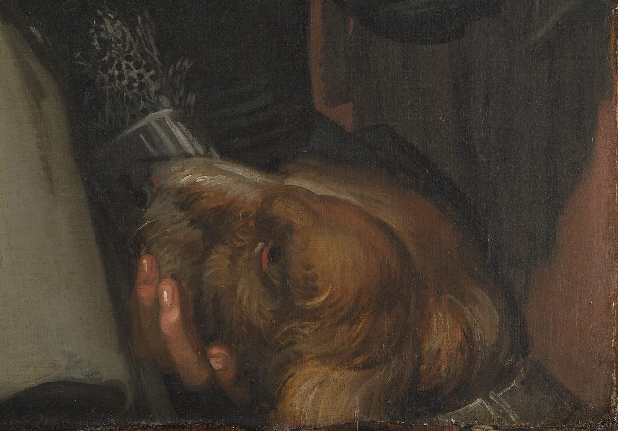
Photos above and right were taken by the Kimball to AP. This demon was painted in tempera and oil with magnificent detail. Color changes and the meticulous line technique are visible.
His mouth is ferocious.
Copyright Julie Schauer 2010-2016
by Julie Schauer | Nov 8, 2011 | Collecting and Collectors, Modern Art, Pop Art
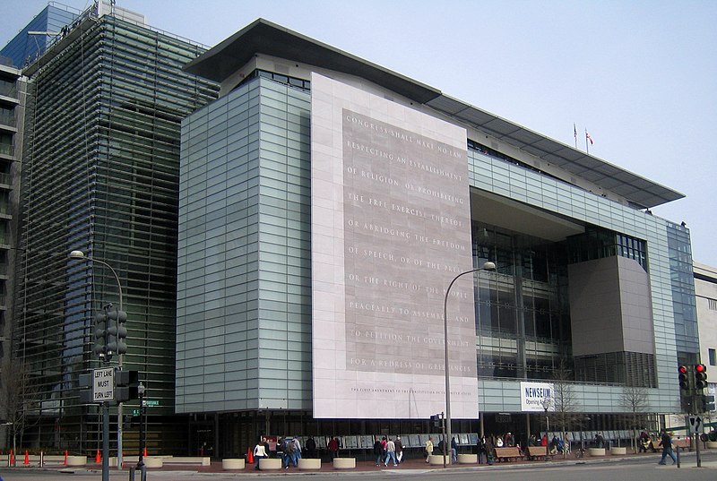
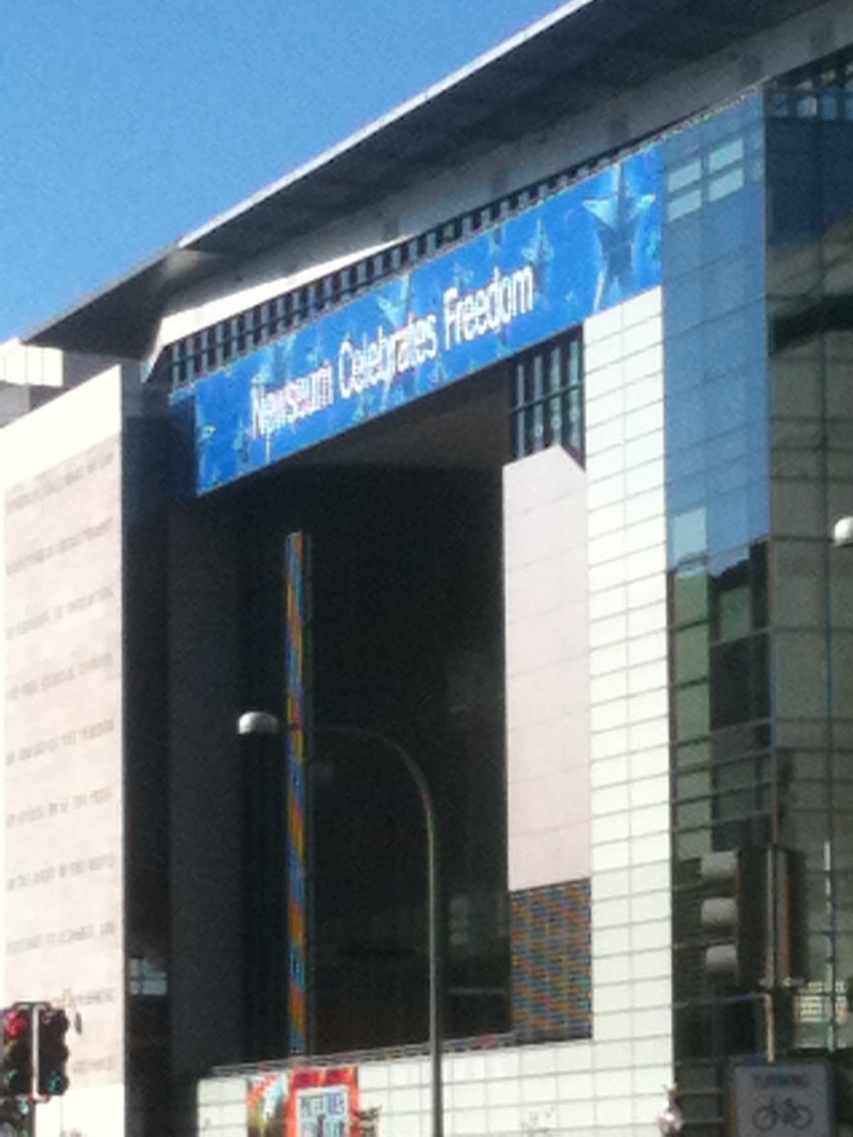
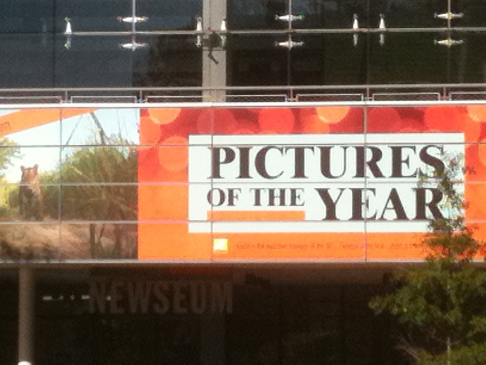
 The Newseum in Washington, DC, opened near the Mall in 2008. This 7-floor, 653 square-foot building on Pennsylvania Avenue is a museum of photographic, print and broadcast journalism. Its architecture combines ultra-sleek glass with reinforced concrete.
Instead of going to the National Gallery’s exhibition, Andy Warhol: Headlines, a trip to the Newseum across the street to learn about real headlines and the history of journalism w ould be more worthwhile. Warhol had a need for publicity, but that does not make his art interesting and real life news deserves more of the public’s attention. The 14 galleries and 15 theaters involve many historic events. A few news programs are broadcast here, including This Week.
Seeing a Warhol in person offers nothing new, unless the colors are wrong in reproduction. Size is the only difference between a real Warhol and a reproduction, but big does not make the art good. A concurrent Warhol exhibition at the Hirshhorn has very large pieces.
In contrast to most large National Gallery exhibitions which are teaming with visitors who can’t get their eyes off the paintings, prints or sculptures, a Warhol show gets visitors who walk through the exhibitions without stopping to look very frequently. On the Sunday I was there, no one had bought the $5 acoustiguide.
 The photo above is from Wikipedia
Why has the National Gallery mounted a Warhol exhibition? Very wealthy collectors who had been lured into the hype have paid $18 million plus for his works, investments which could be worth little in 100 years. A recent news flash showed that actress Sandra Bullock’s son received the gift of a Warhol print; even a one-year old baby is learning to be fashionable. While working at a blue chip Chicago art gallery (not as trendy as Hollywood or New York) in the 80s, I saw how some collectors buy to be in style or flaunt their prosperity rather than for love or interest in art. Collecting Warhol is often for people who fall prey to these scenarios.
A recent PBS documentary about Warhol showed how many of his ideas were not his own ideas, even the soup cans. Contrary to the myth Warhol perpetuated, he was not the inventor of Pop Art. Better than going to a Warhol exhibition, one is advised to watch the PBS show on DVD or watch his imitators, today’s reality trendsetters on TV.

Furthermore, he has completely done a disservice to artists by suggesting that the shallow, narcissistic and capitalistic instinct should be cultivated as art.
Before giving Warhol attention, we should recognize the drug culture he created with many young women and men at The Factory in New York, where workers help him mass produce images. The terrible addictions and deaths that some of these “groupies” experienced should not be disregarded, as he promoted behavior influencing their demise in order to cultivate followers. Warhol received too much attention in his life and he does not deserve it now.
Instead of looking at his uninspired work, viewers should gaze at some of the stunning photojournalism in the Newseum, works of visionary power and depth which can be both illuminating and moving to viewers. The “Pictures of the Year” exhibition just closed. However, a traveling exhibition of Pulitzer-Prize winning photographs is on view through December 2011.
If you disagree, please feel free to comment on this blog and explain why his art has any value. If Andy is genuinely important, there will be persuasive argumen ts in Warhol’s favor. But if Warhol defenders don’t come to the rescue, you will prove my point — that the public should stay home and avoid these exhibitions. Writing your differences of opinion, just like freedom for artists to express themselves, is all important!
The Newseum is funded by Freedom Forum, a non-partisan group group dedi cated to freedom of speech, freedom of the press and free spirit for all people. Its mission is “raise public awareness of the important role of a free press in a democratic society” and bring understanding between the public and the press. Like other institutions these days, it has hit hard financial times (isn’t it time for the price of an Andy Warhol to go down?) and staff had to be cut. The price of admission is now $21.75. But exhibits are interactive and you can spend an entire day there.
Finally, the true artist is one who would do art regardless of fame or fortune, someone like Van Gogh who sold no paintings in his lifetime but whose art truly moves people to this day. In a hundred years, Warhol will be forgotten because his art is lacking.
Here is a blogger who also has poor things to say about Warhol:
http://www.huffingtonpost.com/john-seed/warhol-soup-cans-analysis_b_894140.html
Copyright Julie Schauer 2010-2016
by Julie Schauer | Nov 2, 2011 | Contemporary Art, Encaustic, Exhibition Reviews, Local Artists and Community Shows, Painting Techniques
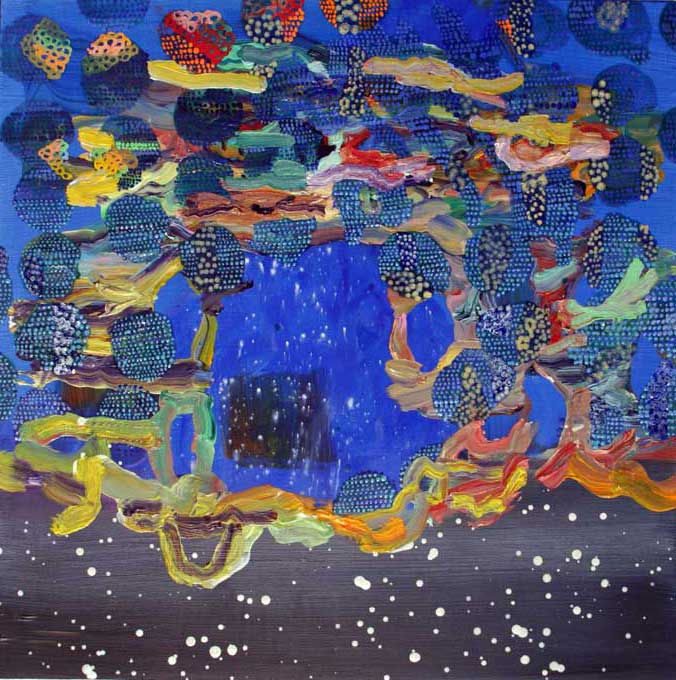
 Georgia Nassikas’s triptych, Stone Wall, is in the very old technique of encaustic..
McLean Project for the Arts is currently exhibiting three contemporary artists whose techniques involve layering. I was initially attracted there to look at Georgia Nassikas’ paintings made in an encaustic technique. In this medium, paint pigment mixes with beeswax to create a very thick and rugged texture, as seen in Stone Wall, above. Paint must be kept hot during application and it sets quickly. The technique was introduced in Egypt during the Roman Empire, in portraits of the deceased encased in mummies. Nassikas uses the wax from the hives of bees she keeps, as it is necessary to cover the large areas of the multi-layered canvases she paints. Many diverse, uneven shades of color show through the wax in both abstract and landscape paintings.
Carolyn Case has small intimate paintings of oil which also feature layering of a different kind. Her exhibition is called Accidently, On Purpose, suggesting the the works are spontaneous. However, portions of her paintings seem to be cut out or stenciled with different patterns. Even if we cannot figure out how she gets her multi-layered effect with different colors and patterns appearing in front and behind each other, we can get lost in the intricacies and details of her paintings.


Carolyn Case’s intimate paintings are 12″ x 12″
They are Part Potion, left, and Blue vs Blue, right, featuring multiple layers
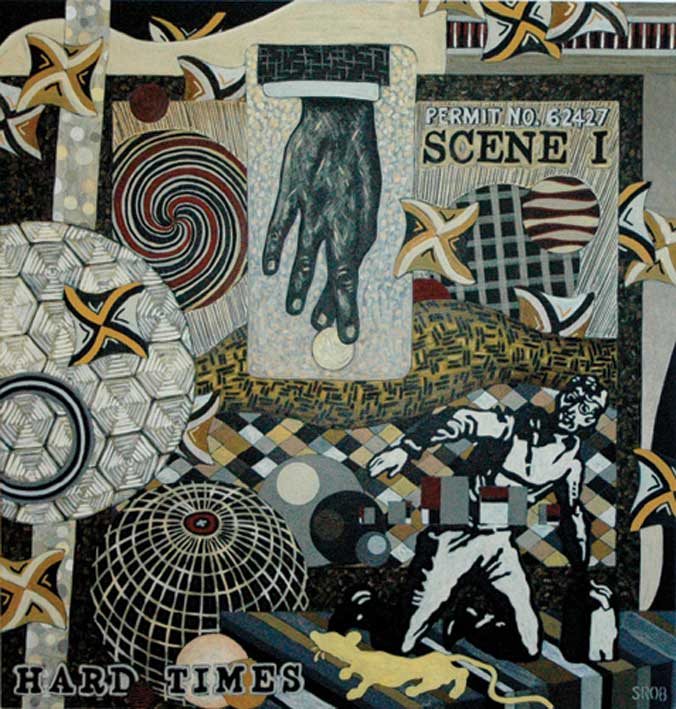
Finally, Seth Rosenberg’s paintings do not have the layers and textures of paint that Carolyn Case and Georgia Nassikas give to their oils and encaustics. However, his paintings from the “Cleveland Years: 2005-2009” give the illusion of overlapping of abstract and realistic forms.
 Hard Times represents the muted colors from Seth Rosenberg’s Cleveland years, a change from the colorful style of his Washington years.
He mastered making compositions which combine several different patterns in single paintings which resemble collages. Colors are minimal, almost monochromatic. This artist lived in Washington, DC, for twenty years, but spent five years in Cleveland until his sudden death in 2009. The Rosenberg exhibition originated at the Cleveland Museum of Contemporary Art. Kudos to a small community art center, McLean Project for the Arts, for bringing in such a good traveling exhibition.
Copyright Julie Schauer 2010-2016
by Julie Schauer | Oct 6, 2011 | 19th Century Art, Art Appreciation: Visual Analysis, Degas, Exhibition Reviews, Impressionism and Post-Impressionism, The Phillips Collection
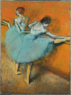
Two Dancers at the Barre, early 1880s−c. 1900, Oil on canvas, 51 1/4 x 38 1/2 in. The Phillips Collection, Washington, D.C. Acquired 1944. This painting is the centerpiece of the current exhibition.
Point….Flex…..Relevé—–these themes of ballet dancing were the obsession of Edgar Degas, an artist associated with Impressionism but known for his paintings and pastels of dancers. Washington’s Phillips Collection recently put their large painting, Dancers at the Barre, under their conservator’s care. In the process, they discovered wonderful color and took a deeper look into the process of this artist. The exhibition Degas’ Dancers at the Barre: Point and Counterpoint transports the viewer into Degas’ mind and back into the opulent Garnier Opera House which opened in Paris in 1875.
Most of the paintings, drawings and studies in the exhibition feature women, mainly ballerinas. After viewing the show, I once again get the feeling that Degas is the foremost among artists in his understanding of the strength of the female body, just as Michelangelo leads all artists in the understanding of the male bodies. However, unlike Michelangelo, Degas did not demonstrate knowledge of musculature or make his figures sensual. At times he appears to negate the underlying anatomy and distort in order to show the body’s expressive possibilities.
Ballet Rehearsal, c. 1885–91. Oil on canvas, 18 7/8 x 34 5/8 in. Yale University Art Gallery. Gift of Duncan Phillips, B.A., 1908 The composition is asymmetric, typical of Edgar Degas.
Degas’s compositions are about contrast: left and right, point and counterpoint, up and down, orange and blue-green, line and shape, solid forms but with diaphanous clothes, stability and movement. He portrays movement with color and with spontaneous, oblique compositions, allying him with the Impressionists. He exhibited with them from 1873-1886. Arguably, Degas was the greatest of all draftsman during the 2nd half of the 19th century, a time of tremendous artistic creativity.
Degas’s studies of dancers reveal his desire to understand and express the outward effects of stretch and stress, not inner musculature. At this time, ballet was not the idealized performance art we imagine. Instead young girls worked long hours under difficult conditions, with much strain on their youthful physiques. Under Degas’ interpretation, we witness the precision and tour de force of their labors. He drew and painted the rehearsals more frequently than actual performances. In Degas’s early paintings, the viewers admire the dancers’ poise and balance, as they move into difficult positions. In later works, such as the signature piece of the exhibition, we see much contortion and distortion, somewhat like a Cirque du Soleil performance. Through Degas’s drawings, paintings and pastels, we do not necessarily appreciate the body’s outward beauty, but we understand its possibilities, flexibility and the strength of human effort. The bodies’ movements are gestural and evoke strong feelings.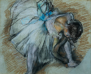
Dancer Adjusting her Shoe,1885, Pastel on paper, 19 x 24 in. Collection of The Dixon Gallery and Gardens, Memphis, Tennessee; Bequest of Mr. and Mrs. Hugo N. Dixon, 1975.6. Drawings repeat poses in his paintings and often show changes of the artist’s mind.
Degas is unique amongst the Impressionists in the strength of his line. Outlines at times contrast with the soft tutus of transparent colors. But his colors are sometimes brilliant, particularly oranges and blue-green. There are also vivid bows of pink, yellow, orange and red. He is superb at using color contrast to create light and shadow. Degas painted mainly indoors, but he used natural light from windows to sparkle on his dancers.
He normally works with off-center compositions, an effective foil to the dancers in their shoes. His asymmetry is like the fragile balance of the ballerinas on the tip of their toes: it can be a precarious balance. The art of the ballerina is to remain strong and poised in difficult positions, and Degas balanced his asymmetric compositions artfully, which was equally a challenge.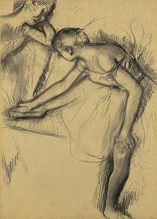
In a nearby gallery are the works of other artists, such as Manet‘s Spanish Ballet. Sculpture helped Degas refine his vision and the exhibition includes 3 bronze-cast sculptures. Like any great artist, he worked on the same themes over and over, same pose with slight differences. Several late works are pastels, a ideal medium for his methods. The Phillips’ exhibition also runs a filmed performance of Swan Lake.Hilaire-Germain-Edgar Degas, Two Dancers Resting, c. 1890–95, Charcoal on paper, 22 3/4 x 16 3/8 in. Private Collection.
Copyright Julie Schauer 2010-2016
by Julie Schauer | Oct 3, 2011 | Abstract Expressionism, Baroque Art, Modern Art, Painting Techniques
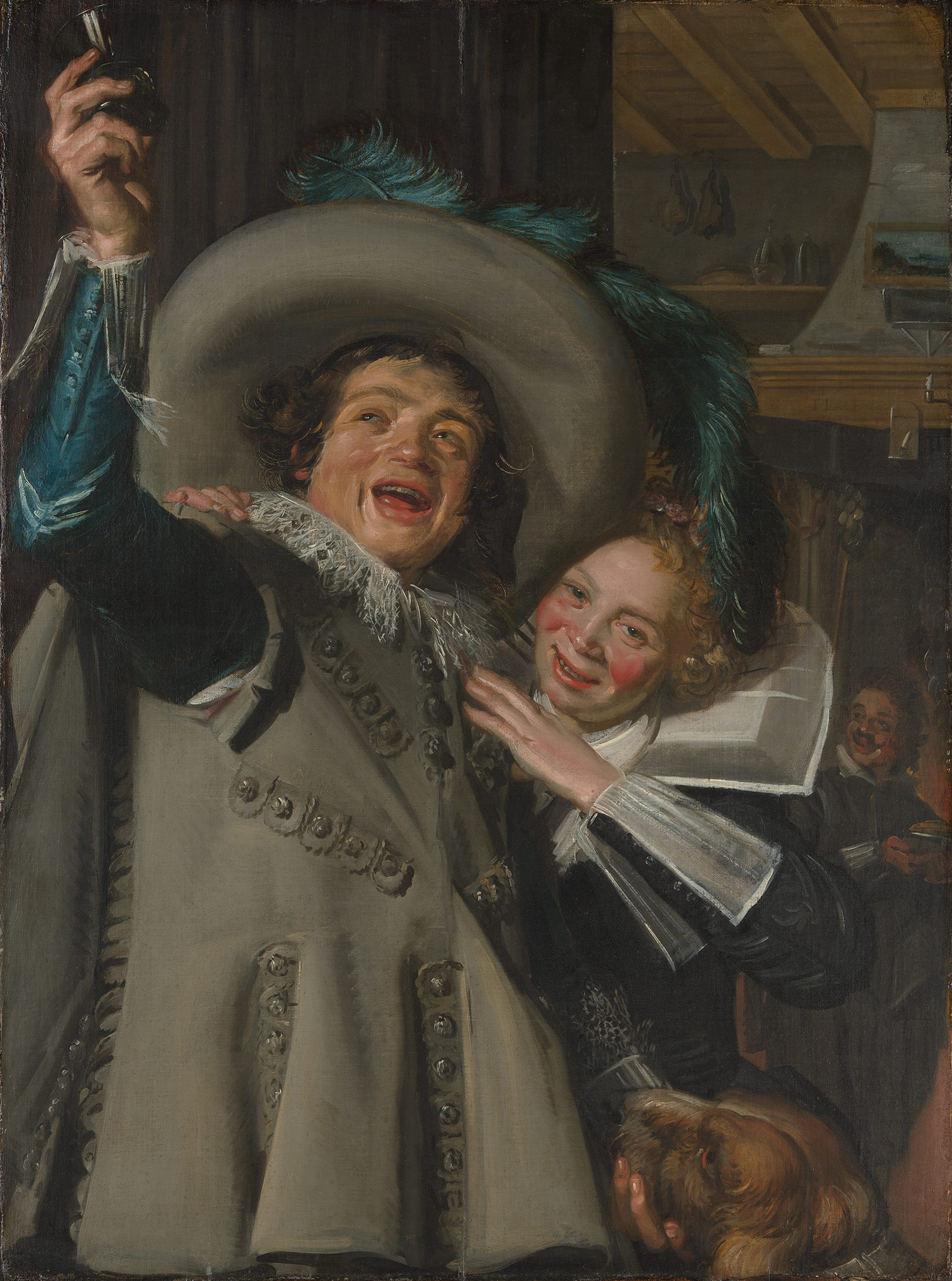
Frans Hals, Young Man and Woman at Inn, 1623 Metropolitan Museum of Art
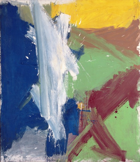 Willem de Kooning, Merritt Parkway, 1959, from the Detroit Institute of Art, Bequest of Hawkins Ferry, is in an exhibition at the Museum of Modern Art (called MoMA), New York
At first glance, Frans Hals and Willem de Kooning have nothing in common, other than being artists who originally came from the Netherlands. More than three hundred years separate their art and two very different New York Museums, the Met and MoMA, have exhibitions of their work. Hals was vividly realistic and de Kooning was a founder of Abstract Expressionism, but their common grounds are looseness of brushwork, luscious paint and bold energies going in all directions. In short, it is their
painterly techniques.
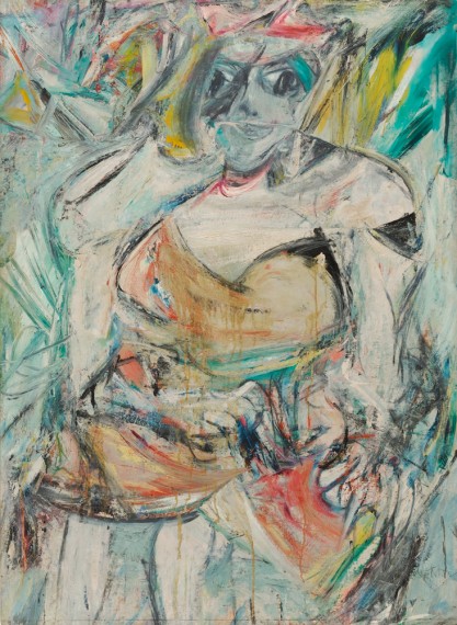 Women, II, in MoMA, part of the Blanchette Hooker Rockefeller Collection, is one of many paintings of women that de Kooning did in the 50s
Analyzing the radiating diagonals of Hals’ compositions and paint quality, we might wonder if de Kooning ‘s thick, diagonal brushstrokes, sometimes overlapping and transparent, were inspired by Frans Hals’ compositions. Both artists give the viewer a texture we would want to touch.
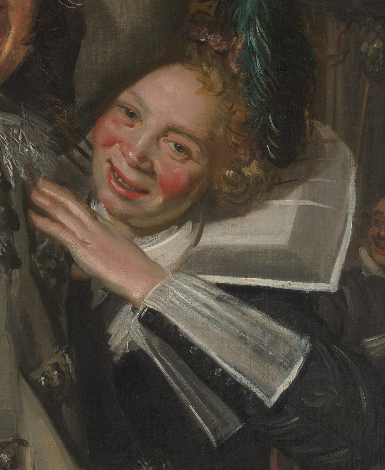 Frans Hals, detail of woman, from Young Man and Woman in an Inn
And then there is color; in Hals, it’s the beautiful blue sleeve and feathers of the man leaving a bar and the flushed cheeks of a woman grabbing his arm. Hals soaked her cheeks with redness from too much drink, but at a time when artists did not exaggerate color. Perhaps a coincidence, but de Kooning, particularly in paintings of women, dared to make the reds quite strong.
Women, II, shown above, also has a tactile quality to its blues, greens, red and white.
 The soft and furry dog is typical of Hals’ ability to paint wonderful, tactile effects
 In Young Man and Woman at the Inn, we witness Hals’ desire was to create a snapshot of time, a vivid realism that looks fresh and unplanned. He used a close-up view, a foreshortened upper arm and a jump into deeper space. The arm holding a glass pokes out of the picture frame. This view looks spontaneous, as if the couple did not know they’re being caught by the artist. A dog in the lower right hand corner completes Hals’ soft, painterly picture. This Dutch master is known mainly for his portraits.
De Kooning, on the other hand, immigrated to the United States and made his fame with the New York School, the Abstract Expressionists of the mid-20th century. The Met’s show of Frans Hals will end soon, but MoMA’s very large exhibition of de Kooning will continue until January 9.
Copyright Julie Schauer 2010-2016


Recent Comments