by Julie Schauer | Nov 8, 2011 | Collecting and Collectors, Modern Art, Pop Art
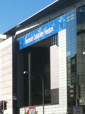 The Newseum in Washington, DC, opened near the Mall in 2008. This 7-floor, 653 square-foot building on Pennsylvania Avenue is a museum of photographic, print and broadcast journalism. Its architecture combines ultra-sleek glass with reinforced concrete.
Instead of going to the National Gallery’s exhibition, Andy Warhol: Headlines, a trip to the Newseum across the street to learn about real headlines and the history of journalism w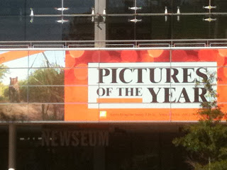 ould be more worthwhile. Warhol had a need for publicity, but that does not make his art interesting and real life news deserves more of the public’s attention. The 14 galleries and 15 theaters involve many historic events. A few news programs are broadcast here, including This Week.
Seeing a Warhol in person offers nothing new, unless the colors are wrong in reproduction. Size is the only difference between a real Warhol and a reproduction, but big does not make the art good. A concurrent Warhol exhibition at the Hirshhorn has very large pieces.
In contrast to most large National Gallery exhibitions which are teaming with visitors who can’t get their eyes off the paintings, prints or sculptures, a Warhol show gets visitors who walk through the exhibitions without stopping to look very frequently. On the Sunday I was there, no one had bought the $5 acoustiguide.
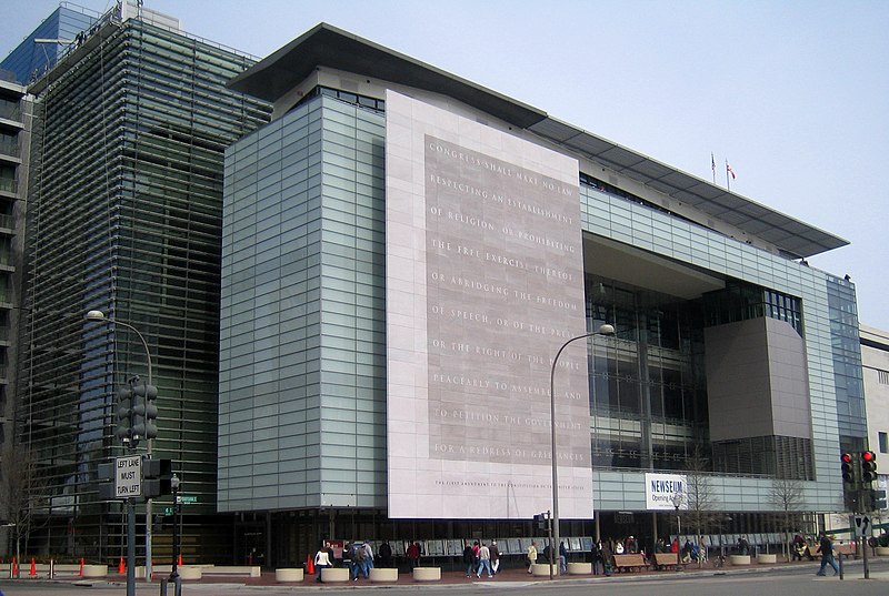 The photo above is from Wikipedia
Why has the National Gallery mounted a Warhol exhibition? Very wealthy collectors who had been lured into the hype have paid $18 million plus for his works, investments which could be worth little in 100 years. A recent news flash showed that actress Sandra Bullock’s son received the gift of a Warhol print; even a one-year old baby is learning to be fashionable. While working at a blue chip Chicago art gallery (not as trendy as Hollywood or New York) in the 80s, I saw how some collectors buy to be in style or flaunt their prosperity rather than for love or interest in art. Collecting Warhol is often for people who fall prey to these scenarios.
A recent PBS documentary about Warhol showed how many of his ideas were not his own ideas, even the soup cans. Contrary to the myth Warhol perpetuated, he was not the inventor of Pop Art. Better than going to a Warhol exhibition, one is advised to watch the PBS show on DVD or watch his imitators, today’s reality trendsetters on TV.

Furthermore, he has completely done a disservice to artists by suggesting that the shallow, narcissistic and capitalistic instinct should be cultivated as art.
Before giving Warhol attention, we should recognize the drug culture he created with many young women and men at The Factory in New York, where workers help him mass produce images. The terrible addictions and deaths that some of these “groupies” experienced should not be disregarded, as he promoted behavior influencing their demise in order to cultivate followers. Warhol received too much attention in his life and he does not deserve it now.
Instead of looking at his uninspired work, viewers should gaze at some of the stunning photojournalism in the Newseum, works of visionary power and depth which can be both illuminating and moving to viewers. The “Pictures of the Year” exhibition just closed. However, a traveling exhibition of Pulitzer-Prize winning photographs is on view through December 2011.
If you disagree, please feel free to comment on this blog and explain why his art has any value. If Andy is genuinely important, there will be persuasive argumen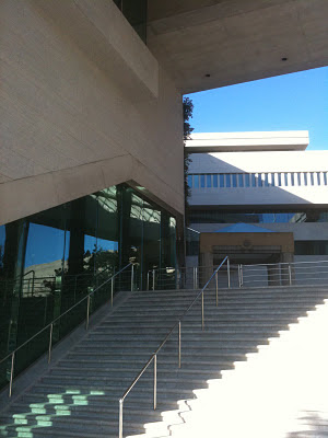 ts in Warhol’s favor. But if Warhol defenders don’t come to the rescue, you will prove my point — that the public should stay home and avoid these exhibitions. Writing your differences of opinion, just like freedom for artists to express themselves, is all important!
The Newseum is funded by Freedom Forum, a non-partisan group group dedi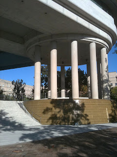 cated to freedom of speech, freedom of the press and free spirit for all people. Its mission is “raise public awareness of the important role of a free press in a democratic society” and bring understanding between the public and the press. Like other institutions these days, it has hit hard financial times (isn’t it time for the price of an Andy Warhol to go down?) and staff had to be cut. The price of admission is now $21.75. But exhibits are interactive and you can spend an entire day there.
Finally, the true artist is one who would do art regardless of fame or fortune, someone like Van Gogh who sold no paintings in his lifetime but whose art truly moves people to this day. In a hundred years, Warhol will be forgotten because his art is lacking.
Here is a blogger who also has poor things to say about Warhol:
http://www.huffingtonpost.com/john-seed/warhol-soup-cans-analysis_b_894140.html
Copyright Julie Schauer 2010-2016
by Julie Schauer | Oct 3, 2011 | Abstract Expressionism, Baroque Art, Modern Art, Painting Techniques
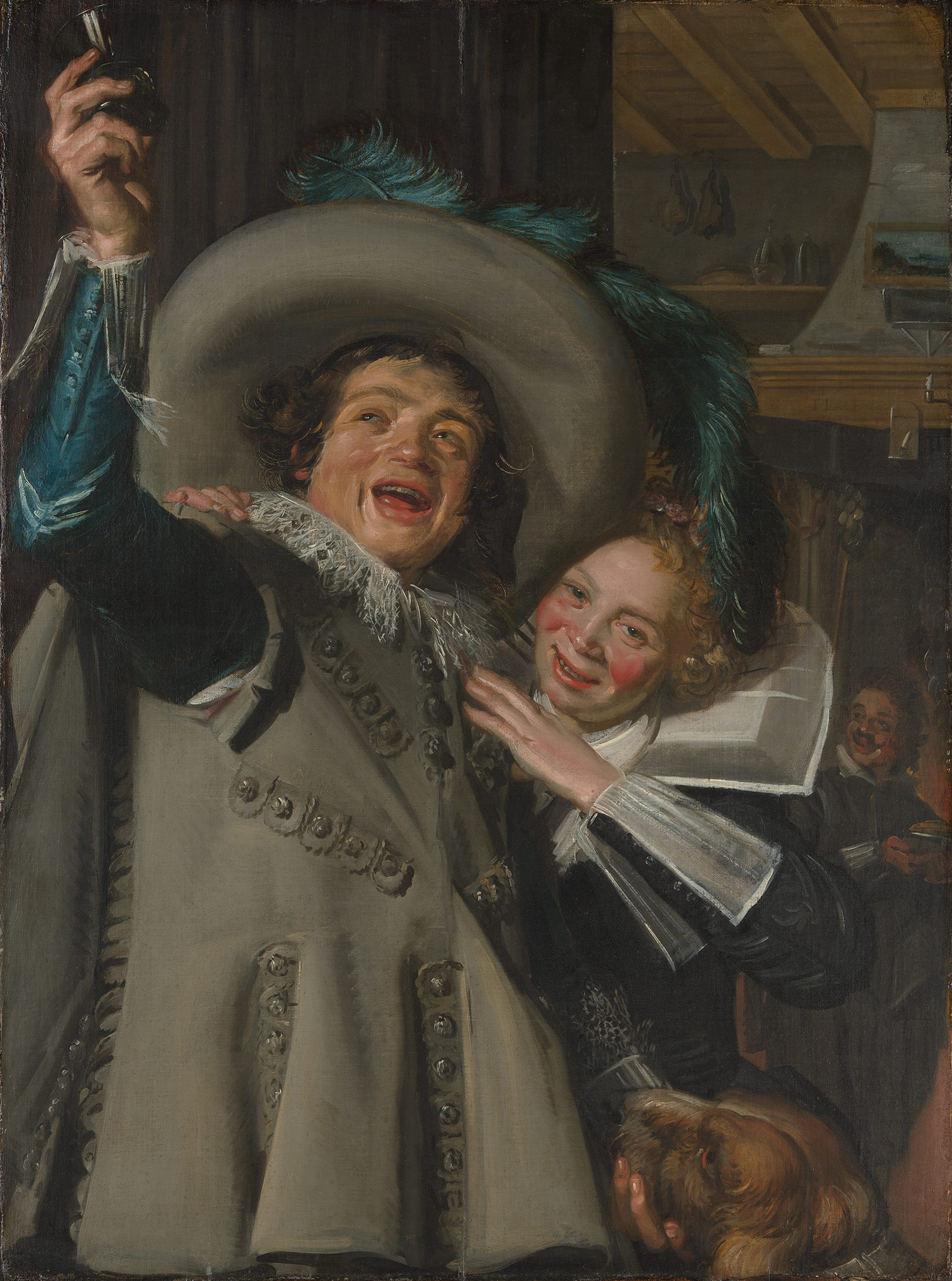
Frans Hals, Young Man and Woman at Inn, 1623 Metropolitan Museum of Art
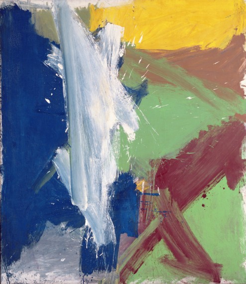 Willem de Kooning, Merritt Parkway, 1959, from the Detroit Institute of Art, Bequest of Hawkins Ferry, is in an exhibition at the Museum of Modern Art (called MoMA), New York
At first glance, Frans Hals and Willem de Kooning have nothing in common, other than being artists who originally came from the Netherlands. More than three hundred years separate their art and two very different New York Museums, the Met and MoMA, have exhibitions of their work. Hals was vividly realistic and de Kooning was a founder of Abstract Expressionism, but their common grounds are looseness of brushwork, luscious paint and bold energies going in all directions. In short, it is their
painterly techniques.
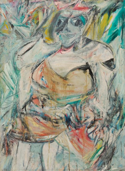 Women, II, in MoMA, part of the Blanchette Hooker Rockefeller Collection, is one of many paintings of women that de Kooning did in the 50s
Analyzing the radiating diagonals of Hals’ compositions and paint quality, we might wonder if de Kooning ‘s thick, diagonal brushstrokes, sometimes overlapping and transparent, were inspired by Frans Hals’ compositions. Both artists give the viewer a texture we would want to touch.
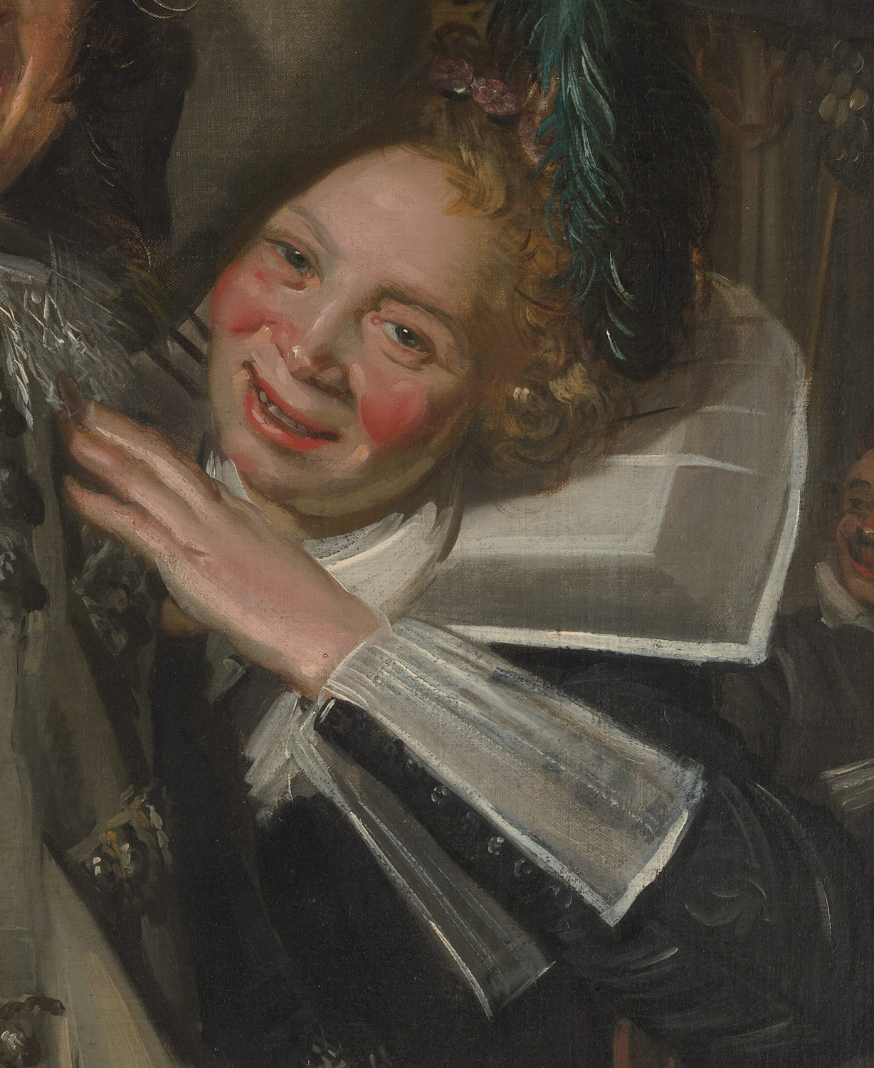 Frans Hals, detail of woman, from Young Man and Woman in an Inn
And then there is color; in Hals, it’s the beautiful blue sleeve and feathers of the man leaving a bar and the flushed cheeks of a woman grabbing his arm. Hals soaked her cheeks with redness from too much drink, but at a time when artists did not exaggerate color. Perhaps a coincidence, but de Kooning, particularly in paintings of women, dared to make the reds quite strong.
Women, II, shown above, also has a tactile quality to its blues, greens, red and white.
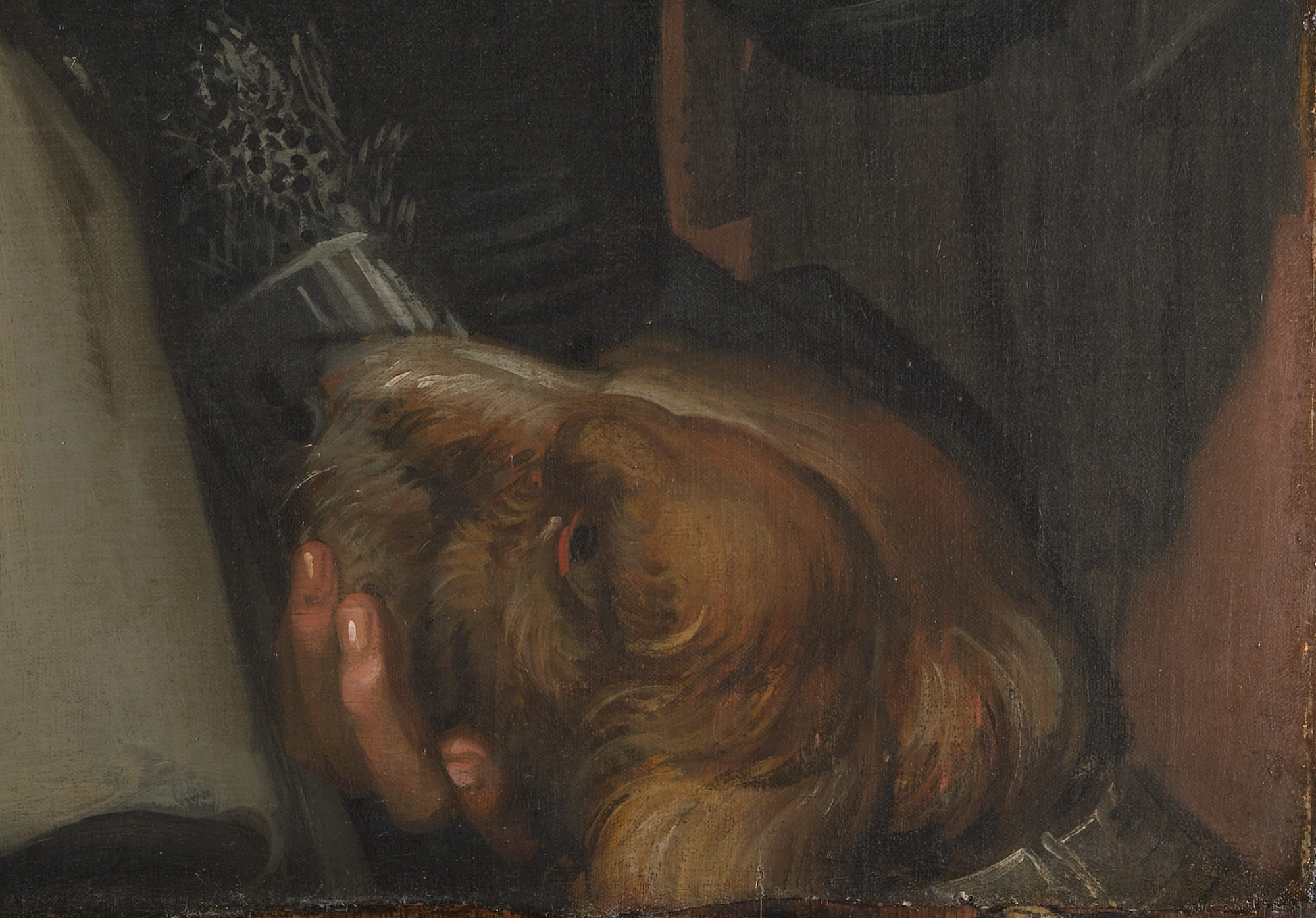 The soft and furry dog is typical of Hals’ ability to paint wonderful, tactile effects
 In Young Man and Woman at the Inn, we witness Hals’ desire was to create a snapshot of time, a vivid realism that looks fresh and unplanned. He used a close-up view, a foreshortened upper arm and a jump into deeper space. The arm holding a glass pokes out of the picture frame. This view looks spontaneous, as if the couple did not know they’re being caught by the artist. A dog in the lower right hand corner completes Hals’ soft, painterly picture. This Dutch master is known mainly for his portraits.
De Kooning, on the other hand, immigrated to the United States and made his fame with the New York School, the Abstract Expressionists of the mid-20th century. The Met’s show of Frans Hals will end soon, but MoMA’s very large exhibition of de Kooning will continue until January 9.
Copyright Julie Schauer 2010-2016
by Julie Schauer | Jul 23, 2011 | Exhibition Reviews, Expressionism, Franz Marc, Kandinsky, Modern Art, Paul Klee, The Phillips Collection
The Phillips’ Kandinsky exhibition centers around this painting from
the Guggenheim, Painting with White Border, 1913. It appears primarily
abstract, but has two specifically Russian iconographic references: a troika
(three horses) and St. George and the Dragon.
 The Phillips Collection’s current exhibition on Kandinsky not only provides insight into the thought process of this giant of early 20th century abstraction, but it also gives us a chance to compare the artists with whom he worked and influenced.
The Kandinsky exhibition is juxtaposed next to an exhibition of contemporary artist Frank Stella, whose sculptures are influenced by music of Domenico Scarlatti, called Stella Sounds. The metal and plastic sculptures point, poke off the walls and into space curving vigorously with color. They become 3-dimensional expressions of abstraction comparable to Kandinsky.
Frank Stella’s K43 comes out of the wall and into space. His sculptures
on view at the Phillips are based on the Sonatas of Italian composer Domenico Scarlatti
Both artists were inspired by music and Stella admits his appreciation for Kandinsky. Kandinsky named most of his early abstract paintings with titles suggestive of music: Improvisation, Composition, Impression, followed by a number. Ironically, the Phillips calls its exhibition Kandinsky and the Harmony of Silence: Painting with a Large White Border. The white border may be silent and restful, but the rest of this large painting has a rich depth, as each strong color pushes into space and clamors for attention.
The Phillips exhibition is educational, showing his drawings and his working process. Included is Sketch 1 for Painting with White Border (Moscow), a major holding of The Phillips Collection, as well as ten other preparatory studies in watercolor, ink, and pencil. But even more instructive is putting Kandinsky in perspective with his colleagues in two German art groups, the Blaue Reiter and the Bauhaus. If the great Russian painter and philosopher was the spiritual leader amongst the abstract artists centered around Munich, their spokesman, it is fitting because his art is the brashest and most assertive of the group.

The Phillips Collection has a superb painting by Franz Marc, Deer in the Forest, II. Looking forward to environmentalism, this painting hints at the destruction of nature in the 20th century. Unfortunately the artist himself died in World War I.
The Phillips owns many paintings done by Kandinsky’s colleagues : Franz Marc, the other leader of Der Blaue Reiter (The Blue Rider) who died in World War I; the nervous Austrian, Oskar Kokoschka; the whimsical, childlike but sophisticated Paul Klee, and the playful American-German Lyonel Feininger. It’s a special treat to see the other early masters of Expressionism.
 Lionel Feininger’s Village is a geometric construction of shifting planes of color.
Beginning in 1922, Kandinsky taught at the Die Bauhaus, a comprehensive art and design school. Paul Klee was one of his colleagues there, as well as in Der Blaue Reiter. Klee’s art is as abstract, automatic and free as Kandinsky. But his vision is more subtle, more simple and more symbolic. Having at least 5 paintings by Klee to compare, we clearly see the difference.
 Paul Klee,Tree Nursery, 1929, is one of several Klee paintings on view to compare with Kandinsky. In Klee’s paintings–not Kandinsky’s – we see the harmony of silence.
One of the great strengths of this Washington museum is its commitment to comparative exhibitions which give the viewer a fuller understanding of individual artists. Fortunately, the Phillips already has a large collection of early Modernism to supplement its exhibitions. The Kandinsky and Stella displays will be on view until September 4.
Copyright Julie Schauer 2010-2016
by Julie Schauer | Aug 13, 2010 | 19th Century Art, Art Appreciation: Visual Analysis, Exhibition Reviews, Expressionism, Modern Art, Munch, National Gallery of Art Washington, Printmaking
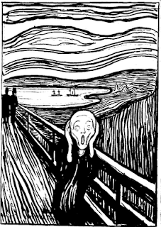 Edvard Munch’s The Scream is so powerful that the other works of this great Norwegian artist are overlooked. Other art by Munch articulated his feelings about the sad passages of life–sickness, death and breakups. Currently at The National Gallery of Art in Washington is an exhibition of Munch’s graphic art which represents many of the other themes he dealt with intensely, including illness, love, loss, and loneliness. The museum has pulled together prints from its own collection with images from two private collections to present a fuller view of the real artist. In fact, the sounds of silence in Munch’s work are as frequent and powerful as the voices of pain.
Munch also can be subtle. He explores the possibilities of images morphing into something else. In Waves of Love, we see a floating woman but don’t notice the man right away. Yet, when we discover him, the work becomes even more powerful.
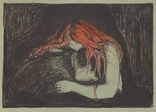 Munch, Vampire II, 1895, lithograph with watercolor, from the National Gallery of Art
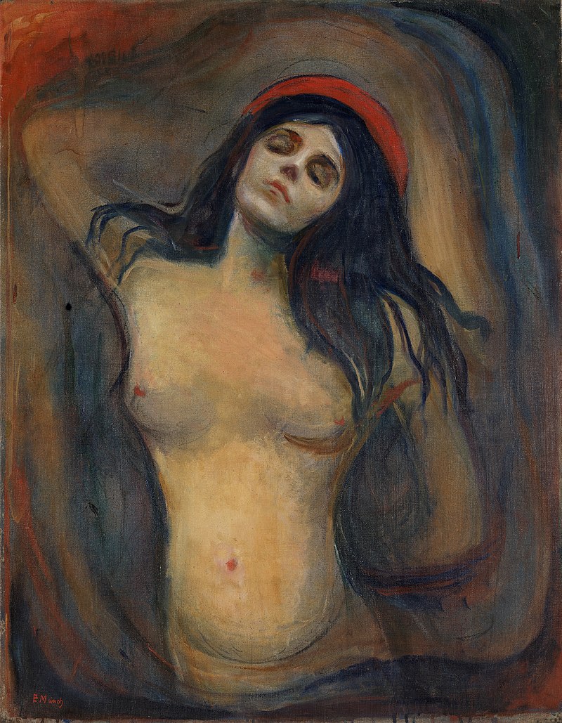
Whether there is silence or pain depends on who you are and when you see these works. Vampire II, above, can be seen as a comforting relationship, but the playwright August Strindberg renamed it with a more provocative title and Munch let it stand. Munch’s original title was Love and Pain, suggesting that falling in love ultimately causes pain, or, more optimistically, that love will console you from the other pains of life.The Vampire series of prints, three prints entitled Sin, and a group of images from the Ashes and Madonna series may suggest unkind, fearful views of women or anxiety in regards to relationships. However, Munch was deeply hurt by the loss of his mother at age five and his older sister when he was 14, both of whom he adored. They died of tuberculosis and he feared the same for himself. Interpreting his images as misogyny is too simplistic.
The Ashes series of prints, above, explores the turmoil after a breakup.
A group of prints entitled The Kiss can be seen as more harmonious symbols of love. One of these prints, an early intaglio example of The Kiss, is sensual in a idealized, classical form. You can see how it became a precursor to Munch’s symbiotic, unified idea of love in the woodcut versions, such as the one on the left, The Kiss IV of 1902. Here, Munch used different colors of ink and exploited the grain of wood to replicate the curves of the couple. Notice that the side view of “his” face is the front of “her” face. This print was certainly an inspiration for Gustav Klimt’s The Kiss–with its colors and mosaic patterns– much more popular and famous than Munch’s versions. Klimt borrowed Munch’s vertical emphasis and upward sweep of motion ending in the curving form of “oneness,” the back of a man’s head and the front of a woman’s face. In Munch’s version the man and woman’s face become one, a prelude to the unity of form that Constantin Brancu
 si used for his abstract rectangular block sculpture of The Kiss in 1910, where the eye of two becomes the eye of one.
Klimt’s The Kiss shows the influence of Munch, above left
The beauty of seeing these graphic images is to see how he reworked themes over many years, changing the content as he made minor changes to the works. His prints are done in multiple colors and states, and vary in graphic techniques, from woodcut to etching, lithograph, aquatint and more. The Impressionists influenced his color and Van Gogh inspired his line, but he tried to reduce expressions even further than Van Gogh, making each of his images powerful symbols of human experiences.
Two Women on the Shore focuses on one central standing woman, with the seated person behind her — perhaps alluding to an elderly figure in her life, a ghost from her past, an alter ego, or a projection of whom she will become. Munch probably wished to evoke different viewpoints and we are likely to experience her differently depending on our individual conception. The colors changed a great deal from print to print, and this series of prints evokes variety of meanings. I am particularly fond of the way Munch repeatedly used a large bright symbol resembling the letter i — the sunlight or moonlight reflecting on water.
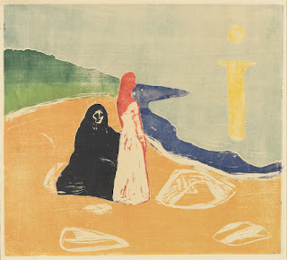 Two Women on the Shore, 1920s, color woodcut National Gallery of Art
Often the power in Munch’s imagery comes from the push-pull effect of space: figures in front, space rushing behind, or figures in both places so we can’t help but be aware of the drama of their distance. Ashes explores the debris left over at the end of a relationship. Repeatedly, Munch used the figure in a landscape as a vehicle to summarize feeling. His women can be brash, his men often hurting.
It’s likely that two of the great images of the early 20th century, Matisse’s Blue Nude and Picasso’s Les desmoiselles d’Avignon fell under the influence of Munch’s slightly earlier, unforgettable figures, the women in Ashes and Madonna. Some find Munch’s art too pessimistic; others say his art was less inspired after a breakdown at age 45 after which he gave up drinking.
Madonna
Copyright Julie Schauer 2010-2022
by Julie Schauer | Apr 28, 2010 | Ancient Art, Architecture, Greek Art, Modern Art, Sicily

The gigantic Temple of Olympian Zeus, Agrigento, was damaged by earthquakes before completion. This new statue, a flying bronze, echoes the temple’s fallen state. The wing overlaps and seems to touch a huge Doric capital to the right of the middle.

I was recently in Sicily to view mainly the ancient Greek sites. My camera broke and thankfully Kelli Palmer is letting me share her pictures of Agrigento, a city known for the beauty of its golden limestone.
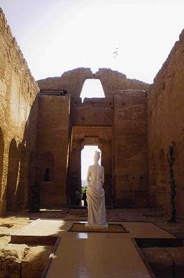
The Temple of Concord in Agrigento is one of the best preserved Greek temples standing today, probably due to the fact that it was used as a church in the Middle Ages. Right now contemporary sculpture is on display there and at the other temples in Agrigento. The combination of antique/modern — though not always successful — is particularly well done at this site because it does not detract from the ancient architecture while displaying the new work effectively. The sculptures seem to be made for this purpose.

A nude comfortably “bronzes”herself on the
porch of a 5th century BC Doric temple. It is
not known to whom the temp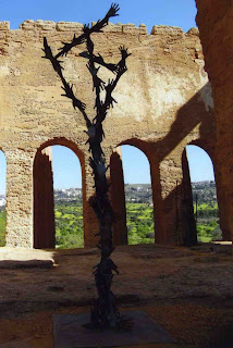 le wasdedicated
.
Bronze hands reach upward, perhaps
expressing aspirations appropriate to
either church or temple. The arches date from the middle ages. The medieval builders cut arches into the walls, changing the ancient temple’s “cella”
into a church’s nave.
The modern marble figure, draped in a fashion reminiscent of the Venus de Milo, is far more sensual than a cult statue to Demeter, Persephone, Aphrodite or even the Christian Mary would have been in a religious building. But it stands harmoniously in this room which had been converted into a church’s nave in the 6th century. The relationship of a church‘s nave to its side aisles is similar to the relationship of an inner temple (the cella) to the outer colonnade.
Copyright Julie Schauer 2010-2016
by Julie Schauer | Mar 21, 2010 | American Art, Exhibition Reviews, Georgia O'Keeffe, Modern Art, The Phillips Collection, Women Artists
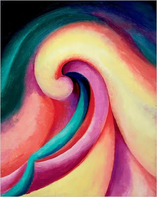 Series 1, No. 3, 1918, is from the Milwaukee Art Museum
Once again the Phillips Collection in Washington, DC, has put on a splendid exhibition of an early modern master, Georgia O’Keeffe: Abstraction. Although I’ve seen O’Keeffe exhibitions in the past, there is always something new to be seen in her work. Several compelling images that I had not seen before, especially from the Whitney Museum, a co-organizer of the exhibition, and the Milwaukee Art Museum, are in this show.
O’Keeffe’s abstract imagery is inspired by diverse subjects, more often natural than manmade–flowers, bones, mountains, aerial views, and the diverse places she lived, Wisconsin, Lake George, NY and New Mexico. Less well known is the fact that she lived in Charlottesville, Va., and some of her colors could easily be reflections of sunsets over the Blue Ridge Mountains. Even though a group of abstractions is inspired by music, one of the curators pointed out that Music, Pink and Blue, No. 2, resembles Natural Bridge, Va. The meaning of each single work is unique to the viewer; everyone who goes to visit the show is inclined to see something different and take their own inspiration from it.
The exhibition is enhanced by O’Keeffe’s charcoal drawings and the weather photographs of Alfred Stieglitz. One thing I recognized anew is the quality of O’Keeffe’s brushstrokes and how they reflect the particular form of each abstraction takes. Although photographs may provide a glimpse at her subtle blending of colors, it is only through seeing the exhibition that one can truly enjoy the wonder of O’Keeffe’s vision. It will be at the Phillips until May 9th, and then moves to the Georgia O’Keeffe Museum in Santa Fe.

Music, Pink and Blue, No. 2, from the Whitney Museum of American Art, New York
Copyright Julie Schauer 2010-2016
ould be more worthwhile. Warhol had a need for publicity, but that does not make his art interesting and real life news deserves more of the public’s attention. The 14 galleries and 15 theaters involve many historic events. A few news programs are broadcast here, including This Week.
ts in Warhol’s favor. But if Warhol defenders don’t come to the rescue, you will prove my point — that the public should stay home and avoid these exhibitions. Writing your differences of opinion, just like freedom for artists to express themselves, is all important!
cated to freedom of speech, freedom of the press and free spirit for all people. Its mission is “raise public awareness of the important role of a free press in a democratic society” and bring understanding between the public and the press. Like other institutions these days, it has hit hard financial times (isn’t it time for the price of an Andy Warhol to go down?) and staff had to be cut. The price of admission is now $21.75. But exhibits are interactive and you can spend an entire day there.





Recent Comments