by Julie Schauer | Jan 14, 2013 | 19th Century Art, Berthe Morisot, Impressionism and Post-Impressionism, Manet, Metropolitan Museum of Art, Musee d'Orsay, Portraiture, The Art Institute of Chicago, Women Artists
 |
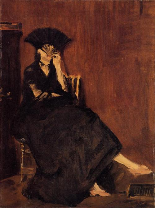
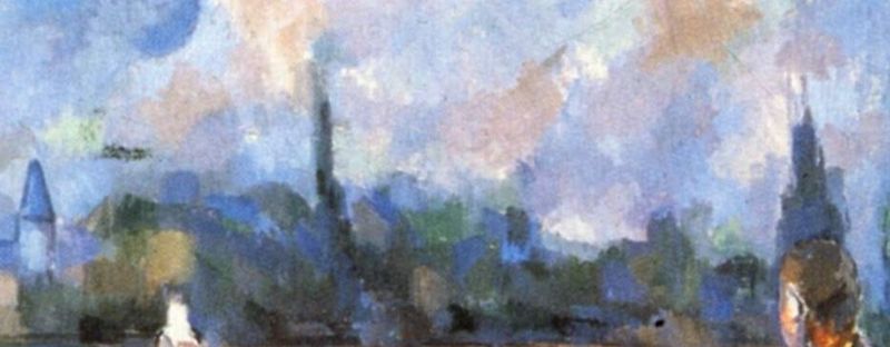
Manet, The Repose, 1870, Rhode Island School of Design. Berthe Morisot is at rest,
but the seascape behind her could symbolize an inner restlessness behind
her calm demeanor. |
Why hasn’t the love story of painters Édouard Manet and Berthe Morisot been told in film? (Both Manet and Morisot are represented in large numbers at the exhibition, Impressionism, Fashion and Modernity, formerly at Musée d’Orsay, but now at the Metropolitan Museum of Art in NYC and onto the Art Institute of Chicago this summer. Morisot was the subject of a large retrospective at Musée Marmottan Monet, Paris, last year, and her work, like much Impressionism, is so much better when viewed in real life rather than reproduction.)
Manet, a “people person” and painter of people, is the one artist of the past I would wish to meet above all others. Morisot, one of his muses, is the artist with whom I empathize more than any other. She loved in a painful way, but her only consolation was to marry his brother.
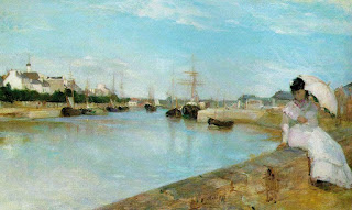 |
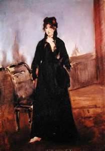
| Berthe Morisot, The Harbor at Lorient, 1869, National Gallery of Art, Washington |
Manet’s portraits of her are compelling. Manet , a man of paradox, painted realistic themes in an audacious style which was shocking to the mid-19th century. Yet he was conventional, proper, well-dressed and conservative in so many ways. His political ideas were forward-looking, but he was patriotic and enlisted in the National Guard during the Prussians’ siege of Paris in 1870. Deeply hurt by art criticism, Manet’s honor was also so important to him that he challenged an art critic to a duel by sword. Duels were remnants of the medieval era, very rare in 19th in 19th century France. The charismatic artist was the ultimate elegant Parisian, the first modern painter but deeply rooted in the past.
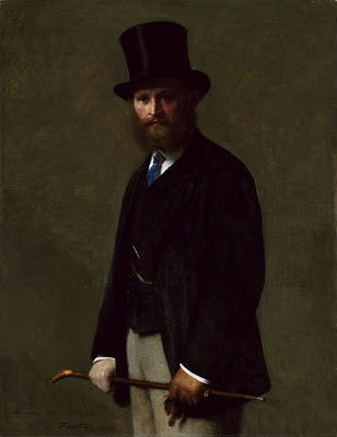 |
Portrait of Édouard Manet, by Henri Fantin-Latour, 1867, Art Institute of Chicago
Fantin-Latour introduced Manet and Morisot, an important personal
and artistic relationship. |
Last week I watched a movie about Modigliani, but the story of Manet and Morisot’s love is far more interesting. Although letters exist, they don’t tell the whole story and mystery remains. An actress with the soulful eyes and depth of Juliette Binoche would be an ideal choice to play Berthe, although there are younger stars like Audrey Tautou who could do justice to her character. I can think of many actors who could be the confidant, dapper Manet. With the right script and right director, this story in film could be even more interesting than films of artists like Jackson Pollock, Vincent Van Gogh or Frida Kahlo, artists known for their tempestuous lives.
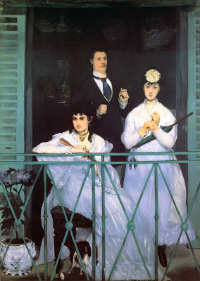 |
Manet, The Balcony, 1868, in the Salon of 1869,
now in Musée d’Orsay, Paris |
While waiting for this film to be made, we can track the story and trace much of the love and feeling in Manet’s 12 portraits of Berthe. She was his leading muse, as he painted her more times than anyone else. Many of Manet’s people are distinctive for their air of nonchalance, and they end up revealing themselves if only by expressing a desire not to let us get to know them. Berthe was different, as he tapped into her soul and seemed to know the longing and wistfulness that was inside. These portraits are tantalizing and mysterious, and they come in many forms, but leave us guessing the extent of their relationship. Manet’s The Repose, at the top of this page, shows Berthe relaxed and dreaming on a sofa, but the image of a Japanese sea storm above her suggest turmoil may lurk beneath her quiet demeanor.
Manet first painted Berthe Morisot in The Balcony, but with two figures not in communication with each other or with the viewer. Berthe’s black eyes grab all the attention. Hers is the only face which is revealing, while the others have expressive hand gestures. The second woman who posed for Manet, violinist Fanny Claus, appears vapid and vacant next to the pensive Berthe leaning on a green balcony. The man, painter Antoine Guillemet, enters from behind and a boy is vaguely seen in the black background. The womens’ white dresses are in daylight, vividly contrasting with darkness behind while a plush dog and porcelain planter below Berthe’s feet add textural richness of the painting. It is “focused on her air of compelling beauty, her mystery and the complex inner struggle reflected in her face.” (Sue Roe, reference below)
 |
| Manet, Berthe Morisot with a Muff, 1869 |
By most accounts, excluding her own, Berthe Morisot was stunning. Her beauty comes across in her deep, dark eyes and delicate, chiseled features we see in Manet’s portrayals of her. She was elegant and filled with social refinement. One contemporary account described her as so full of politeness and graciousness towards others as to make acquaintances of less manners uncomfortable. Yet she broke with convention in pursuit of career in art and in the pursuit of a art style outside of tradition.
She and Manet came from similar background, he as the oldest of three boys and she as the youngest daughter in a family of three girls and one younger boy. Their parents walked in the same social circles. He spent time in the Navy, and it was awhile before his father finally agreed that he could pursue a career in art instead of law. Though it was hardly typical of women to become painters at the time, it seems that the Morisot parents were encouraging of the daughters who studied under a famous artist, Camille Corot. Berthe was the most serious, the only one to continue that career through marriage and motherhood.
 |
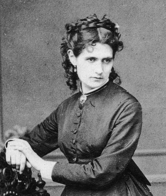
| Photo of Berthe Morisot, c. 1870 |
However, Manet was 9 years older and married when they met copying paintings at the Louvre copying in 1867. Each of them had already submitted paintings which had been accepted in France’s annual Salon, the yearly review of what was in judges’ views considered the best art of the time. Édouard Manet’s reputation was controversial on account of his subjects and the way he painted them. Berthe was very taken with him immediately, but of course younger French painters who were interested in breaking new artistic ground, including Monet and Renoir, also revered Manet.
 |
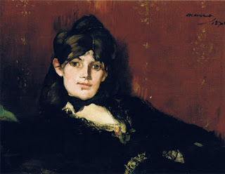
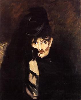
| Manet, Berthe Morisot with Fan, 1872 |
According to some sources, Berthe’s mother was her chaperone whenever she went to Manet’s studio, as befitted her social class. Who really knows? Manet wife was Suzanne Leenhoff, a Dutch piano teacher his father had hired years earlier to teach the Manet brothers. He married her shortly after his father died, perhaps out of obligation to protect the reputation of his father, a judge. Many sources staty that the older Manet was the father of a mysterious son she brought into the marriage, Léon Leenhoff, another favorite model of Manet’s. Léon always referred to Manet as his godfather, but may have been a half-brother. Manet’s marriage was not an easy love and he had other liaisons. However, he was always protective of his family name and loyal to this immediate family, although no children were born in the union. In his will, it was made clear the inheritance would pass from Suzanne to Léon. (Some writers believe Manet was the father. If that were true, would he be forced to cover up that the boy was born out of wedlock? No.)
The letters of Berthe Morisot were published by a grandson who edited them, perhaps leaving out things intended to remain private. In letters to her mother and sisters, she confessed strong feelings for Manet, fraught with jealousies, frustrations and the pain that it could not be more. Much of her self-doubt has to do with her frustrations as an artist, a situation most artists have at some point. Personally, I cannot stand when writers attribute female artists’ inner difficulties primarily to gender politics. Suggestions that Morisot and Manet were in competition or that he tried to hold her back are off the mark. In letters between the mother and other sisters, it’s clear that the mom feared for her youngest daughter who pined for Manet and sometimes didn’t eat. Berthe was unable to stay away from him, and he appears to have been quite attached, too. As friends, they shared an intellectual and artistic kinship. He painted many other women, repeatedly, but none with so much insight as those of Morisot.
 |
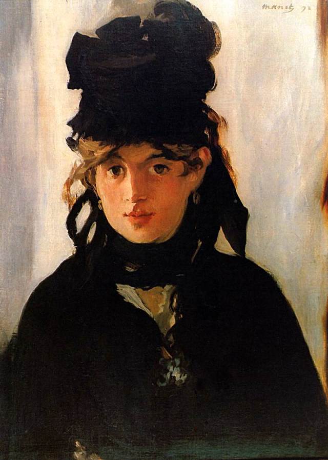
| Manet, Berthe Morisot with Violets, 1872 |
Berthe Morisot with Violets, 1872, seems for many observers to express the growing love between Manet and Morisot. To me, it is Manet’s painting of her in which Berthe seems the most forthright and the most confident. Berthe’s gaze is usually quite intense, a characteristic also found in the few photographs which exist.
However, in Berthe Morisot with a Fan, 1872, she covers her face, hinting that real intimacy with the artist was socially forbidden. Berthe Morisot with a Veil , 1874, also conveys the social blockage in the relationship. While working closely with Berthe, Manet began to loosen his brush work and get more of Impressionist swiftness to his paint. There is more spontaneity as time goes on and Manet adds many more light colors to his canvases.
Manet sometimes lightened his colors, but he rarely lightened his palette while painting Berthe Morisot. Does he see a sadness in her that does not brighten over time? Or is there a darkness that he sees and knows? Her hair was black and painting the contrast of exquisite blackness and lighter tones was his specialty. He certainly painted her with greater verve and style than many other portraits, including those of his wife and of Eva Gonzalès, a 20-year old student who came to studied under Manet. Berthe was envious of that relationship, although a portrait of Eva Gonzalès caused him much difficulty and was not successful.
 |
| Manet, Berthe Morisot in Profile, 1872 |
To a certain extent, the portraits seems to grow in their sense of intimacy as time goes on, and Berthe seems increasingly relaxed with Manet. Portait of Berthe Morisot in Profile, 1872, shows Berthe in movement with spontaneous gestures. Her expressive fingers and long hand add to a sense of elegance and she appears less serious than previous depictions. Clearly Manet found a fascinating subject.
Professionally, each artist helped and encouraged the other. On one occasion Manet complemented her on a painting and then started touching it up. She did not object and sent it to the Salon, where it was accepted. It was a painting of her mother and her pregnant sister, now in the National Gallery of Art, Washington, DC.
 |
| Manet, Berthe Morisot Reclining, 1873 |
When Degas, Pissaro and Monet wished to break out of the Salon and start their own salon des indépendentes in 1873, Manet refused to join them and opted only for the traditional road to success. This inner conservatism reflects a paradox in his character. He also advised Berthe Morisot not to rock the boat, not join in their venture, which became the first Impressionist exhibition and almost an annual event. Berthe, however, kept her own counsel and continued to exhibit with the Impressionists until 1886, when Impressionists were finally accepted and no longer needed an alternative venue. Of the 8 Impressionist exhibitions, the only one she skipped was in 1879, after giving birth to her daughter in November of the previous year.
 |
| Manet, Berthe Morisot in Mourning Hat, 1874 |
We know Berthe Morisot was highly determined to follow her chosen path and not be deterred by the man of her dreams when she disagreed. However, that doggedness often hid behind a shell of quietness and, at times, depression. Edouard Manet’s paintings of her variously capture her allure, her elegance, her intelligence and a pensiveness tinged with tragedy. He painted Berthe Morisot in a Mourning Hat in 1874, during the same year her father died. The texture is rough, the eyes are enormous and the color contrast is bold. Her color is pale and she appears emaciated. It’s an expression of the sadness she was holding deeply within her at the time.
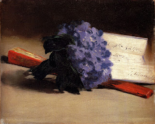 |
| Manet, Violets, 1872, was a gift to Berthe Morisot |
Manet gifted an exquisite still life of violets in 1872 to Berthe. He painted Violets with a swift, fresh and textural style, signed it and dedicated to her. Note that it includes a fan, a symbol Berthe holds in several of his earlier paintings of her. He only painted her in clothing, and she never painted him.
Berthe clearly gave Manet an outlet and a means to express his feeling for her in painting. In these portraits of her, we also see the workings of her psyche. On the other hand, he seemed to appreciate Victorine Meurent (the other favorite model who posed in Olympia, The Luncheon on the Grass, The Railway and later became a Salon painter), for the versatile expressions she could give to a painting’s message. In other words, paintings of Morisot are all about Berthe Morisot. Victorine would have had greater freedom than Berthe in some respects. Berthe Morisot and Mary Cassatt were expected to behave according to their social standing. (American Mary Cassatt and Edgar Degas were important Impressionists who had a professional relationship and bond of friendship similar to the Morisot – Manet duo. The time period was fascinating not only for how the artists related to each other, but to contemporary writers, poets, musicians and intellectuals.)
 |
| Morisot, Eugène Manet on the Island of Wight, 1875 |
 |
| Berthe Morisot, Self-Portrait, 1884 |
Édouard Manet suggested to Berthe that she marry Eugène his brother, a situation that promised they could continue indefinitely to see each other, but in the company of others. The mother’s criticisms of Édouard had been out protectiveness for the daughter, but her hesitation about Eugène was because he lacked a profession. Eventually, at age 33, Berthe and Eugène married. Four years later at age 37, she gave birth to her only child, Julie Manet. Berthe Morisot did many portraits of her daughter and her husband which suggest affection and domestic happiness.
By all accounts, Eugène Manet was kind and extremely supportive of his wife’s career and provided much administrative support for the Impressionists in general. His famous brother certainly overshadowed him in every way, but there is no evidence that he was jealous of his brother. He must have realized Berthe’s extreme fondness and probable preference for Édouard. Once they were married, the older Manet appears to have stopped painting her.
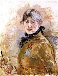
Compared to her brother-in-law Édouard’s work, Morisot’s own paintings have smaller and lighter brushstrokes, and a lighter palette. Her form is not deliberate as that of Manet. In a self-portrait of 1884, we recognize the same chiseled features and delicacy that Manet portrayed, and self-confidence. Their styles were already well developed when the met. Differences in their styles reflect the differences between their teaching: Morisot learned from Corot, the master of outdoor painting in diffused light of day, while Manet studied under Thomas Couture whose techniques are recognized in his heavier brushwork. Manet’s dark backgrounds reflect his admiration of Spanish painters Goya and Velazquez. Her forms were more diffused, silvery and more true to the goals of Impressionism.
 |
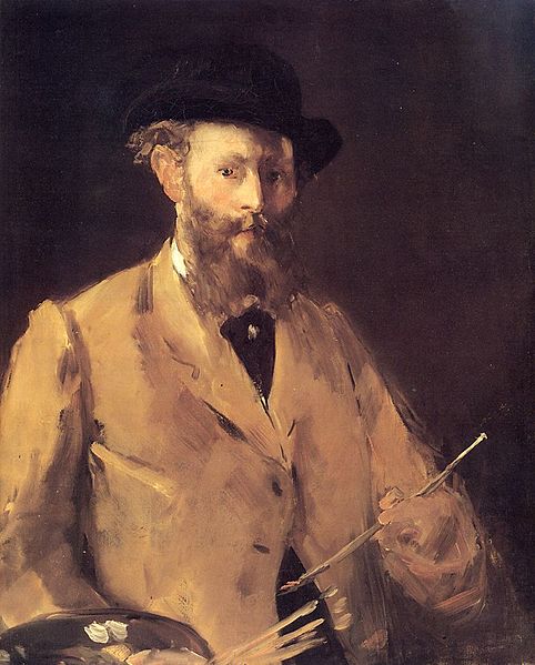
| Manet, Self-Portrait with Palette, 1878, sold at a London auction for approximately $33 million 2010 |
Though he was criticized in his early career, by the time the Impressionists were accepted and recognized, Manet was esteemed as the leader of new way of seeing and painting in a modern technique. Like his father, Manet received France’s highest honor, the prestigious Légion d’honneur before he died. Advocating for this success and protecting the honor of his family was extremely important in the end, despite his progressive political and artistic ideas. Both Édouard Manet and Berthe Morisot died fairly young, he of syphilis (like his father) in 1883, and she of pneumonia a little more than 12 years later.
 |
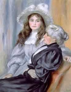
| Auguste Renoir, Portrait of Berthe Morisot and Julie Manet, 1894 |
|
(When the diary of Julie Manet was compiled and published many years ago, I read the book, Growing Up with the Impressionists, in which Julie Manet expresses her thoughts and feelings about her family and the important artists who were their friends. From what I remember, she seems to have had a fondness for everyone except Edouard Manet’s wife Suzanne, whom she found overbearing, perhaps reflecting her mother’s feelings.) Berthe Morisot was devastated when Manet died, and again when her husband Eugène died in 1892. Berthe and daughter Julie were extremely close. Berthe was nursing Julie who had pneumonia when she caught the bug and suddenly died in 1895. Her friends Renoir, Monet and Degas put together a large solo exhibition of her work shortly afterwards.
An orphan at age 16, Julie was left to the guardianship of painter Auguste Renoir and poet Stéphane Mallarmé. A few years later Julie married a painter, Ernest Rouart. She became an artist, as did cousins Jeannie and Paule Gobillard. Julie Manet lived until 1966, nearly 88 years, in contrast to her mother, father and uncle.
Renoir did several portraits of Julie Manet, including a painting of the Berthe Morisot with her daughter towards the end in 1894. Morisot‘s hair appears to have changed from black to gray rather quickly after the loss of Manets, both of Édouard and then her own Eugène, who she had undoubtedly loved dearly. He was kind and generous to her. When the older Manet died, his estate held a key indication of Berthe’s personal importance to him — seven of the paintings of her were found in his possession. While Manet’s wife had the financial and social benefits of marriage, he painted her less often.
 |
| Manet, Young Woman with a Pink Shoe |
|
In grad school, I took a seminar, Manet and Degas, and remember reading Manet and His Critics, as well as the novels of Émile Zola. Many books have come out since that time. Marni Kessler published an important article in The Art Bulletin about Manet’s paintings of Morisot, which I’ve not read. I’ve read The Private Lives of the Impressionists by Sue Roe and quoted her above; The Judgment of Paris by Ross King, and a biography, Rebel in a Frock Coat: Édouard Manet, by Beth Archer Brombert, each book very well documented. Impressionist Quartet, by Jeffrey Meyers, a book I’ve not read, insists they were lovers. Perhaps the most recent book to cover the Manet-Morisot relationship is Roberto Calasso’s book, La Folie Baudelaire, which has a chapter about the relationship as well as Manet’s connections to Degas.
Brombert says of Manet, “He hungered for critical and popular success but refused to yield to the taste of the day; he was the leader of a new school who dissociated himself from it as soon as it gained cohesion; he was a man of public diversion and the most private of lives.”
 |
| Morisot, Woman at Her Toilette, 1875-80 |
Manet’s greatness is in the paint and the experimental ways of presenting his subjects. At a time when painting had to compete with photography, he asserted the importance of texture and presented the ambiguities of modern life. I could not imagine Van Gogh without the influence of his rich, tactile paint and color juxtapositions as seen in the sofa of The Repose , the green of The Balcony and the lush purple Violets. Morisot’s style intersects with Manet’s at times, but in most ways she is closer to Pissarro, Renoir, Monet. She and Manet inspired each others’ artistic evolution, as did Degas and Cassatt, who excelled in the artfulness of their compositions.
Morisot’s Women at her Toilette, above, features a mirror and centers on a female figure, as in Manet ‘s very important painting, A Bar at the Folies-Bergère, but her tones are always more silvery and form is less defined. Morisot’s work is also a masterpiece, but the figure and mirror merge into the overall impression. Manet’s woman at the Folies-Bergere is an icon who reminds us of what remains when participating in the excitement of the fleeting, contemporary world. Manet is best known for painting ambiguities, while the purest Impressionist compositions of Morisot, Renoir and Monet keep the figure merely a part in the whole painted arrangement. In her modern compositions, Morisot holds her place in the path to 20th century abstraction.
Manet was the right person born at the right time to be pivotal in the changing world of art. Morisot loved him but was independent, carving out her own reputation, in her time and in our time. (Here’s a blog with a wide variety of Morisot’s paintings.) Having been soulmates unable to live together in love, Manet and Morisot respected each other until the end. Our pictures of them together remain in our imagination.
Copyright Julie Schauer 2010-2023
by Julie Schauer | Jan 10, 2013 | Art and Literature, Art and Science, Photography
 |
| Rosamond Purcell, Field of the Cloth of Gold, 2010 |
A group of pictures in the Folger Shakespeare Library’s exhibition this past fall, Very Like A Whale, fooled me. I thought artist Rosamond Purcell’s medium was some inventive watercolor, ink or acrylic technique. Was the room too dark, or are my eyes are going bad? To my surprise these pictures were photographs!
It was an imaginative way to portray Shakespeare, and artist whose myriads of visions who give us such a breadth of humanity.
Very Like a Whale took its exhibition name from a quote in Hamlet showing the human ability of interpreting single objects in multiple ways.
(Hamlet and Polonius saw different images in the same cloud.) Purcell curated the show, along with Shakespeare scholar and Folger Director Michael Witmore. This pair also collaborated on
a book
, Landscapes of the Passing Strange, using her photographic images with evocative quotations from Shakespeare. This great
review is by an English teacher.
 |
| Rosamond Purcell, Twenty Shadows |
The exhibition covered scientific knowledge in Shakespeare’s time using objects and prints created during the Renaissance. Quotes from various Shakespeare plays and Purcell’s color photographs were interspersed with these more scientific images in a suggestive and imaginative display. For example, Twenty Shadows, above, was one way of seeing Shakespeare, and the graphic presentation of viewing instruments is another. Near the demonstrations of refracting light and perspective was a quote:
“Each substance of grief hath twenty shadows
Which shows like grief itself but is not so;
For sorrow’s eyes, glazed with blinding tears,
Divides one thing entire to many objects
Like perspectives, which rightly gazed up
Show nothing but confusion, eyed awry
Distinguish form” — Richard II, Act 2, scene, lines 14-20
 |
| Rosamond Purcell, Awake Your Faith, 2010 |
Purcell’s photos make me think of change and of flux, but they also can be enjoyed as abstract compositions without the quotes from Shakespeare. Does she have a unique developing technique with strange chemical solutions? Probably not, but she takes her photographs from images reflected on antique mercury glass jars. The colors are beautiful, and the forms as they mesh and flow together are evocative. Surreal has been a word used to describe some of these works. Awake Your Faith, right, is a photo of a statue in The Winter’s Tale.
We may see something today and it could be gone tomorrow. What seems to be real may in fact not be real. That’s how nature works. And, as a quote from Shakespeare that was in the exhibition, says:
“Fortune is painted blind……….she is turning and inconstant, and mutability and variation;
and her foot, look you, is fixed upon a spherical stone, which rolls and rolls and rolls.
” — Henry V, Act 3, scene 6, lines 29-36 (The Folger used one of their Library’s images for this quote, but Durer also made an engraving of Fortune in the current National Gallery show.) Purcell’s interest in science is a constant, though. She is a collector of objects found in nature and has always combined science with her art. She is especially known for her photographic documentation of natural history collections. As an author, illustrator and/or photographer, Rosamond Purcell has written or illustrated 17 books.
Copyright Julie Schauer 2010-2016
by Julie Schauer | Dec 5, 2012 | Contemporary Art, Exhibition Reviews, Fiber Arts, Folk Art Traditions, National Museum of Women in the Arts, Women Artists
 |
| Photo courtesy of Rachael Matthews from the UK Crafts Council |
“High fiber” usually refers to a type of diet, but High Fiber at the National Museum for Women in the Arts demonstrates how “high art” integrates with the everyday world of a Folk Art. In the multi-media world of contemporary art, Fiber Art has gained recognition as a serious art form over the last fifty years. Like the art of glass making, fiber art was invented milleniums ago for utilitarian purposes. Knitting, sewing and weaving developed to meet basic needs of warmth and clothing, but as soon as pattern and design were involved, the process of making art began.
 |
| Knitted objects are often in Matthews’ work |
When the ancient artists/crafters knitted, knotted, wove or stitched to follow patterns or innate designs in their heads, they tied together movements between the left and right hands, bridging the creative left side of the brain with the analytical right side of the brain.
Contemporary fiber art may or may not have definite recognizable patterns and designs, but fiber art by definition is very tactile and textural. It may also be sculptural.
The National Museum for Women in the Arts’ exhibition of contemporary fiber artists, on view until January 6, 2013, features seven contemporary fiber artists, each working in styles completely different from the next one. High Fiber is the third installment of NMWA biennial Women to Watch exhibition series, in which regional outreach committees of the museum meet with local curators to find artists. The NMWA made a final selection of the seven artists representing different states and countries.
Rachael Matthews was a leader in a revival of knitting movement in the UK about 10 years ago. She is co-owner of a knit shop in London, Prick Your Finger, where one is more likely to see objects crafted of yarn, rather than a sweater. In Knitted Seascape, 2004, Matthews used illusionism much the way painters do; her hanging curtains, lace-like and pleated, open onto the seascape seen through a false window. She created depth similar to that in Raphael’s visionary painting. The vigorous texture into those waves, making their foam as real as in a Winslow Homer seascape, is not painted but knitted. Matthews also did a floor sculpture to which an hourglass and skull and crossbones attach. We are reminded of death in A Meeting Place for a Sacrifice to the Ultimate Plan, 2010. Another piece she supplied in the exhibition is a wedding dress, made as a collaborative effort where the individual pieces knit by different women form the whole. Collaboration and connection is certainly a part of emerging trend in Fiber Art.
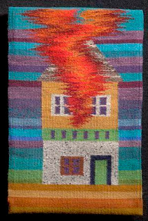
Louise Halsey, from the Arkansas council, is a weaver, who has spent years studying the ancient art of weaving, while teaching and doing workshops. Her work demonstrates vivid color and technical perfection, but also shares the artist’s own narrative ideas. The four works in this show are images of homes. On her website, she explains, “Recently I have been weaving tapestries using the house as a symbol for what I cherish. These images of houses include placing the house amidst what I see as threats that are present in the environment.” Dream Facade, at right, may warn of being too strongly possessed and owned by vanity, while Supersize My House, 2011, questions the dream of bigger and bigger homes.
Louise Halsey, Dream Facade, 2005
wool weft on linen warf – tapestry technique
The house becomes sculpture in large, colorful constructions by Laure Tixier, from France and representing Les amis du NMWA, are based on architecture from around the world. Like children’s forts out of blankets, architecture meets the basic need for shelter with imagination in design. She stitches the forms out of felt and very large Plaid House reflects the classical architecture of Amsterdam. Smaller houses are also on display and they reveal her domestic interpretations of diverse types of architecture, including that of the future. Tixier clearly has an interest in the symbolism and meaning of architecture in history.
Laure Tixier’s Plaid House , 2008, wool felt and thread, 90-1/2″ x 33-1/2″
Collection of Mudam Luxembourg
Debra Folz of Boston combines sophisticated cross-stitch patterns on furniture and mirrors with a sleek modern look. Her works are a contrast to the homespun beauty of some of the works described above, but she was trained in Interior Design. The threads are small and look mechanical but can have depth, control, color harmony and pattern. Mixing thread with a industrial materials may sound discordant, but this harmony of opposites is beauty!
Debra Folz, XStitch Stool, 2009. Steel base,
perforated steel and nylon thread, 20 x 14 x 12 in
Steel is the canvas for embroidery.
 |
| Beili Liu, Toil, 2008, Silk organza,72 x 36 x 8 in |
Homes and their contents give security and comfort, but not all works of art in the exhibition have a domestic meaning. There are sculptural wall hangings and installations in the NMWA’s show. Beili Liu, recommended by the Texas State committee, spun strips of silk, a material traditionally associated with China, her country of origin. For Toil, she burned the edges of silk fabric with incense before winding the strips into the funnel-shaped projections that point off the wall. These forms twist and turn in various directions — like miniature tornadoes — creating paths and shadows on the wall. A variety of beige and brown tones add to the richness of this view. Liu’s larger Lure Series (not on view) installations use thread to recall Chinese folklore, she has that is said her work highlights the tensions between her Eastern origins and Western influences. She bridges these gaps well. In fact, fiber art is all about connecting.
Fiber Art seems to be on the verge of asserting new importance into the world of art. Jennifer Lindsay, one of my former students from the Smithsonian Associates and Corcoran College of Art and Design’s Masters Program in the History of Decorative Arts, coordinated the public outreach, the design and collaborative installation of the Smithsonian Community Reef. The replica of a coral reef in crochet made expressly for the Smithsonian National Museum of Natural History’s 2010-2011
expressly for the Smithsonian National Museum of Natural History’s 2010-2011 Hyperbolic Crochet Coral Reef project, is now on view in the Putman Museum of History and Natural Science in Davenport, Iowa, until 2016.
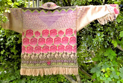 |
| Jennifer Lindsay, Cowgirl Jacket is a memento mori to Frida Kahlo, photo by Judy Licht |
Jennifer also dyes her own wool yarns and uses them to make intricate knitted and crocheted clothing, examples of which are shown here. She calls her cowgirl jacket a memento mori for Frida Kahlo. It uses nearly every knitting stitch available. Note the skeletons which link this design to El Dia de los Muertos. Memento mori is a reminder of death.
 |
| Lindsay’s Russian Star, photo by Judy Licht |
Getting back to the women’s museum, in the permanent collection, there are other works of fiber or those that remind us of fiber. On the 3rd floor of the NMWA, Remedios Varo’s Weaving of Space and Time is on loan along with two other works by Varo. The oil on masonite painting uses a symbolic circle to magically pull together the opposites of male and female figures, representing time and space. Within the circle are threads, not real threads but painted threads in light glazes that weave together ideas. Nearby is also a Judy Chicago painting whose circular painted form in acrylic and airbrush resembles the type of patterning with which traditional fiber artist created.
NMWA also has a piece by Magdalena Abakanowicz, one of the best known fiber artists of today. Four Seated Figures are of her recognizable life-size figural types made of fabric. The same, yet different, these abakans are representative the anonymity and uniformity of communist society in Poland, what she has known during the bulk of her life. Born in 1929, to Abakanowicz is accustomed to living in conditions which repressed individual creativity and intellect in favor of the collective interest.
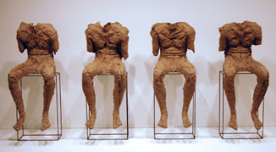 |
Magdalena Abakanowicz, Four Seated Figures, 1974-2002, burlap, resin, metal pedestal
figure: 115 cm, 55 cm, 63 cm pedestal: 76 cm, 47 cm, 23 cm
coll. The National Museum of Women in the Arts |
Finally, we can be reminded of the diverse women came together for their quilt-making art who in a film of 1995 called How to Make An American Quilt, including Maya Angelou, Anne Bancroft, Ellen Burstyn, Alfre Woodard and Winona Ryder. Quilting is one the most lasting forms of Fiber Art, embedded into so many folk art traditions. In the end, the making of a quilt is compared to life: “As Anna says about making a quilt, you have to choose your combination carefully. The right choices will enhance your quilt. The wrong choices will dull the colors, hide their original beauty. There are no rules you can follow. You have to go by your instinct. And you have to be brave.”
It’s with fibers that women can connect and that the women of history are tied to the women of today.
Copyright Julie Schauer 2010-2016
by Julie Schauer | Nov 28, 2012 | Architecture, Christianity and the Church, Mosaics, Sculpture, Sicily, The Middle Ages
 |
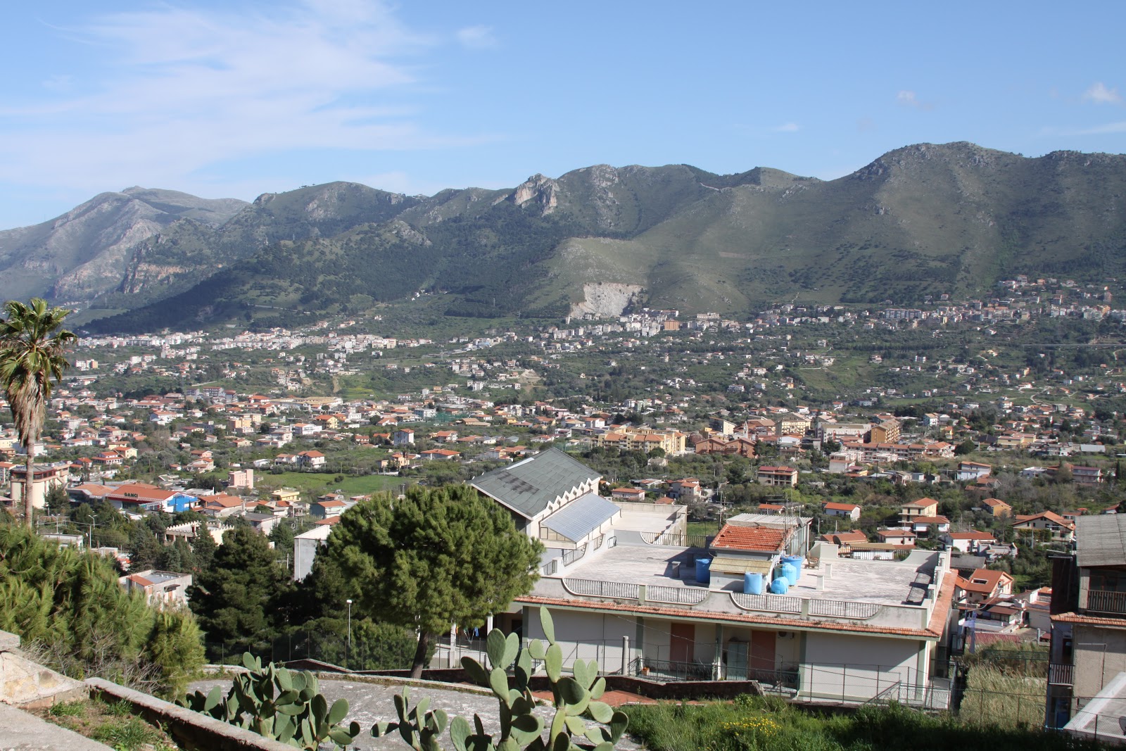
Sicily was controlled or settled at various times by Carthaginians, Greeks, Romans, Saracens,
Normans and Spaniards. This view is Monreale, in the north, east of Palermo. |
 The island of Sicily has a central location in the Mediterranean Sea which has made it the most conquered region in Italy, and perhaps the world. Even the Normans who ruled England also went to Sicily. Despite the violence of the Middle Ages, today we can recognize that era in Sicily as providing an example of cross-cultural cooperation which is to be admired. Islam, Judaism, Greek Orthodoxy and Roman Catholicism lived in tandem and with tolerance during most of that period. The different religious and cultural groups poured the best work of various artistic traditions in to the building of Monreale Cathedrale, about 8 miles outside of Palermo.
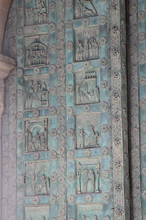 |
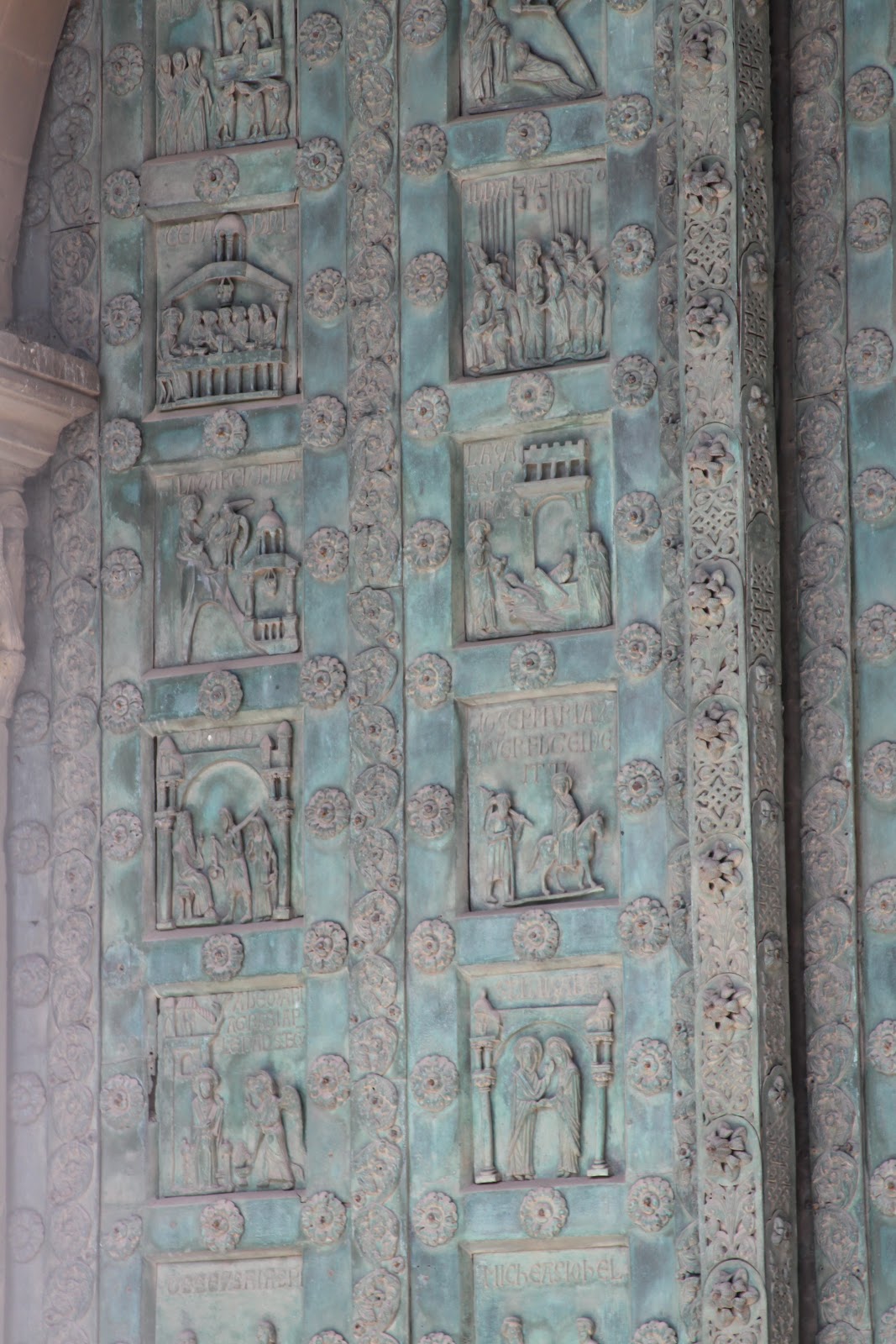
Bonnano of Pisa cast the bronze doors
in 1185 |
A Norman ruler, William II (1154-89), built Monreale Cathedral between 1174 and 1185. When the Roman Empire first became Christian, Sicily reflected the ethnic Greeks who lived on the island. In the 8th century, Saracens conquered Sicily and held it for two centuries, although a majority of residents were Christians of the Byzantine tradition. William the Conqueror’s brother Roger took over the island in 1085, but allowed the other groups to live peacefully and practice their religion. Normans, Lombards and other “Franks” also settled on the island, but the Norman rule between the late 11th and late 13th centuries was quite tolerant. By the 13th century, most residents adopted the Roman Catholic faith. Germans, Angevins and finally, the Spanish took control of the island.
 |
This pair of figural capitals in the cloister could be a biblical
story such as Daniel in the Lion’s Den or even a pagan tale |
Monreale Cathedral was built on a basilican plan in the Romanesque style that dominated Western Europe in the 12th century, although the Gothic style had already taken hold in Paris at the time of this building. It is based on the longitudinal cross plan with a rounded east end. Two towers flank the facade. (This Cathedral ranks right up with Chartres and Notre-Dame of Paris, as one of the world’s most beautiful churches.)
 |
Capitals feature men, beasts and beautiful
acanthus leaf designs |
In the artistic and decorative details, there is great richness. The portal has one of the few remaining sets of bronze doors from the Romanesque period. These doors were designed and cast by a Tuscan artist, Bonanno da Pisa. A cloister, similar to the cloisters of all abbey churches has a beautiful courtyard with figural capitals. Its pointed arches betray Islamic influence. The sculptors who carved the capitals are thought to have come from Provence in southern France, perhaps because of similarity in style to abbey churches near Arles and Nîmes, places with a strong Roman heritage. However, on the exterior apse of the church is a surprise. It has the rich geometry of Islamic tile patterns. Islamic artists who lived in the vicinity of Monreale were probably called upon to do this work.
 |
| Islamic artisans decorated the eastern side of the church with rich geometric patterns |
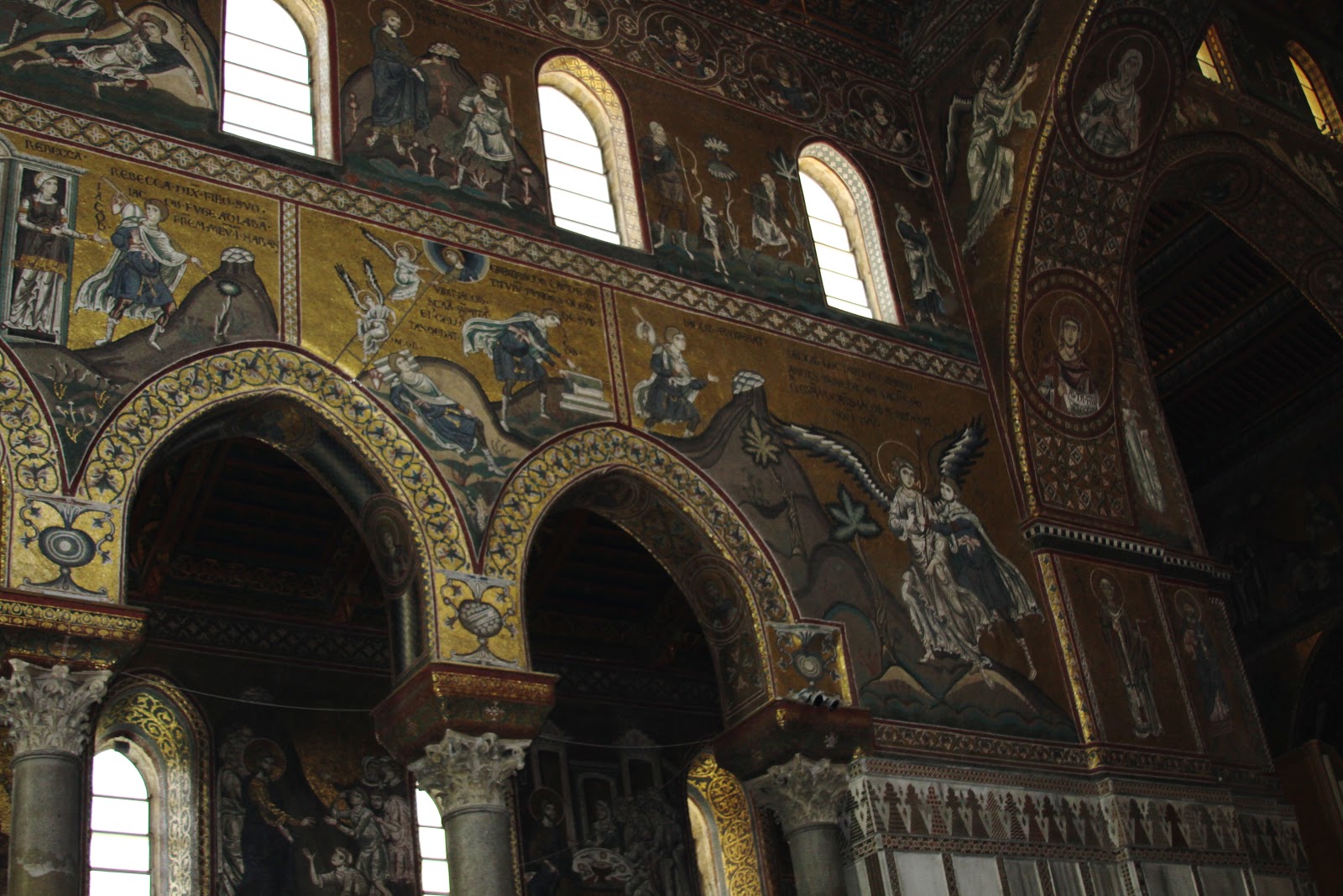
The Greek artists who decorated the Cathedral’s interior were amongst the finest mosaic artists available. The Norman ruler may have brought these great artisans from Greece. Monreale Cathedral holds the second largest extant collection of church mosaics in the world. The golden mosaics completely cover the walls of the nave, aisles, transept and apse – amounting to 68,220 square feet in total. Only the mosaics at Hagia Sophia in Istanbul, Turkey, cover more area, although this cycle is better preserved. The narrative images gleam with heavenly golden backgrounds, telling the stories of Biblical history. The architecture is mainly western Medieval while imagery is Byzantine Greek.
 |
| Mosaics in the nave and clerestory of Monreale Cathedral |
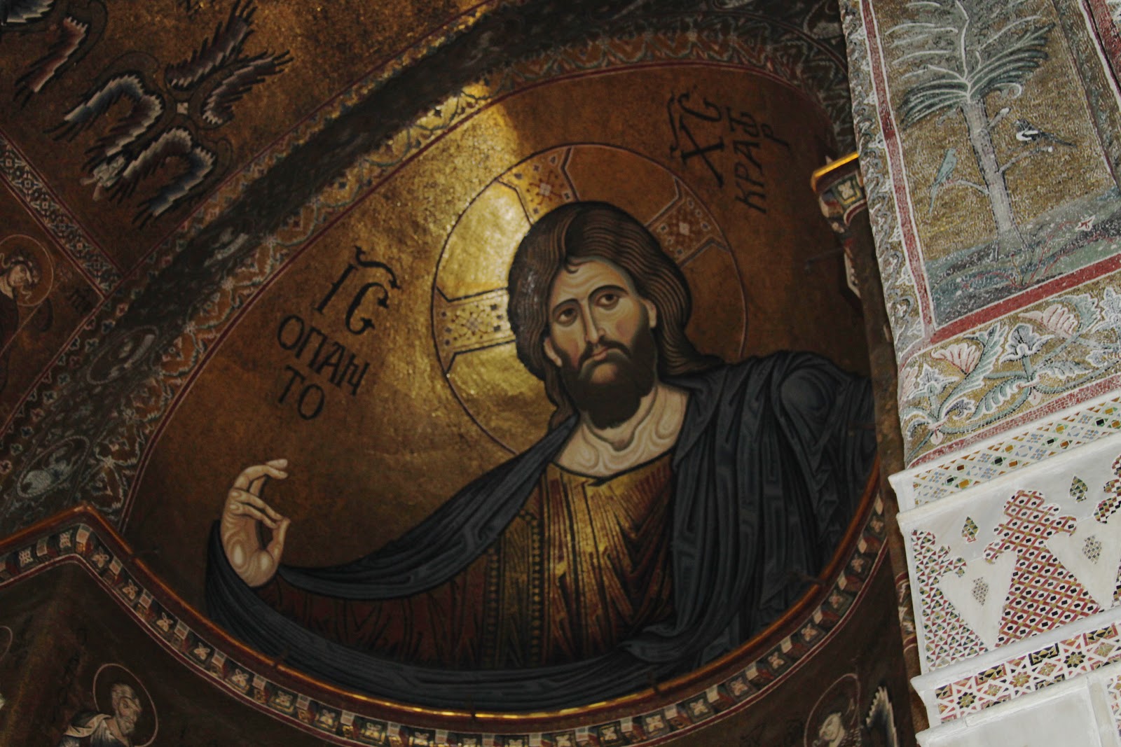
A huge Christ Pantocrator image that covers the apse is perhaps the most beautiful of all such images, appearing more calm and gentle than Christ Pantocrator (meaning “almighty” or “ruler of all”) on the dome of churches built in Greece during the Middle Ages. The artists adopted an image used in the dome of Byzantine churches into the semicircular apse behind the altar of this western style church. Meant to be Jesus in heaven, as described in the opening words of John’s gospel, the huge but gentle figure casts a gentle gaze and protective blessing gesture over the congregation. He is compassionate as well as omnipotent.
 |
Christ Pantocrator, an image in the dome of Greek churches, spans the apse
of this western Romanesque church. |
Copyright Julie Schauer 2010-2016
by Julie Schauer | Nov 16, 2012 | Collage, Conceptual Art, Contemporary Art, Modern Art, Picasso, Pop Art
Semen Fridliand, Die kaüfliche Presse (The Venal Press) 1929 halftone reproduction,
6 1/4 x 8 1/4 in. (16 x 21 cm) National Gallery of Art Library, David K.E. Bruce Fund
At least four exhibitions on the Mall, at the National Gallery of Art and Hirshhorn Museum, take a look at printed word in painting and other art forms of the past century. Chronologically, these exhibits begin with the avant-garde artists of circa 1910 at the National Gallery of Art’s “Shock of the News” exhibition. They end with today’s leading provocateur-artist, Ai Weiwei of China, at the Smithsonian’s contemporary art museum, the Hirshhorn. So we search for the meaning of the word in art.
 |
| Jean-Léon Gérôme, O Pti Cien, 1902, is an academic style |
|
|
|
|
|
|
In 1902, Jean-Léon Gérôme, a leading academic artist of the day, painted O PTI CIEN, a puppy wearing a monacle. The letters suggest a reading of “au petit chien” (“at the little dog”), which would sound approximately like Oh P T shee-en to the French. But the letters also form the French word for an optician. This work actually was a competition for an advertisement, but Gérôme’s humorous pun set the stage for the Cubists, Surrealists and other artists who brought the painted word into prominence: Picasso and Georges Braque, Dada artists and even Surrealists like Magritte.

The intersection of the news media and visual art is the subject of the National Gallery’s Shock of the News. This cultural force burst onto the scene around the 2nd decade of the 20th century, when an Italian group, the Futurists, published their manifesto in 1909. Pablo Picasso and Georges Braque were soon incorporating collage into Cubism and using words from the newsprint to articulate their artwork. Guitar, Sheet Music and Glass, 1912 has the masthead from “Le Journal,” a Paris daily. The letters Jou appear as reminders of le jour, meaning day, journal, the daily newspaper and jouer, which means to play.
Pablo Picasso, Guitar, Sheet Music, and Glass, 1912 sheet music, newspaper, colored and white paper, charcoal, and hand-painted faux-bois paper on wallpaper 47.9 x 36.5 cm (18 7/8 x 14 3/8 in.)Collection of the McNay Art Museum, Bequest of Marion Koogler McNay ©2012
Estate of Pablo Picasso/Artists Rights Society (ARS), NewYork
That last word is the key, because modern art, if anything, is playful and ironic. If you can’t make the world better, why not laugh about it? The Dadaists, who followed Picasso, were despondent over the established civilization and the horrors of World War I. Particularly in urban centers of Germany and in Paris and New York, they couldn’t fight the world, so ridiculed it. Their art is full of newsprint, ready-made objects and things not expected to part of aesthetics. Hannah Hoch’s collages are particularly playful and interesting
Hannah Höch Von Oben (From Above), 1926-1927 photomontage and collage on paper 30.5 x 22.2 cm
(12 x 8 3/4 in.)Des Moines Art Center’s Louise Noun Collection of Art by Women through Bequest, 2003
Semen Fridliand’s photo halftone image, The Venal Press, above center, is a commentary on the public’s capability to let the press influence their to beliefs in everything. How much greater that power is with the blogs, the facebook and Twitter of today!
Of course, Picasso continued to respect the power of print media in Guernica, of 1937 (not in the exhibition), which is his commentary the first time a bomb was dropped from air, hitting the Basque city of Guernica in Spain. He wanted the monumental, 25-foot painting to have journalistic quality and therefore imitated the lettering of newspapers, while painting only blacks, whites and grays.
 |
On Kawara,Oct. 26, 1971 (Today series no. 97), 1971
cardboard box, newspaper, and liquitex on canvas
painting: 10 1/8 x 13 in., box bottom: 10 1/2 x 13 3/8 x 1 3/4 in. box lid: 10 5/8 x 13 1/4 x 1 3/16 in. Hirshhorn Museum and Sculpture Garden, Smithsonian Institution, Joseph H. Hirshhorn Purchase Fund, 2007. The Panza Collection |
On Kawara painted the date, October 27, 1971, in white on a black canvas. It is one of over 5,000 such images his has done over many years. Each painting goes along with a cardboard box and cover and the packing functions as a time capsule, because the news of that day is place in the box with the painting. After leaving the Shock of the News exhibition, National Gallery visitors move onto the next exhibition, Roy Lichtenstein: A Retrospective.
 |
|
Roy Lichtenstein, Look Mickey, 1961, oil on canvas, 121.9 x 175.3 cm (48 x 69 in.)
National Gallery of Art, Washington, Gift of Roy and Dorothy Lichtenstein in Honor of the 50th Anniversary of the National Gallery of Art © Board of Trustees, National Gallery of Art, Washington
|
First and foremost, we think of Roy Lichtenstein (1923-1997) as the artist who transformed the art of the comic book into a higher form of art. As a Pop artist, he is often eclipsed in reputation by Warhol. This large exhibition brings together works from his entire career, encompassing several themes. Throughout his long career, he used bold colors and ben-day dots. The dots imitative of a printer’s dots for the comics and newsprint remain a consistent signature of his style, but Lichtenstein’s late work parodies earlier art history using few words. His images of the 1960s borrow from cartoons, but he added captions and details to complete the compositions. His captions capture the spirit and humor of certain cultural icons like Mickey Mouse and Donald Duck. Other large cartoon-like images fill rooms on the specific themes of war and romance. He uses boldness, humor and a surprising amount of emotion in a simplified style.
 |
| Barbara Kruger, an installation at the Hirshhorn Museum, Washington, through 2014 |
The bold, sans serif letters of Barbara Kruger overwhelm the ground floor of the Hirshhorn right now. The exhibition, called Belief + Doubt = Sanity, uses words in every way to make us think. Kruger was a graphic artist before she became a fine artist and the heritage of graphic art remains part of her style and her appeal, much like it did for the Pop Artists before her. The stairs and adjoining rooms are dressed in bold letters using only black, yellow, red and white, an overwhelming effect. Her messages are arresting, questioning thought about politics, consumerism and all sorts of aspects of contemporary life. We realize the dichotomy of much in the world in which political banter stems from belief in one truth. The only sane way to evaluate it is with a blend of belief and doubt. Her art functions to ask questions, to question the cultural norms and to make us stop to think. As we ponder one of her bold messages, we recognize ourselves in the lines: “YOU WANT IT, YOU BUY IT, YOU FORGET IT.”
 |
|
Ai Weiwei, Coca-Cola Vase, 2007, paint on Qing Dynasty
ceramic at Hirshhorn Museum until February 24, 2013 |
The Ai Weiwei exhibition, According to What (named after a painting by Jasper Johns currently in a Philadelphia Museum of Art exhibition, Dancing around the Bride), is on the 3rd and 4th floors of the Hirshhorn. Like many contemporary artists, Ai Weiwei doesn’t limit himself to one medium; he does photographs, sculptures installations. He critiques American and Chinese governments, most notably the shoddy building construction which led to the death of 4,000 plus children in an earthquake. Ancient culture and modern life clash, but come together in Coco-Cola vase. He disrespects tradition but forces us to think how consumerism, corporate marketing and globalism meet ancient culture.
The works of Ai Weiwei and Barbara Kruger entertain, but those artists also challenge us and make us think more than Pop Art does. This summer I saw another contemporary, conceptual artist’s work at the Institute of Contemporary Art in of University of Pennsylvania, Philadelphia. Stefan Sagmeister’s The Happy Show, is also the work of a graphic artist, like Kruger. The words printed are in black on a yellow ground, the typeface combination that can be read most easily in the mode of the yellow pages. Yellow is the happiest of colors. Sagmeister made me think of a modern “pursuit of happiness” written into the Declaration of Independence. The exhibition questioned, provoked, entertained, tried to make us laugh and added one more valuable asset, encouraging happiness. If we recognize the paradoxes that Barbara Kruger and Ai Weiwei demonstrate, it’s possible to use the art of the word to promote not just “JOU” (play), but also joy in the world, or joy in the word.
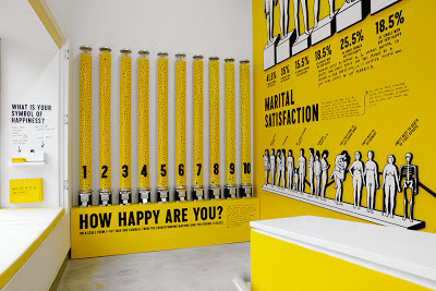 |
| Stefan Sagmeister, The Happy Show, at Institute of Contemporary Art, Philadelphia, April 4 – August 12, 2012 |
Copyright Julie Schauer 2010-2016
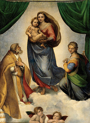
by Julie Schauer | Nov 16, 2012 | Christianity and the Church, National Gallery of Art Washington, Raphael, Renaissance Art
Last weekend the annual Sydney J. Freedberg Lecture on Italian Art at the National Gallery of Art was “Not a Painting But a Vision.” Andreas Henning, curator from Dresden, Germany, spoke about The Sistine Madonna, a magnificent altarpiece Raphael painted in 1512 which is now in the Dresden State Art Museum. I have written about it in a previous blog, comparing the Mary of this painting to the Raphael’s lovely image of inner and outer beauty in La Donna Velata.
However, as the title suggested, it is painting of a vision and that Mary is not of this world. She has facial features of that generic beauty similar to those of the Donna Velata, but she is more ethereal and otherworldly. As much as we may want to reach out and hug the baby Jesus, we can’t. The Madonna also carries a tinge of sadness in this image, a practice artists used to reveal Mary recognition that her Son will die someday.
However, two saints, Saint Sixtus and Saint Barbara have brighter colors and lead the transition to the audience on earth. The curator explained that they represent a reconciliation of opposites, as we often find in Raphael’s paintings. They are male and female, old and young, the active life and the contemplative life. But the truth is that they, too, are in heaven.
When the Sistine Madonna was completed and set as an altarpiece in a monastery church in Piacenza, we must imagine curtains framing the Mary, her veil blowing in a wind, as separating one world from another. The drama is in the relationship of the audience to the vision in the work of art. Only the saturated green curtains and a balustrade on bottom are meant to be part of the material world. In fact, in this visionary painting, Raphael has gone behind the Renaissance perspective which aims for imitation of reality. He anticipated the triumphant late Renaissance artist Correggio and the visionary art of Baroque, such as Bernini’s Ecstasy of Saint Teresa.
I’ve never seen this painting, but was thrilled to view the new slides since the painting’s cleaning. In the background, the clouds reveal the faces of many more cherubs. There are 42 faces in the clouds. (These faces are mainly visible in first image on the upper left side.) What glorious illusion!
The curator also pointed out that these sweet and precious angels, who look upward in observation and wonder, were an afterthought which Raphael felt the composition needed them for completion. What impeccable images of innocence, charm and love!
Copyright Julie Schauer 2010-2016
by admin | Nov 11, 2012 | Dale Chihuly, Glass, Landscape Design, Seattle
The art of glass is a place where artistic vision, exquisite craftsmanship and landscape design come together. Currently, there’s an exhibition of Chihuly Glass at the Virginia Museum of Fine Arts, Richmond, which may be a distance to go see, but worth it! It’s the third major installation in a US Museum, following exhibitions in San Francisco and Boston. One can expect huge crowds and colorful visions that are full of surprise.
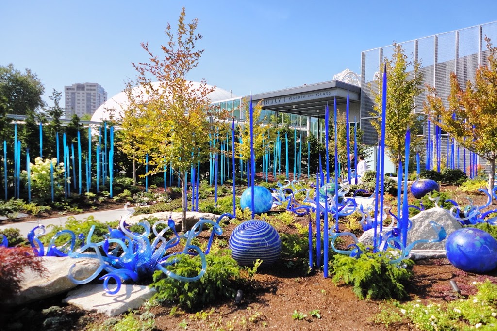
Chihuly’s Garden of Glass opened last spring in Seattle.

The Seattle museum is adjacent to the
Space Needle and Frank Gehry’s Experience Music. Over Labor Day weekend, I had the pleasure of going to Seattle when it wasn’t raining, thanks to my niece for choosing the right time to have her wedding on Bainbridge Island.
September is lovely in Seattle, and when the sun is out, the full spectrum of the colors can be appreciated. It may not be as bright in winter, but if I had to live there through the rainy winters, the colors probably would give me some solace. Chihuly is a native of Tacoma and it is a wonder that he developed such color and technique in this climate. Chihuly studied glass blowing on the island of Murano, near Venice, Italy, one of the few places known for making exquisite glass. Glass blowing techniques go back to the Egyptians, and the Romans learned from them. Surprisingly, there are many other glass artists and craftsmen working today, but we really have to credit Dale Chihuly for bringing back artistry, craftsmanship and popular interest into the art of glass.
Radiant complementary colors abound.The Garden of Glass includes outdoor and indoor spaces.
One time I had gone to the Chihuly’s Bridge of Glass in Tacoma on a rainy winter day. I tried, but it was impossible to appreciate the array of colors through the gloom of a rainy winter day. From November to April, the rain is constant in Washington.

There are many rooms and sections of the indoor museum, including a section of Native American weavings which have influenced the artist. To me the Glass Forest, below, is the most impressive interior room. Circles, swirls, and organic shapes compete for attention against a black background.
Before leaving the building, flowers of glass hang from the ceiling. Light, color and reflection give a endless array of design.
The Chihuly Garden of Glass is permanent but the Virginia Museum exhibition will last until February 10th. Going along with its exhibition, the museum made and recently this video of Dale Chihuly in his studio. He obviously needs a host of workers in the Walla Walla Studio to make these magnificent organic visual wonders.
by Julie Schauer | Oct 31, 2012 | Contemporary Art, Mexican Art, Nicolas de Jesus, Printmaking
 |
| Nicolás de Jésus and students, October 2012, NVCC, Annandale, VA, right side |
The day of the Dead ( Día de los Muertos) is a starting point for Mexican artist Nicolás de Jésus, who visited and demonstrated his work in my Art Appreciation Class on October 17th. Since today is Halloween, it’s a good time to explore how Nicolás de Jésus uses this theme. A mural he completed with students has been hung on the second floor of the CM Building.Is it a coincidence or not to discover this past weekend that someone near and dear to me turned out to be in an art exhibition on the El Dia de los Muertos theme?
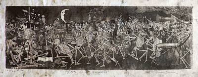 |
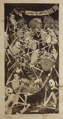
| Nicolás de Jésus, Fiesta de los Muertos, etching and aquatint |
Nicolás de Jésus mesmerized the class as he explained his prints, impressive for their beauty, meaning and the textures. The skeletons of his prints are very animated and life-like. His art dips into memories of his childhood in the Amayaltepec region, where he learned to make art at a very young age and his father was among the most notable folk artists. At first his art seems immersed in imagery of Día de los Muertos, but closer examination reveals that the holiday becomes a means to an end. His meanings go much deeper, because the subjects of the vernacular, folkloric tradition apply as well to other themes.
 |
| Dia de la Muerta, etching, aquatint
|
The celebration of the Day of the Dead recalls our own Halloween, but it is celebrated on November 1 (for deceased infants and children) and November 2 (for elders) in Mexico. Typically families go the cemeteries where deceased members of their families are buried. In some parts of the country they dance in the graveyards. They build altars to the deceased and present offerings of food, like sugared skulls, and decorations such as trinkets or flowers, preferably orange marigolds. They bring toys to the children, essentially blurring the boundaries between life and death. The celebration combines aspects of an ancient Aztec celebration with the Catholic feast days. The lines between the living and the dead become blurred, as I had recently witnessed in an exhibition at the National Mexican Fine Arts Museum in Chicago, where there were installations with food offerings to the dead, Hanan Pixal. Art is life and the art of this theme is for both the living and the deceased.
But in the art of Nicolás de Jésus, the skeletons can be powerful metaphors for the living. The skeletons dance and celebrate, taking on the qualities of living people. They act out the human comedy, or, at times they partake in the human tragedy and satirize human behavior. His meanings can be critical and provocative. He is concerned with the lives of Mexicans on both sides of the border.
 |
| Left side detail with skeleton in NVCC/Annandale’s new mural |
 |
|
Maicidio refers to the death of corn, a gift
from Mexico, through modification
|
|
|
|
Nicolás de Jésus prints his works from amate bark, native to his Guerrero region of Mexico, which is west of the Yucatan peninsula. Though he did not demonstrate in our class how to do his technique, it is a combination of etching and aquatints. In etching, the artist sketches the lines of an image into a waxy substance over the metal plate. For broad areas of shading, aquatint is used. Aquatint is a printmaking process that uses rosin, a natural lubricant produced by from tree sap, melted on a zinc plate to give a grainy quality to the tones. A acid bath ‘bites’ the images into the metal plate in both etching and aquatint, before the scene can be inked and printed in reverse of the drawn image. De Jesús uses the aquatint process frequently to create the grainy, textural backgrounds of many works.
One print that really strikes me is Maicidio, suggesting death to corn, one of Mexico’s great gifts to the world. The United States has now changed the nature of corn, overproducing it and turning it into cattle feed or high fructose corn syrup, things it was never meant to be. Its by-products become additives in almost all processed food. With American corn now is 85% genetically modified, it’s no wonder the skeletons attack and pull it apart. Let us remember this fact next Tuesday, when Californians go to the polls and vote on Proposition 37 which will require labeling for genetically-modified food (GMOs). As our industrialized US agricultural system is dominating and killing corn, people in the US become increasingly disconnected to land.
 |
| En El Tran recalls when the artist lived in Chicago. |
|
Nicolás de Jésus lived in Chicago from 1989-1994, and he has at least 60 works of art in the Mexican Fine Arts Museum in the Pilsen neighborhood of Chicago. En el Tran brings his familiar skeletons into the elevated train of Chicago’s mass transit system, while skyscrapers are seen out the window behind. He implies a deeper truth behind the scene, the fate that awaits all of us in the end. Although not mentioned, Mexico has a tradition of Surrealism and de Jésus also seems to be connected to Surrealists.
In many ways his prints follow in the tradition of socially and politically active artists from Mexico in first half of the twentieth century: Diego Rivera, Jose Clemente Orozco and David Alfaro Siqueiros. A full-blooded Nahua Indian from a small village in the state of Guerrero, Mexico, he is an advocate for the rights of indigenous peoples. Themes of struggle meet the themes of celebration in his work. Though he is critical of much in society, he is above all a humanist who recognizes our foibles but understands our humanity.
Copyright Julie Schauer 2010-2016
by Julie Schauer | Sep 8, 2012 | Art Appreciation: Visual Analysis, Cezanne, Impressionism and Post-Impressionism, Nicolas Poussin
Paul Cézanne, The Large Bathers, 1898-1906, Philadelphia Museum of Art
Cézanne worked on The Large Bathers, now owned by the Philadelphia Art Museum, during the last 8 years of his life. He did about 200 paintings of bathers, and another one in the National Gallery of London is also called Large Bathers. Its French name, Les grandes baigneuses, pays homages to the grandest of Cézanne’s compositions of this subject, which may be his final statement of the theme as well. To me it seems truest of an Arcadian dream, as witnessed in the Philadelphia Museum of Art’s recent exhibition.
The composition was clearly important to Cézanne in the search to find his truth. Through making art, he explored, subjectively, that which is true and everlasting in nature and in human existence. In his early paintings he used heavy brushwork, but as time went on he thinned the paint and applied it tentatively, as if his vision was changing. Planes of various colors overlap, but outlining shapes brought transient visions back to clarity. Cézanne worked with the Impressionists in the 1870s and had painted with them near Paris, but returned to his hometown, Aix-en-Provence in the early 1880s. In Aix, he mixed modernism and classicism, searching to add something solid and permanent to an Impressionist vision of color, while painting some of the same scenes over and over again.
Cézanne, Riverbank, c. 1895 National Gallery of Art, Ailsa Mellon Bruce Collection
Location is imprecise, but it is the type of river scene which inspired him
The Roman name for Aix-en-Provence implied natural baths or springs
Of course truth to Cézanne was tied to nature, where he sought refuge. Cézanne was equally tied to Virgil, whom he regularly quoted in Latin while painting among the rocks, trees, waters and paths that still contained vestiges of ancient Roman pastoral life. Romans founded Aix-en-Provence, called Aquae Sixtiae Silluviorum, in 123 BC, at the site of natural baths or springs, and fought a battle at the site of Mont Saint-Victoire 20 years later. Cézanne grew up with a very classical education of Latin and Greek at the École Bourbon in Aix. We note that this painting and others are modern but seem as classical as paintings by Poussin, who also often included landscapes similar to Mont Saint-Victoire is his compositions.

In Cézanne’s The Large Bathers, the nude women stand, kneel or sit, almost in symmetric formation, creating several triangles within the larger triangle of trees. They are enclosed within the trees just as an altar is enclosed within a church. The curved roof of a Gothic church could provide a sacred space, but here it is nature’s roof, the trees. The women seem to be performing a ritual, as if making a picnic, but we can’t tell what they do. A river and two patches of scorched brown earth run horizontally, suggesting true-to-life distance. Further back, trees and church steeple point upward.

Usually a church is the highest point, the center of a composition, but here it is subordinated to nature. Note, that in the background that the shape of the church and the trees is the same. The larger trees, the foreground trees which frame the women, don’t join at the top, and a central tree in the distance points to an opening, very suggestive of the upward ascent to the divine. The church is within this framework and a part of this ritual space where these women play a role and act out a ritual, but not the means to an end. The trees, i.e.nature, have replaced the church as the shelter and the vessel to carry them to divinity.


One woman’s finger points to the water where there is a swimmer, a detail too deliberate to be ignored and obviously something Cézanne wished to emphasize. The painting may suggest death, as the artist himself knew he was approaching the end. (In Greek and Etruscan paintings, swimmers diving into the water are thought to represent the diving into the afterlife, although I’m not sure if Cézanne was familiar with such paintings.) Beyond the swimmer, two figures have reached the other side. When we get back to main scene, we see that two or three women on the right will be diving soon. The other nymphs are acting, making preparations or staging a dress rehearsal, without clothes, for their ultimate transformation, the passing from earth to afterlife. Note they are calm and at peace, which makes me think Cézanne must have been at peace when he died.
 Cézanne worked on this painting for about 8 years and it is the culmination of so many studies of bathers he did. (I was told that his models were actually bathing men, but he made them into women.) He lacks interest in correct anatomy and sensuality, but was deeply interested in meaning which he explored by connecting the relationship of the parts to the whole. Their nude forms take on geometric constructions, and motifs of the circle, triangle and cone are present, even in outline, here. He left open patches on parts of their bodies, as he sometimes did, but it’s also possible the painting is unfinished. This painting represents Cézanne as an artist on a quest to understand humankind in the order of things, whose place in strong, but humbled next to the greatness of nature. Detail photos come from this website: http://www.artble.com/artists/paul_cezanne/paintings/the_large_bathers

We note that in painting and others by Cézanne, there is balance of verticals and horizontals, warm and cool tones, sky and earth — the heavens and the earth. Cezanne is also both classical and modern in style and composition, as he takes from the past to point to the future. Again, that pointing finger reminds us of the journey from the world of the past to the world of the future, just as it reminds us that death is a natural process of life.
Though Cézanne may not have been pleased with much of his art while here on earth, he has received an immortality in the end. Picasso, Matisse and others said he was the single greatest inspiration on the course of 20th century art, perhaps because of his ability to capture the essence over detail. The Grand Bathers is the essence of living life attuned to nature.
Copyright Julie Schauer 2010-2016
by Julie Schauer | Sep 1, 2012 | 19th Century Art, Art and Literature, Cezanne, Exhibition Reviews, Franz Marc, Gauguin, Giorgione, Impressionism and Post-Impressionism, Landscape Painting, Matisse, Modern Art, Mythology, Nicolas Poussin
One of the first ‘pastoral‘ paintings(not in the exhibition) was
The Pastoral Concert, 1509, by Titian and/or
Giorgione, originator of the pastoral, where landscape is on par with figures. Shepherds and musicians are frequent in this theme.
Good things always end, including summer and a chance to see how the greatest modern artists painted themes of leisure as Arcadian Visions: Gauguin, Cezanne, Matisse, ends Labor Day.
The exhibition highlights 3 large paintings: Gauguin’s frieze-like Where do We Come From?…, 1898, Cézanne’s Large Bathers, 1898-1905 and Matisse’s Bathers by a River, 1907-17.
Each painting was crucial to the goals of the artists, and crucial to the transitioning from the art and life of the past into the 20th century. These modernist visions actually are part of a much older theme descended from Greece and written about in Virgil’s Eclogues. Nineteenth-century masters were very familiar with this tradition from the 16th-century painting in the Louvre, The Pastoral Concert, by Giorgione and/or Titian. Édouard Manet’s infamous Luncheon on the Grass of 1863 was probably painted to fulfill that artist’s stated desire to modernize The Pastoral Concert. Those who think artists throw away tradition, think again; the greatest artists of the modern age did not.
Arcadia was originally thought to be in the mountains of central Greece. Virgil described a place where shepherds, nymphs and minor gods who lived on milk and honey, made music and were shielded from the vicissitudes of life. With its promise of calm simplicity, Arcadia was a place of refuge. Renaissance scholars writers and painters re-descovered it; Baroque painters developed the theme further, and 19th century artists glorified it because the Industrial created yearnings for a simpler life. (Musée d’Orsay in Paris has a small focused exhibit on Arcadia at the moment.) Stéphane Mallarmé’s poem of 1876, An Afternoon of the Faun, had this theme, too, and was followed by Claude Debussy’s musical interpretation after that poem.
But, even Virgil had warned, that things are not always as they seem. The exhibition’s signature pieces by Gauguin, Cézanne and Matisse reflect harmonious relationships between humans and nature, but tinged with loss. The best of Arcadian visions give equal importance to figures and landscape, as these artists do. Other 19th century painters, whose work is shown for comparison, include Corot, Millet, Signac, Seurat, and Puvis da Chavannes. It is interesting that the museum did not include Auguste Renoir’s Large Bathers, 1887, in the PMA’s own collection, probably because that idealized scene does not have anything foreboding.
Paul Gauguin, Where do we come From? Who Are We? Where Are We Going?(detail of left side), 1898
From the Museum of Fine Arts, Boston, is so large that it must be seen in real life.
Artist Paul Gauguin escaped France and settled in the the south seas, Tahiti, where he searched for his version of Arcadia. It was the first time I had seen Gauguin’s Where do we come from? Who are we? Where are we going? No reproduction does justice to its color, details and beauty. Twelve five feet wide and four feet high, it must be seen in person to adequately “read the painting.” Composed of figures familiar from other Gauguin paintings, this allegory makes us think deeply about the meaning of life via Gauguin’s favorite figural types, the women of Tahiti. He depicts youth, adulthood and old age and treats each phase as a moment of discovery and passing to the next, but we may end up with more questions than answers.
Paul Cézanne, The Large Bathers, 1898-1906, Philadelphia Museum of Art, is the
culminations of many studies he had been doing of bathers since the 1870s.
The acoustical guide to the exhibition quotes Paul Gauguin who said that Paul Cézanne spent days on mountaintop reading Virgil. Cézanne’s soul was always in his hometown of Aix-en-Provence and the connection to that past was in his blood, coming from a very classical childhood education of Latin and Greek and hiking through old Roman paths with friend and future novelist, Émile Zola. Even though the bathers have no sensuality, Cézanne’s Large Bathers is a painting which gives exquisite beauty to its concept. To me, it stands out as the most important painting in the show. An article links Cézanne to thoughts of death, Poussin and several poets who wrote of the territory surrounding Aix as Arcadia. This painting is perhaps the most Arcadian modern painting of the exhibition, although there are no shepherds, no musicians and no men. While it picks up the dream of humankind living simply in nature, under its beauty and its bounty, one woman points to the river, suggesting a place where these complacent bathers will ultimately go.
The design of The Large Bathers perfectly balances traditional space and compositional structure with the goals of modern art. I always knew how much I loved this painting, but now I know why. The exhibition gave me much new insight and appreciation to fill an entire blog about this painting. Matisse’s painting is in the same large room of the exhibition, but the message is less subtle.
Matisse spent ten years revising this painting, 8’7″ by 12’10” Art Institute of Chicago
He completed Bathers by a River around 1917
Bathers by a River is also very large and, as expected, even more abstract. Matisse worked on the painting for 10 years and changed it, as his ideas and conceptions changed. Noticeable is the lack of color and empty features of the faces. He paints verticals, a suitable balance to the curves, but a snake appears in front and in the center, which can be seen as a dire warning. World War I was happening at the time he finished it. His earlier paintings of bathers were far more joyful and colorful.
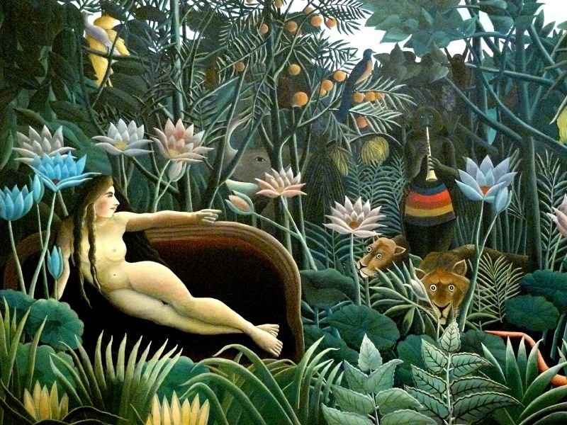
Henri Rousseau, The Dream, 1910, from the Metropolitan Museum of Art, New York,
is approximately 6’8″ x 9’9″
It was a complete surprise to see Henri Rousseau’s The Dream, also a very large painting. The tropical landscape with an elephant and lions is included in the same room of monumental paintings. Rousseau drew exotic plants in the botanical gardens of Paris and he painted them in a simplistic style with unexpected, evocative juxtapositions. He was a visionary before the Surrealists. His woman reclines in a traditional pose on a seat-less sofa, as a dark-skinned horn player and jungle animals appears. Music, repose, luxury of nature are typical Arcadian themes, and it is a joy to see it in the same room with the three signature paintings of the exhibition.
Nicolas Poussin, The Grande Bacchanal, c. 1627, from the Louvre, Paris
To understand all these connections, the curator included a painting by the most representative painter of the Arcadian tradition, Nicolas Poussin. (New York’s Metropolitan Museum hosted an exhibition, Poussin and Nature: Arcadian Visions, 4 years ago.) Poussin was a Baroque artist who was thoroughly engrossed in a classical style with themes taken from ancient writers. His painting The Grande Bacchanal, 1627, on loan from the Louvre, has beautiful women, musicians, a Silenus and even baby revelers, with darkess approaching the landscape. Each of the early modern artists featured in the exhibition were familiar with Poussin’s style and sources, as well as Watteau and Boucher who painted pastoral themes in the 18th century.
Matisse’s early Fauvist paintings, Music and The Dance, are abstract and modern but thoroughly a part of the pastoral tradition. Athough the exhibition does not show any of the colorful compositions Matisse did in the first decade of the 20th century, those paintings have tons of color and are steeped in the pastoral tradition. (I’ll need to take trip to Philadelphia to see the Barnes Collection with another large version of Cézanne’s Bathers and Matisse’s famous The Joy of Life.)
A sketch of “Music” from MoMA links back to Poussin’s The Andrians, with dancers, a lounging woman and a violinist. This painting is not in the exhibition..
Quotes from the poet Virgil’s pastoral literature line the walls. We witness how various artists of the 19th and 20th centuries interpreted his poetry in drawings, paintings, etchings and illustrated books. The exhibition ends with Picasso, Cubists, Expressionists and little-known Russian painters of the 20th century. Although not always inspired by Virgil or Ovid, these paintings can be linked to the desire for a bucolic life of simplicity and harmony in nature.
I was awed to see the Robert Delaunay’s City of Paris, 1910-12. Delaunay famously painted the Eiffel Tower in a Cubist jumble of colors and shifting perspectives. That symbol of modernism was only a little more than 20 years old at this time. This giant canvas of Paris also has three large nudes. They are the Three Graces, just as Botticelli and Raphael had painted them. Delaunay’s vision of Paris includes the past and the present, but the nudes of the past are actually seem more central to this composition of shifting triangles, circles and planes of colors. If anything, Cubism reminds us of life’s impermanence.
Robert Delaunay, City of Paris, 1910-12, is 8’9″ x 13’4″
Finally, at the end we see
Franz Marc’s Deer in Forest, II, from the Phillips Collection. Here the humans are gone and only animals are in the forest. The exhibition is very thoughtful and reflective, and I thank Curator Joseph Rishel for giving us so much to ponder. It is one designed not only to make us only look art more closely, but we must also think more deeply.
Copyright Julie Schauer 2010-2016


 1929 halftone reproduction Des Moines Art Center Louise Noun Collection of Art by Women through Bequest, 2003")


Recent Comments